Years You Have Left to Live, Probably

The life expectancy for the average woman in the United States is 81 years and 2 months. For men, it’s 76 years and 5 months. These are the most recent estimates from the Centers for Disease Control and Prevention. Just subtract your current age from those numbers for a rough estimate of how many years you have left.
It feels accurate. It feels precise.
But people die at various ages. Life is imprecise. Otherwise, you could just plan your days all the way up to your last.
Also, life expectancy is typically quoted “from birth.” It’s the number of years a baby is expected to live the moment he or she escapes from the womb into the wondrous realities of the outside world. This is a good measure for progress in countries and is a fine wideout view, but it’s just so-so for you and me, as individuals.
The range of your life expectancy is much more interesting.
Toggle your age and sex below to see the possibilities.
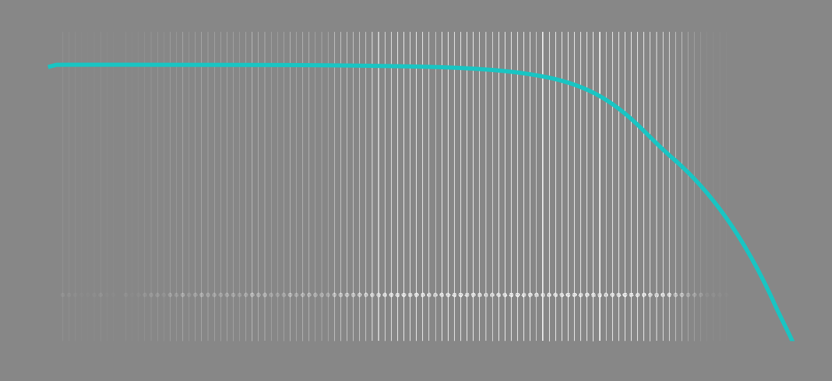
The graphic uses data from the Social Security Administration to simulate your possible lifetimes. That’s plural. The line shows the probability you live to see your next birthday, given age and sex. Each running dot represents a possibility.
As expected, the probability that you live to the next year decreases as you age. More than 99% of people under the age of 60 live to see the next year, but the probability shifts towards zero relatively quickly after that.
Let the simulation run long enough (or flip on the “fast” switch), and the distribution always converges towards a curve that skews towards older. That’s expected.
The individual data points? Those are much less predictable.
Well, depending on your age of course.
For example, if you are female and 50 years old, the average life expectancy is about 33 more years. However, let the simulation run, and that single average value represents a wide span that mostly rests between 20 to 49 more years.
There’s less room for error if you’re a centenarian.
That said, shift the slider higher, say 70 or older, and see what happens. Life expectancy increases and the balls tend to drop farther past the overall life expectancy point. That is, as you shift into later years, life is like, “Hey, you’re pretty good at this aging game. Better than most. You’re probably going to live longer than the average person.” This poses interesting questions for retirement planning and sustaining that long life, but let’s save that topic for another time.
As for me, a 34-year-old male, my distribution is still open to lots of possibilities. And I should probably look into life insurance.
 How You Will Die
Now that you know how many years of life you have left, here’s how it’s going to end.
Become a member. Support an independent site. Make great charts.
See What You GetFlowingData is made possible by supporting members. Since 2007, I, Nathan Yau, a real person, have been analyzing and visualizing data to help more people understand and appreciate it in their everyday lives.
If you liked this or want to make similar data things, please consider supporting this small corner of the internet. You get unlimited access to visualization courses, tutorials, and extra resources. Thanks. — Nathan


