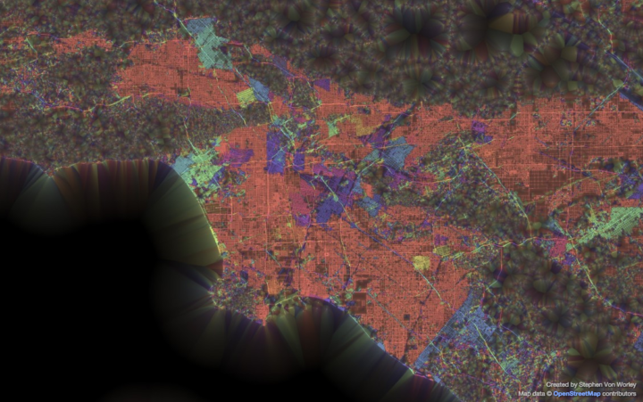
This is what you get when you group streets by their geographic orientation and color them accordingly with a neon paintbrush. From the ever curious Stephen Von Worley:
That’s every public street, colored by the predominant orientation of itself and its neighbors, thickened where the layout is most “grid-like” — to use an old-school woodworking metaphor, it’s as if we brushed some digital lacquer over the raw geographic transportation network data to make the grain pop.
Above is the map for Los Angeles. You see a lot of north-south grids in the red-orange color, but head towards the center of the map in the downtown area, and you get pockets of misdirection. In cities like Tokyo and Paris it looks like there’s no order at all to the roads, whereas Chicago’s road network looks like one big grid.
Lots to ponder, especially if you live in the cities.
See also the level of gridded-ness by Seth Kadish.


