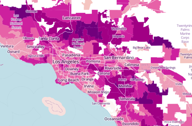
The United States Census Bureau just released county-level commute estimates for 2011, based on the American Community Survey (that thing so many people seem to be against).
About 8.1 percent of U.S. workers have commutes of 60 minutes or longer, 4.3 percent work from home, and nearly 600,000 full-time workers had “megacommutes” of at least 90 minutes and 50 miles. The average one-way daily commute for workers across the country is 25.5 minutes, and one in four commuters leave their county to work.
The Bureau graphic isn’t very good [PDF], but WNYC plugged the data into a map, which is a lot more informative.
There’s also a link to download the data on the bottom left of the WNYC map in CSV format, in case you want to try your hand at making a choropleth map. Or you can grab some flow data from the Census Bureau.


How can we find a key for the map? I sent it to a bunch of Angelenos, and now we’re wanting to explore more.
Check out the links in the post.
I did. I couldn’t find anything anywhere. One of my colleagues found a Manhattan map from the WNYC data guy, but no Los Angeles map.
It’s interactive, so you can go to the location you want:
http://project.wnyc.org/commute-times-us/embed.html
Can you please elaborate a bit more to the reasons why the Bureau’s graphic “isn’t very good”?
The map above is made, presumably, by place of residence. It could also be made by place of employment. Might be interesting too.