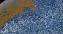
 Horace Mitchell, director of the NASA Scientific Visualization Studio discusses the process behind their visualization that shows estimated surface currents around the world, Perpetual Ocean.
Once we have the data set, then we bring two things to bear. I’m a scientist by training — I have a doctorate in physics and I did research for about a decade — but everyone in my group has a level of understanding what the point is of all these animations. We know what we’re doing, and what we’re trying to bring out. Then, the team is amazing — working together, they play off of each other and every person in the team has a separate project they’re working on. They’re always bouncing ideas off of each other. As a result, over the last 10 or 20 years, we’ve gotten very good at figuring out what we can do. We have tools we can bring out at the drop of a hat to do certain kinds of visualizations. But we’re always thinking about the next thing, and what we can’t do yet.
People miss that very first part a lot of the time: “Once we have the data set…” No data means nothing to show.


“Once we have the data…” I wonder how much pain and effort is hidden inside this simple little sentence!
Lest people think NASA’s Mr Mitchell doesn’t realize this fact, here is the paragraph preceding the one Nathan quoted, above:
“Obviously, if you don’t have interesting data, you don’t do anything. That’s just it. And I have to give all the credit to the fabulous researchers who work in NASA and with NASA to produce these amazing and accurate data sets in all kinds of ways.”
that quote contains interesting food for thought… hehe
This is indeed an amazing and conceivably accurate data set.
My first reaction to this visualization was: Why the heck is the earth spinning? If I were to compare different areas of the oceans I would want to see them all in the same frame. What happens on the back side of the earth at the time I am looking at the front.
After a few minutes I am left with a conclusion about… all right, water moves in mysterious ways, moves in patterns that on different scales looks surprisingly similar and seems to be highly influence by the shapes of continents.
But reading the article (yeah I know… sorry) made me think a little bit more about the purpose of producing a movie like this.
“We submitted it to the conference, but it didn’t get selected. So, we had shown it to people and we had it hanging around. […] Then a colleague of ours […] put it on our Facebook Page, and it just caught like wildfire — it went completely viral at that point”
Form follows function – as numerous designers and architects have pointed out for a long time. If we believe this, the form of this visualization might follow the function of promoting NASA’s popularity. In this case this visualization is great. “Hey look, we send satellites into space, and then we create these amazing computer generated animations”.
However I think a ”great’ visualization should be judged by a wider set of standards, especially wider than how many likes on Facebook. Standards that might connect the purpose of the data gathering with meaningful decisions more clearly. And some of these standards might be the reason why this visualization didn’t get selected at the conference.
Does anyone have ideas for, knowledge about or maybe even experience with what the ocean current data sets are used for?