Flow Chart Shows You What Chart to Use

Amit Agarwal, of Digital Inspiration, posts this Andrew Abela creates this flow chart that helps you decide, well, what type of chart to use. Start in the middle with what you want to show – comparison, relationship, distribution, or composition – and then work your way out to the number of variables. Pretty timely for our brand new Visualize This project.
[via Digital Inspiration]
17 Comments
Become a member. Support an independent site. Get extra visualization goodness.
See What You Get
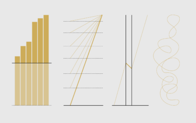

I knew I recognized this chart. The original (http://extremepresentation.typepad.com/blog/2006/09/choosing_a_good.html) creator is actually Andrew Abela, Author and founder of Extreme Presentation(tm) who does a wonderful job helping folks make sure their presentation message gets the point across. He created this chart to make sure people were using the right chart type for the right information in their presentations. We’ve found it to be really useful in helping folks get started in the right direction.
Typepad and Flickr are both blocked by Work Firewall, which is ironic in this case as this flowchart could be really useful.
Are FlowingData allowed to reproduce it in full? or does anyone have any other links.
Thanks.
You should really credit Andrew Abela of http://extremepresentation.typepad.com/blog/ It’s his work.
This sounds a lot like Juice Analytics’ – Chart Chooser, which I know has been around for at least a year or so. The beauty of their site is that it’s interactive versus a static reference.
http://www.juiceanalytics.com/chartchooser
I recall from previous exchanges that the Chart Chooser from Juice Analytics has been developped based on DR Andrew Abela’s work.
Bernard – you are absolutely correct. I checked and Juice references the Extreme Presentation Method site, which is Abela’s work. Thanks for correcting this.
Oh snap. I guess there is never any reason to use a scatter matrix plot. That’s a shame, it is my favorite multivariate chart type :(
Blech, thanks for the correction all. Abela’s name is even in the right corner of the image. I must’ve seen the A.A. initials late last night, and just assumed it was Amit…
Hi all,
Thank you for acknowledging my work – I appreciate it.
Per Joshua’s comment: please note that I never intended for this to be definitive. What I hoped, when I posted it, is that I would receive feedback on what’s missing or misplaced, and I could improve the diagram based on that feedback. Arguably, the scatter matrix is a type of the “Table with Embedded Charts” in the upper left of the diagram, but I agree that it really does deserve a place of its own. I’ll work on it.
Meantime, if you have any further feedback, please feel free to add it here: http://extremepresentation.typepad.com/blog/2006/09/choosing_a_good.html
Hey Andrew, sorry about that. Thanks for the link to extreme presentation.
No problem Nathan. I’m glad to have discovered your site – you have some great stuff here.
Pingback: lucasjosh.com » Blog Archive » Flow Chart for Data Visualization
You get a chart selector in the stats program SPSS, too.
The circular area chart is not only fit for the display of few variables which vary in time, such as audience by day time. It is used in weather analysis (wind speed by direction). You can also use it for describing a classification if you have up to half a dozen of variables and want to show the different profiles of the types.
An example : http://www.cost269.org/Committee/linksmoreda/Smoreda%20&%20Thomas.pdf Fig.4
For my book, Applied Security Visualization, I developed a decision chart as well. It somewhat based on Andrew’s work, but I included the data types (nominal, ordinal, etc) in the decision process.
Pingback: Chart Selection | The Big Picture
I forgot about this one: http://interface.fh-potsdam.de/infodesignpatterns/patterns.php
In addition to the different chart/viz choices, there are also examples and detailed history about the selected technique.
Pingback: ::: Think Macro ::: » Reading blogs #10