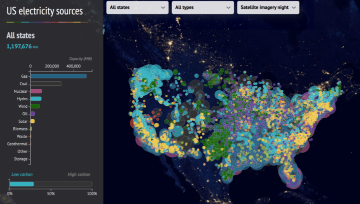
This interactive map from CarbonBrief shows how America generates electricity. Each circle represents a power source, color represents type, and size represents output.
See also a more edited version from The Washington Post a couple of years back.

This interactive map from CarbonBrief shows how America generates electricity. Each circle represents a power source, color represents type, and size represents output.
See also a more edited version from The Washington Post a couple of years back.