Useless Data Comparisons
It’s in our nature to compare things. What’s better? What’s worse? What falls in the middle? However, make sure you don’t end up in an apples and oranges situation where the comparisons don’t even make sense or are completely useless.
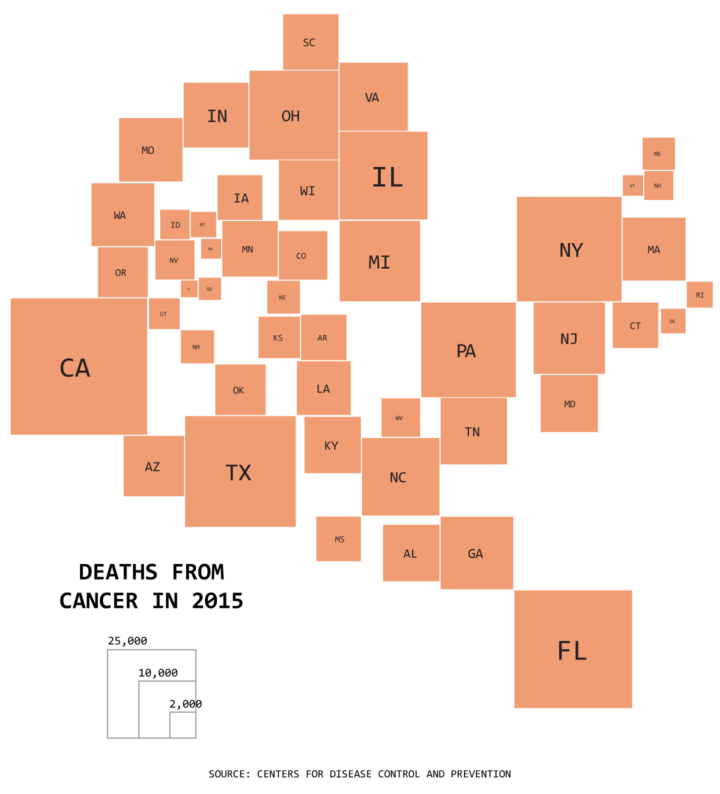
Incorrect conclusion
How weird that the states with large populations have a lot of cancer deaths. There must be something weird about living in areas with a lot of people that make cancer more prevalent. Therefore, I should live in North Dakota.
Actual
Okay, but you’re looking at absolute counts again. California has a large population, so there are more deaths there. When you compare the rates for each state, there’s a lot less variation. This is not to say that absolute counts are pointless. But if the data is directly related to group size, then you should account for that.
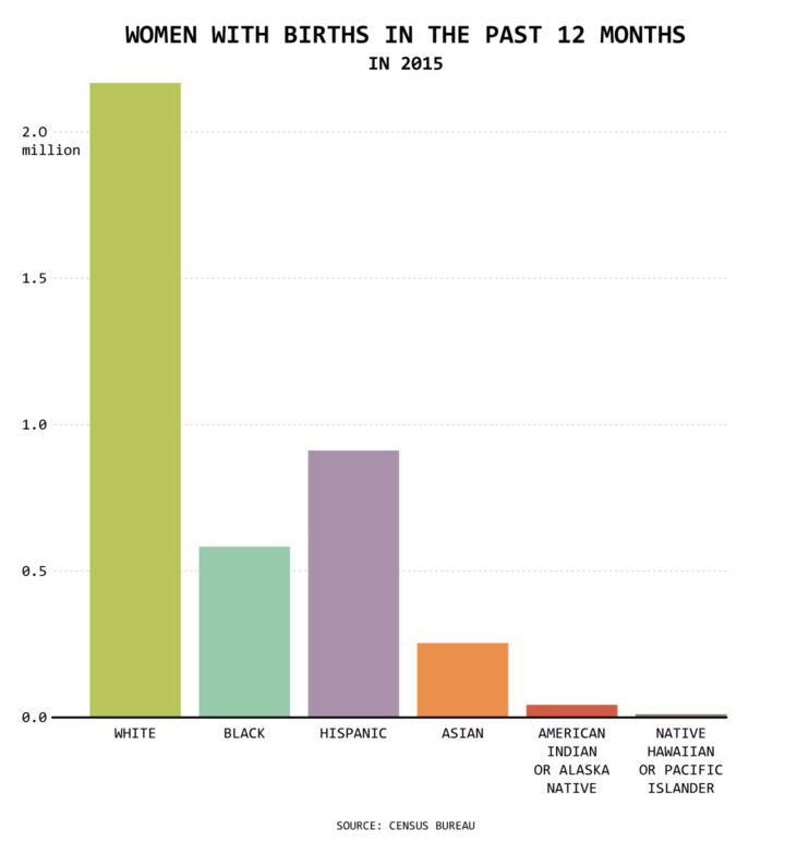
Incorrect conclusion
White people must be really fertile and have a lot of kids! Look how many more white women had a child than all the other groups. It’s not even close.
Actual
Okay, but the chart shows absolute counts. There are many more white people than the others, so there are inevitably more women who gave birth in total. But, if you look at rates — say, number of women who gave birth per 1,000 women in any given group — then white is the lowest and native Hawaiian is the highest.
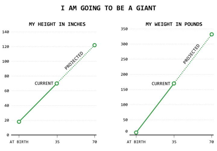
Incorrect conclusion
I was a tiny baby when I was born. Now look at me! Extrapolate that. I’m going to be a giant, because when I’m double my age, my height and weight will also be double. Look out world. Here I come.
Actual
Okay, but. Well. Probably not. You can’t just extrapolate linearly like that. Height and weight levels off. You know that, right? Have you grown in height at all during the past decade? Maybe look at more data points in between birth and your current age.
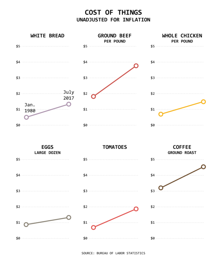
Incorrect conclusion
The cost of everything is going up! Ground beef costs twice as much as it did in 1980. How am I going to make my mom’s famous omelettes when eggs prices are going through the roof? The world is crumbling to pieces. I want to cry.
Actual
Okay, but these average prices don’t account for inflation. You can’t compare monetary values over time without thinking about the changing value of a dollar. One dollar in 1980 is the value of about three dollars in 2017. So the ground beef price of $1.82 in 1980 dollars is $5.73 in 2017 dollars, meaning the price decreased.
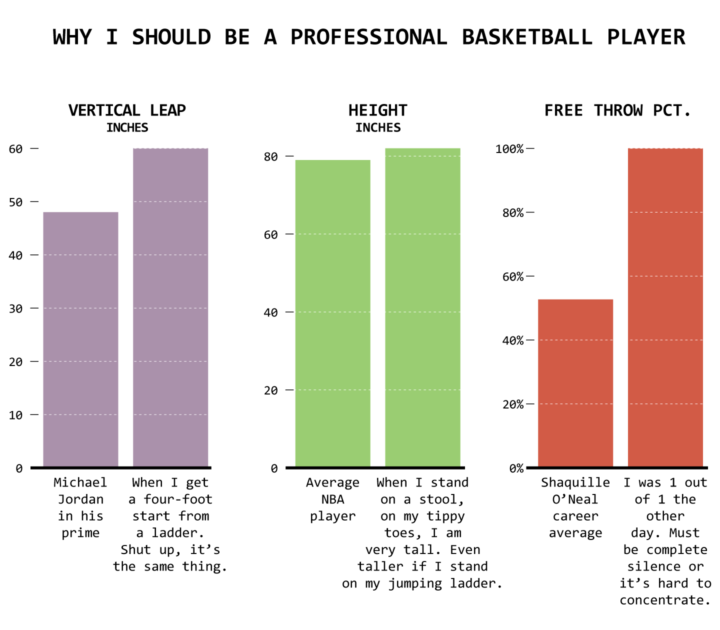
Incorrect conclusion
I can jump higher than Michael Jordan in his prime, I am taller than the average professional basketball player, and I shoot better than most. SHOW ME THE MONEY.
Actual
Okay, but players don’t get ladders or stools during basketball games. I mean, seeing as you’re interested in becoming an NBA player, you’ve seen at least one game, right?
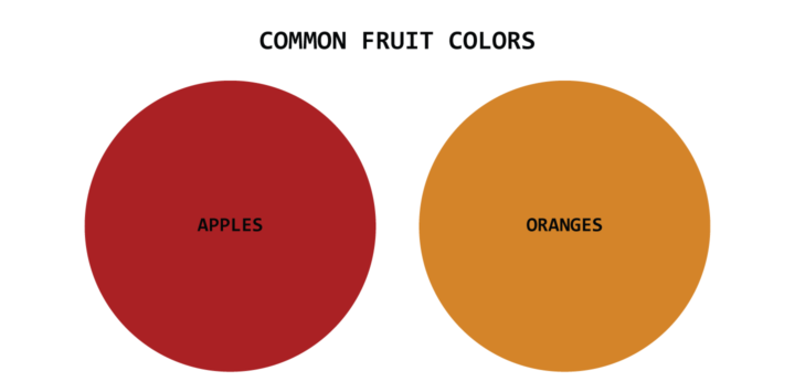
Incorrect conclusion
Apples are often red. Oranges are often orange. Different!
Actual
Okay, but you’re comparing apples and oranges. Oh wait. This comparison actually works in this case. Never mind.
Become a member. Support an independent site. Get extra visualization goodness.
See What You Get