Real Chart Rules to Follow
There are a lot of “rules” for visualization. Some are actual rules, and some are suggestions to help you make choices. Many of the former can be broken, if that’s what the data dictates and you know what you’re doing.
But, there are rules—usually for specific chart types meant to be read in a specific way and with few exceptions—that you shouldn’t break. When they are, everyone loses. This is that small handful.
Bar chart baseline must start at zero
The bar chart relies on length to show data. Shorter bars represent lower values, and longer bars represent greater values. Compare bar lengths to compare values. That’s how it works.
When you shift the baseline, you distort the visual.

For example, look at the graphic above. The first bar chart on the left compares 50 and 100, and it has a zero-baseline. Good. The bar that represents 100 is twice the length of the bar that represents 50, because 100 is twice the magnitude of 50.
But when you shift the baseline to a higher, non-zero value, the length of the first bar decreases. The length of the other stays the same. The 100-value bar is no longer twice the length of the 50-value bar. Keep on going, and the left bar disappears completely, suggesting that 100 is infinitely greater than 50.
A bar chart’s baseline must start at zero.
Example
This bar chart comes courtesy of Fox News:

The March 31 goal of 7,066,000 is 17.8% greater than 6,000,000, but the second bar is almost three times the length of the first.
One might argue that the focus is on the difference of the two values rather than on the two values themselves. Even so, a bar chart would be the wrong choice. A time series that shows a monthly cumulative would likely be better.
Don’t go overboard with pie slices
Some say to avoid pie charts completely. Maybe they’re right, and maybe not. Some might argue that pie chart usage in itself is an unforgivable violation. I would argue against that. In any case, the fact is that people use them regardless, so we can at least push for correct usage.
Avoid using too many slices, because it eventually becomes unreadable.

What is “too many” slices though? That’s a judgement call, but if it’s hard to tell that one slice represents twice the value as another or smaller slices start to look the same, it’s time to scale back. Consider clumping the smaller categories into a larger “Other” group. The same goes for donut charts.
Also consider using a different chart type to show proportions.
Just don’t go overboard with pie slices.
Example
This set of pie charts comes by way of Wikipedia, and it shows the areas of countries.
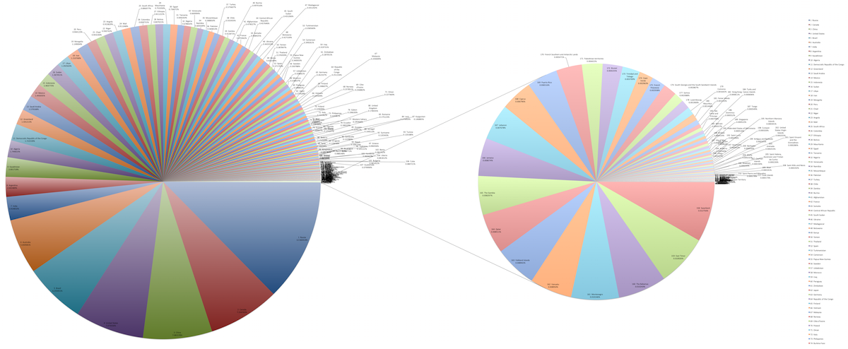
The chart on the left already has a lot of slices, but then there’s a breakout pie chart for smaller countries that provides even more. There are a lot of ways to go about showing this data, such as a treemap, properly scaled symbols, or just a regular map. The meager pie chart just isn’t built for datasets that are more than a handful of values.
Respect the parts of a whole
Charts that represent parts of a whole should be used to show data that represents parts of a whole. This includes stacked bar charts, stacked area graphs, treemaps, mosaic plots, donut charts, and pie charts. Each section in these charts represents a separate, non-overlapping proportion.
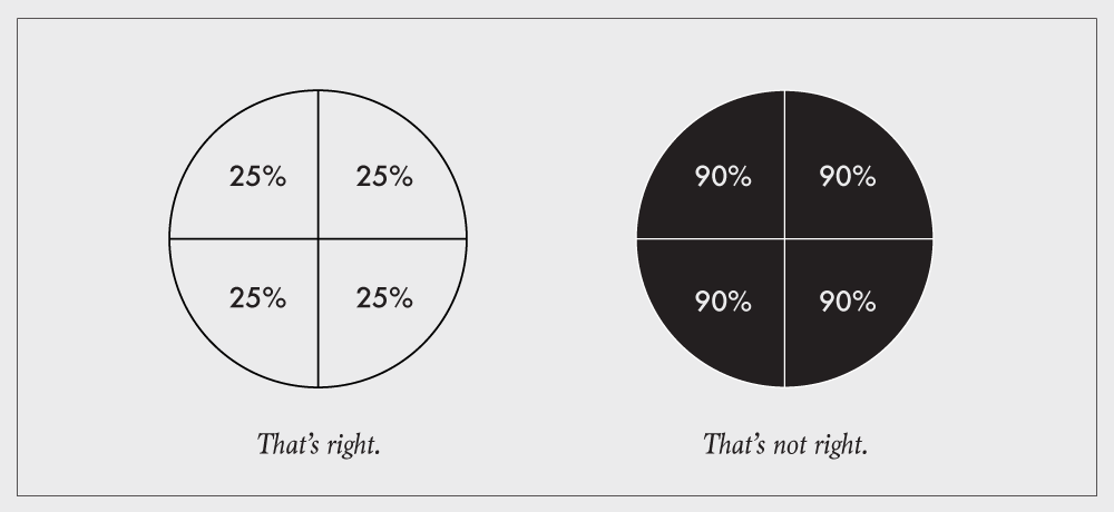
The most common occurrence of this violation is when a survey question allows for more than one answer. For example: “What mode of transportation have you used in the last week? Check all that apply.” Account for the overlap, where people select more than one answer, or you can’t chart the proportions straight up.
Example
This pie chart, courtesy of a Fox News affiliate, shows three percentages that aren’t parts of the same whole:
Instead, each value is a standalone percentage out of 100, so three stacked bars (or regular bars) would be more useful in this case.
Show the data
This is the point of visualization. If you don’t show the data, it defeats the purpose of the chart. This often happens when you show too much data at once, and you obscure the area of interest.

This is a classic over-plotting problem, and there’s plenty of research on the topic. But for your basic charts, there are a few simple solutions.
Change symbol sizes so that each dot (or whatever else) doesn’t take up as much space. You’re basically trying to increase white space.
Use transparency so that symbols still appear when another is placed on top.
Break up the population into subgroups either by sampling or using actual categories in the data. From there, you can go the small multiple route so that there are fewer points per chart.
Aggregate the data into bins.
In summary: Show the data.
Example
Here’s a chart for every shot the Golden State Warriors took during the 2008-09 season.
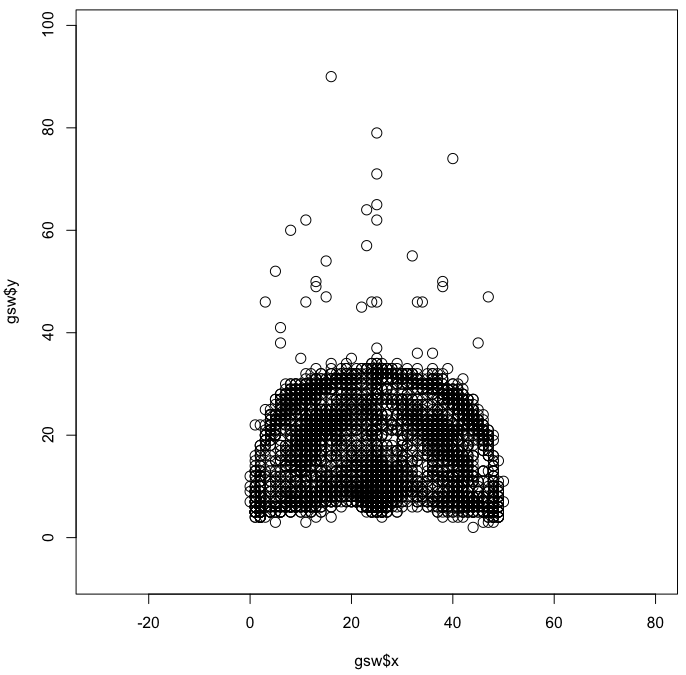
You end up with the shape of a court and a slight idea of where players shot the most — close to the basket, mid-range, and three-point. But the difference is subtle and you can’t see the true magnitude of the differences. Aggregation would help.
Explain encodings
When you “show the data”, you encode it to shapes, colors, and geometries. For that to work though, you and others need to be able decode back to the values. The classic example is unlabeled axes.

Sometimes encodings don’t need to be explained. For example, your audience likely knows how to read a bar chart, so you don’t have to explain that bar length represents values. But you do need to explain the data, namely the units and the subject at hand.
So label your axes. Provide a key or legend. Explain encodings.
Example
This mislabeled comes courtesy of the Winnipeg Sun:
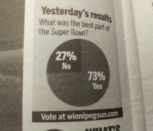
If only we knew what the real question was.
Wrapping up
There you have it. At the end of the day—to make sure you don’t break the most basic of visualization rules—it’s all about understanding the encodings. If you understand how data translates to geometry, you can make your own things and establish your own visualization types. But when it comes to specific chart types that are meant to be read in a specific way, there’s little to no leeway.
In summary: Learn data encodings. Then figure out the difference between a suggestion and a rule.
Become a member. Support an independent site. Get extra visualization goodness.
See What You Get
