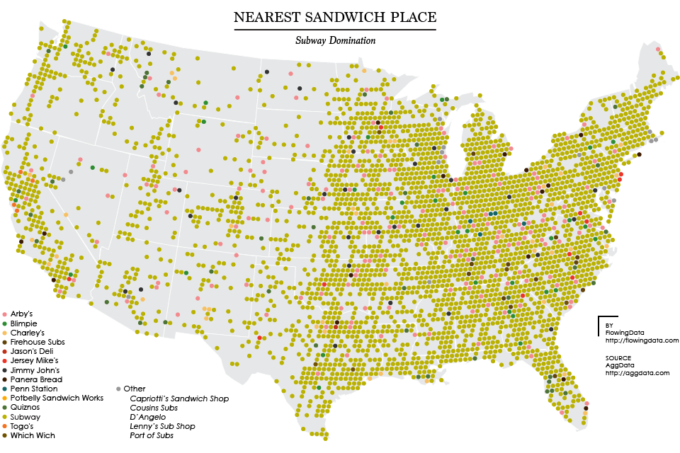
Sandwich Place Geography

As of this writing, there are over 27,000 Subway restaurants in the United States and about 16,000 locations in other countries, putting the total count at around 43,000. In contrast, McDonald’s has about 36,000 locations worldwide, or somewhere around 16 percent fewer locations than Subway.
That’s a lot of chopped lettuce.
Arby’s, Subway’s nearest sandwich competitor, is dwarfed with about 3,300 locations. Jimmy John’s and Panera Bread have about 2,000 locations each. In fact, there are more than twice as many Subway locations as there are all other sandwich chains (with at least 100 locations) combined.
The map below shows Subway’s dominance. Each circle represents an area with a 10-mile radius, colored by the nearest sandwich chain. Subway’s lead is clear with unexpectedly much more gusto than McDonald’s. There are a few other sandwich places sprinkled here and there.
Take Subway out of the equation, and you get the map below. Arby’s starts to exert its dominance, but not with nearly the same magnitude as Subway. Jimmy John’s, Blimpie, and Charley’s start to poke through in the east. You see a good number of Togo’s in California. It’s kind of a free-for-all in other areas.
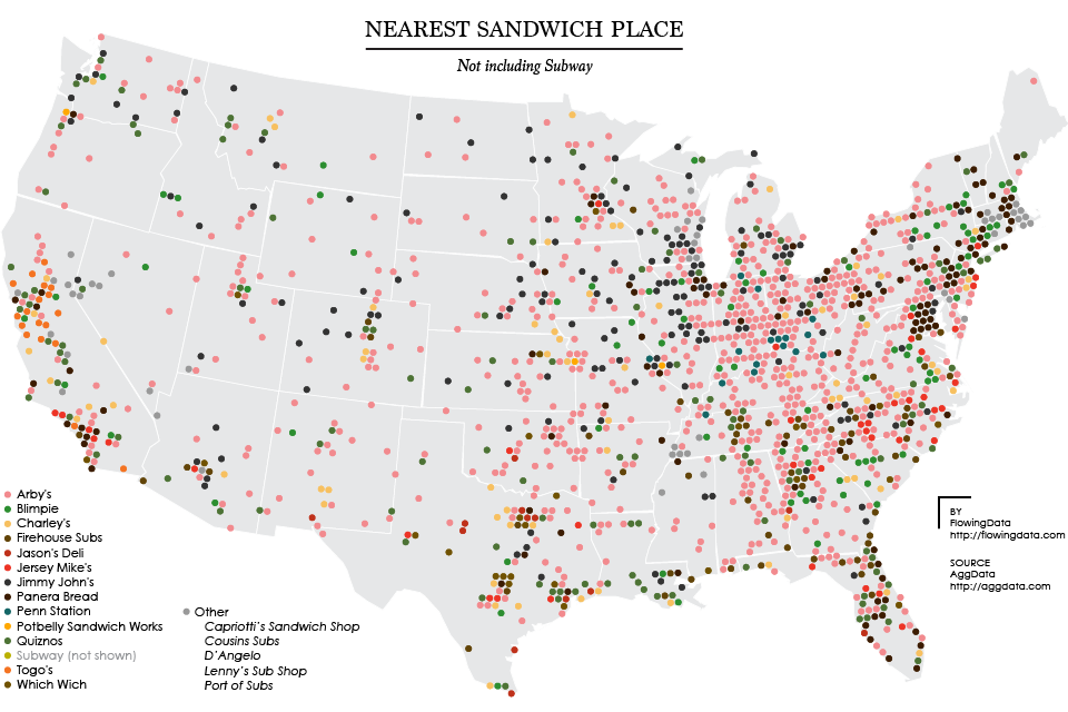
This kind of surprised me, because I expected to see more regional clustering like the comparison between Dunkin’ Donuts and Starbucks. But even if you take away both Subway and Arby’s national coverage, you still get a mixed bag of sandwiches.
So basically, wherever you are, it’s likely there’s a Subway not too far away. And if you don’t want Subway, there’s probably another sandwich option nearby, not to mention all the local, independently-owned options.
Thanks to AggData for the sandwich data.
Become a member. Support an independent site. Get extra visualization goodness.
See What You Get