Pizza Place Geography

Most of the major pizza chains are within a 5-mile radius of where I live, so I have my pick, but I usually order from whatever place is closest to where I am. So it doesn’t matter if there are more Domino’s locations than Pizza Huts where I live. I just want my feeding time to come sooner rather than later, and if that place happens to be Pizza Hut so be it. (Although, if I’m not in a rush, I’ll go to the local sit-down place.)
This is the point of the map above, which shows the nearest pizza place within a 10-mile radius across the United States. Nice and clean data courtesy of AggData.
Stephen Von Worley did something similar with burger joints and FloatingSheep looked at pizza from another point of view. But like I said, I was more interested in distance than location counts. How long is it going to take the delivery guy to reach my doorstep?
As you might expect, Pizza Hut (red) dominates from a national perspective. Domino’s (blue) also has a strong showing nationally, but with a better showing in the east.
Regionally, Papa John’s, which started in Kentucky, is strong in the east central area; Godfather’s, with headquarters in Nebraska, is popular in the midwest; Little Caesars shows strong in California and Michigan (its first location in Garden City, Michigan); and Papa Murphy’s is strong in the northwest, which makes sense because it started in Washington.
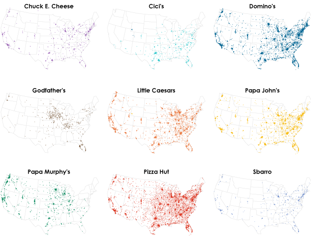
While interesting, the one chain versus all approach obscures locations a bit. For example, Pizza Hut and Domino’s have locations in the midwest, but you can’t fully see that, because Godfather’s is so dominant. And poor Chuck E. Cheese doesn’t even stand a chance, even though there are 557 locations. The quick maps above show where the actual pizza locations are.
But I still want to know how restaurants compare against each other, so let’s instead do it pairwise. It offers higher granularity than the first map.
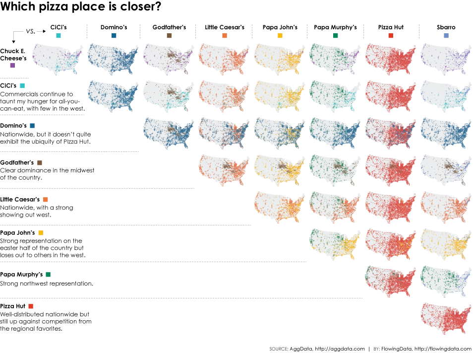
It’s your classic pairwise matrix with maps. Take a restaurant from the left, one from the top, and then find the map at the intersect and you’ve got your matchup.
Now if you’ll excuse me, for some reason I feel like grabbing a pizza and playing with Legos.
Chart Type Used

Become a member. Support an independent site. Get extra visualization goodness.
See What You Get