The Forest of Advocacy is a series of animations that explores the political contribution patterns among eight organizations, such as Bain Capital, Goldman Sachs, and Harvard Business School.
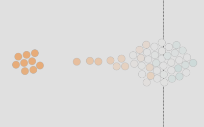
These visualizations provide a dynamic look at the partisan tilt of giving within organizations. For each organization, individuals are characterized as points sketching out a line over time. The X axis is time, and the Y axis represents the net partisan tilt of contributions over the preceding 6 months. Over the decades, one sees lines sketched out, reflecting the partisanship of individuals over time. For each organization, we also provide the net contributions of the entire organization, and the names of biggest Democratic, Republican, and “bipartisan” contributors (the individual with the highest product of Democratic and Republican contributions).
At the core, each animation is a time series chart, but the aesthetic and animation, which is narrated, provides for a more organic feel. In particular, the movements of people, represented by squares shifting straight across or up and down, makes it easy to see consistent and not so consistent contributions. [Thanks, Mauro]


