Explore weekly earnings between men and women, over the past nine years. There’s more to say about it, but my hands are tired from manually editing parsed PDF files, so I’ll leave that for later.
Basically, three or four articles on the gender wage gap popped up on my radar last week, some focusing on the rise of women as the lead household earner and others on how much less women make. Such contrast. So I took a look.
Women computer support specialists rockin’ it.
 Visualize This: The FlowingData Guide to Design, Visualization, and Statistics (2nd Edition)
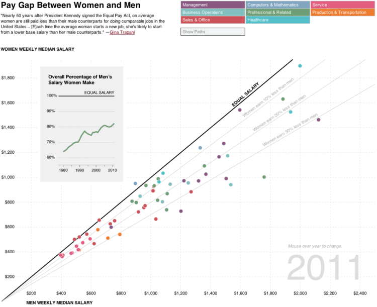
Interesting stuff. I’d love to see if there’s any trend with distribution or standard deviation (which could be shown based on something to do with fill and stroke of the dots…), it’d be interesting to see if those sectors with the widest pay gaps are or aren’t those with the most varied salaries, and how individual sectors fit in.
Something with 2 thin horizontal lines across the dots showing some measure of how many people are substantially above and below the median wage, maybe based on the standard deviation of the whole set not stratified by career type. Something like that.
Boy, is this diagram hard to read.
The screenshot or the actual interactive?
This diagram is awesome in its way to represent the data as a drift from the bisecting line. The number of data points on one side and the distance clearly speak for themselves.
Many good data sets are in PDF :( what can I say, I join you in sorrow…
Great work!
I really like the ‘show paths’ button – so you don’t have to scrub through all the years to see how things have changed, but the paths aren’t cluttering the graphic by default.
Also, great way to narrow the focus of this dataset, and still get a lot of info from it.
I was surprised by the ‘legal occupations’ – 43% less in 2011?
What did you use to parse the pdfs? I’ve had luck with basic parsing using : http://pdfbox.apache.org/
@Jim — Thanks. I used the free trial of Able2Extract: http://www.investintech.com/prod_a2e_pro.htm
It does a decent job, but seems to get mixed up when there are notes in the table, or in this case, parentheses to footnotes. Also, because I wasn’t ready to spend $130 on the pro version, I had to do things one page at a time.
Please define comparable jobs. Do they work the same number of hours? That can make a big difference.
Nice tool for showing/seeing a variety of relationships (through time, among sectors and occupations, the actual earnings of each gender. . .) clearly and interactively. Interesting video-game quality to the UI: I stumbled across a feature accidentally (while showing paths, scrolling across the year engages a timeline). Thank you for the ideas.
Really enjoyed the interactive. I saw that one purple dot move around in the ‘women make 30% less than men’ in the highest wage areas, and was surprised and disappointed to see that it represented female CEOs.
One comment, I would’ve liked to see the axes show annual median pay, instead of weekly median pay. Was that a consideration?
I’ve seen utilities such as PDFMiner to convert PDF to HTML. Seems like you could then use BeautifulSoup to get the data…
Thanks, I’ll take a look. Once you get something in an HTML table, it’s pretty easy to get out:
http://blog.ouseful.info/2008/10/14/data-scraping-wikipedia-with-google-spreadsheets/
Paper format be damned, parity should be y=x i.e; a line with slope 1 (45 degrees)
This doesn’t factor in WHAT job it is. I’d like to see how many women are strong enough to operate a 95lb jack hammer, which pays pretty good money.
As an aside hovering over the dots didn’t produce any additional information using Firefox 11 (my default browser) under with my Windows XP laptop. Switching to Safari worked fine however.
I have a couple clarifying suggestions…
I wish I could click on a dot and have that dot stay “selected” as it moves through the years, as it’s confusing, even within one industry, to follow a particular dot. I’d also prefer that selecting an industry would unselect all the others.
The “Show Paths” feature works well for industries with only a couple dots, but is messy for those with more then 3 or 4, I’d almost prefer to just see a line graph appear off the side when clicking on a given dot (much like the nice line graph insert for the overall percentage).
I wonder if there is data for how many days a year women, on the whole, work. Statistically they will work less hours a year, since they are the ones stuck with the burden of child birth. Even if the position is held, in the end, it’s hard to justify pay for work that there is no chance to reward with higher pay. One day we will be able to solve this problem with male impregnation :)
Not sure I understand why there are multiple data points for each industry? Are these just different observations? Also, the underlying data is probably OES data from the Bureau of Labor Statistics, which doesn’t have preset “industry” groupings. Would be curious to know how occupations were assigned.
It’s OCS data from BLS, which does have groupings. If you click over to the interactive, and roll over dots, you can see what jobs each one represents.
Oh rock, Nathan. I still make immediate judgements on the interactives, because I forget how you can layer information. Nice!