Perpetual Ocean

Mar 27, 2012

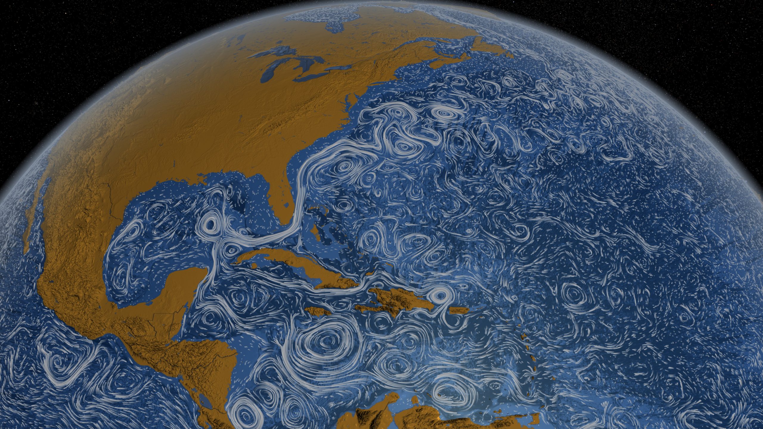
Using a computational model called Estimating the Circulation and Climate of the Ocean, Phase II (ECCO2), the NASA Goddard Space Flight Center Scientific Visualization Studio (I think NASA has a thing for long names.) visualizes surface currents around the world. This is beautiful science here. Make sure you turn on high-def and go full screen. [via @aaronkoblin]

Become a member. Support an independent site. Get extra visualization goodness.

See What You Get
Favorites

Data, R, and a 3-D Printer

We almost always look at data through a screen. It’s quick and good for exploration. So is there value in making data physical? I played around with a 3-D printer to find out.

Think Like a Statistician – Without the Math

I call myself a statistician, because, well, I’m a statistics graduate student. However, the most important things I’ve learned are less formal, but have proven extremely useful when working/playing with data.

How We Spend Our Money, a Breakdown

We know spending changes when you have more money. Here’s by how much.

19 Maps That Will Blow Your Mind and Change the Way You See the World. Top All-time. You Won’t Believe Your Eyes. Watch.

Many lists of maps promise to change the way you see the world, but this one actually does.