The Don’ts of Infographic Design
Smashing Magazine offers advice on the dos and don’ts of infographic design, but they forgot to include the former. It’s as if I wrote a fake post and someone mistook it for a serious guide.
Written by Amy Balliett of Killer Infographics, the post in question is basically tips for how to create linkbait that doesn’t work. Or at least I hope it doesn’t.
Let’s take it from the top.
Infographics are visual representations of information, or “data viz” as the cool kids call it these days. The term “data viz” comes from “data visualization,” which implies that sets of data will be displayed in a unique way that can be seen, rather than read.
I’m not going to get into the semantics. That’s for people who are smarter (and cooler) than me, but the obsession with a visually unique result is overdone. Sure, you want your graphic to be compelling, but that comes from the data or the information. You’re just trying to make crap look like cake if you do it any other way: it looks good from far away, but as soon as you take a taste, you realize you have poop in your mouth.
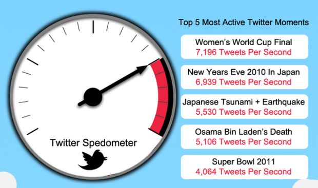
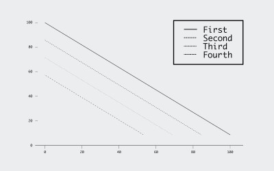
Next up, which refers to the graphic above:
What’s wrong with this infographic? It breaks the first rule right out of the gate. When you have an opportunity to display information visually, take it. Here, the tweets per second could have at least been shown in a bar graph.
What? We all know the first rule of infographic design is to not talk about infographic design. I guess that’s implied. After that though, the first thing wrong is that there are numbers? What about that gauge on the left without any labels? What does it mean?
Most run-of-the-mill infographics take a few data points and make it look like a lot with big things. This is both a reflection of the data on hand and the creator’s data comprehension.
It gets worse.
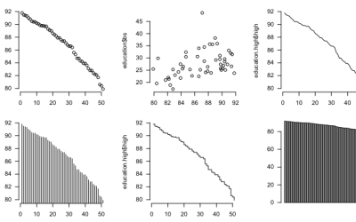
Two alternatives to the above are offered. Do you choose the utterly boring, horribly regular graph A or the awesomely, cool, and round graph B?
Balliett’s suggestion was to use the speedometer, basically because it looks awesomer. Something else comes to mind.
I hope you didn’t answer graph A. If so, you’re wrong.
If you answered Graph B, you’re catching on. Of course, not all data lends itself to creative and unique graphs. Graph A might work very well if the rest of the infographic shared a similar aesthetic. Sometimes you just have to bite the bullet and produce a traditional bar graph or pie chart; nevertheless, always consider ways to dress it up […]
It’s that obsession with unique again. The problem isn’t the bar chart. It’s that there’s only five data points occupying a lot of screen space. Plus, the speedometer makes tweet rate look way more than it really is, because the method uses arc length as its visual cue.
A more useful graphic would provide more context to the events that these numbers describe. What made the Women’s World Cup Final so much more exciting than Super Bowl 2011? Which final was it? Was it really more exciting? When were these measurements taken? Are they the peaks of each event or is it a mix? Were there more tweets because there were more Twitter users at the time? Was it because the time of the day each thing happened? Tell people something — anything — more about the data.
The second half of the post covers mostly general design tips such as color and focus, so it’s less rough, but the examples aren’t any better.
Bottom line: when it comes to information graphics, it should always be data and information first, and then you design around that. For that to happen, you have to learn more about data — how to work with it, where it comes from, and what it represents in the real world.
Now how about some real dos of data and information design? Leave a DO in the comments below by the end of this Friday, and a signed copy of Visualize This goes to a randomly picked doer.
Made possible by FlowingData members.
Become a member to support an independent site and learn to make great charts.
About the Author
Nathan Yau is a statistician who works primarily with visualization. He earned his PhD in statistics from UCLA, is the author of two best-selling books — Data Points and Visualize This — and runs FlowingData. Introvert. Likes food. Likes beer.
Do: explore the possibility to visualize deviations from the mean, rather than absolute values
(example: on the topic discussed above, what is the average (even rough!) rate of tweets / mn for world cup finals anyway)
DO use a piechart if you’re comparing “things” as a part of a whole, but keep control of the amount of “things”, 351 is probably too much.
Do keep things simple, two elegant ‘graphs’ are better than one cluttered amalgam of both, with the bonus of less data occupying more space, avoiding the “graph A” wastage above.
DO remember that your audience might be happier with a crap graph they feel they know where to start with (e.g. a pie chart), but don’t stop attempting to “grow” your audience
Clement read my mind and wrote my initial thought. Dipping back into the overflowing bucket, we get…
DO make it distinguish between different values or series. Help your viewers’ focus stay on your wonderful infographic, not go hunting all over for the key then back to find the line they were trying to follow.
Do learn about the data you are displaying. In the “Age of Users” example, the pyramid is upside down.
Do sort. In the “%of Healthcare Paid by Government” I don’t see what sorting key was used.
Do stop writing blog posts about infographics if you don’t know (or care) anything about communicating with data.
DOh!
Yup, “data and information first” is the DO rule number 1. Thus, DO understand the data you are visualizing. DO try to play with it to uncover interesting perspectives and unexpected (yet meaningful!) facts. DO find a story that unifies the interesting facts and trends that you have discovered. DO select facts that enrich the story, and DO throw away all the cool stuff that is irrelevant. DO try to understand what is interesting to the consumer of your work. Only then, DO go and choose forms and figures. And when you do, DO remember the importance of simplicity, coherence, and content over form. Consumer’s attention span is too tiny to be waisted on confusing prettiness.
thanks Nathan for the reply. I am still disturbed by the article though, not because of the authors advice on creativity but because I feel the rift between the more and less academic aspects of visualization is growing deeper. I’m confident we can solve that but how?
KISS
Keep it simple stupid.
Haha, that’s exactly what I said in my first data how-to post!
Nice summary Nathan. I got a bunch of requests to post a response to this article, and I didn’t because it would have been too negative and harsh. You skipped the worst visual example they gave, the airplane seats graphic. I still can’t figure out what that graphic is trying to communicate.
DO design the information and context into the visualization. Your readers shouldn’t have to look at separate information (like a legend or a key) to understand your visualization.
Hi Nathan,
Thank you for the write-up. Would you like to publish this article (or perhaps an extended version of it) on Smashing Magazine as a rebuttal to Amy’s article?..
Do read “Designing with data” by Brian Suda
DO focus on the data AND presentation, not JUST presentation.
DO use sparklines http://en.wikipedia.org/wiki/Sparkline to quickly show a trend without losing the details if space is limited.
Great post Nathan.
Less is more.
The late, great Steve Jobs explained it better than I can:
“Simple can be harder than complex. You have to work hard to get your thinking clean to make it simple. But it’s worth it in the end because once you get there, you can move mountains.”
Do… more posts like this: it helps shape the identity of the community.
Sometimes boring may be more relevant. Looking at graph A and B above, I can instantly “see” the data more effectively than in graph B. That said, keeping it simple doesn’t have to be boring…
DO: know your end users and produce the type of viz that will be most efficient for their use.
DO not make the information more difficult to understand. The whole point of visualization is to make it easier, not cooler.
As far as I can tell, the SAS Institute spent their $1 Billion of R & D developing GUI interfaces to turn numbers into speedometers for ‘Business Intelligence.’
I do hate anything resembling a speedometer being used to display data.
DO show your chart to someone who is not already familiar with it.
Someones complete and utter confusion at seeing Chart B should be enough to convince you to keep trying.
DO be consistant with color assignments.
Maybe Amy B intentionally used different colors for the data points in the two alternatives, but it makes it difficult to compare without double-checking the labels between the two graphs.
DO think about the message in the data that you want to communicate to your audience, and pick the right type of visualization for that message and audience.
DO keep it clean. Just looking at a cluttered presentation will keep some people from trying to understand the data.
Do: remember that words are data, too and a little text in the graphic can go a long way toward explaining what’s going on.
DO choose meaningful data.
DO clearly define what the numbers represent
DO design it so that readers can quickly understand what the data means
DO label the graphic with a title that conveys the conclusion of the chart
DO realize that a chart is successful only if it communicates what you intend it to.
DO keep your information dense, but DON’T ignore the value of negative space.
(Maybe too Tufte-ian, but I think this DO and DON’T pair helps bridge the straightforwardness of raw data and the accessibility–and possible artistic appeal–of interpreted visualizations.)
DO use consistent, easy to read fonts.
DO keep in mind that people are color-blind and choose colors accordingly.
DO provide your audience with an opportunity to easily explore the relationships between different data sets.
DO take a point of view in your work.
DO develop your viz with the canons of professional print journalism as a lodestar. If you want to be a great viz pro, read great writers and emulate.
Do include a standard for comparison. Are these tweet/min speeds high compared to normal? How high?
Do or do not, there is no try.
I worship Yoda.
Do: read tuftes work. Let’s talk about smallest effective difference. Micro/macro date.
DO show it to your mom.
Yes!
I’ve tested this – I can expect my mom to say:
. So what.? :(
. If you hadn’t explained that I wouldn’t have noticed :(
. Hadn’t thought of it like that :)
. Looks like they have a problem with the type of customers they are selling to :) :)
DO: give the axis an intercept. i.e. 0, when possible.
My annual income over my working life is truly impressive, if you leave the $ scale between 30k & 60k, whereas if the $ axis goes from 0 to 100K, it’s really not as volatile, and the two points of profession changes are actually less impressive than I would like to think.
DO: LABEL AXES !!! WITH UNITS !!!
DO: cite your source of data, even if it’s in tiny font at the bottom corner and I need a magnifying glass to read it.
DO: Figure out *first* what, exactly, you’re trying to say. Then make the picture say that.
DO NOT: just because you have data doesn’t mean you need to put it into the graph/image. I don’t mean lie through omission. But, the existence of data doesn’t mean that they will be meaningful in a given graph.
Nathan, please do the rebuttal that Vitaly asked about. I think it would be very welcome (and obviously needed).
@Kim – Workin’ on it.
DO: Avoid gimmicks. Your point won’t get across if your viewer gets scared off by something which isn’t easy to evaluate.
(I.e. Bar chart – most people can read. Bar chart twisted onto speedometer chart – most people either give up or misinterpret.)
DO learn the best practices of data visualisation before setting up a specialist infogrpahics company.
I usually enjoy Smashing Magazine, but they dropped the ball with this one. I don’t blame the author too much. I guess she was jumping at the chance of promotion. But too many practitioners are jumping on the bandwagon and making it up as they go along. Smashing Magazine should have approached a better known expert.
Kudos for the article in reply.
DO tell a story.
“Top 5 active Twitter moments” is a list that doesn’t need, or benefit from, a data visualization. It’s essentially inert. Dressing it up with a donut chart only makes it harder to read. Bin Laden’s death was tweeted less than the tsunami but more than the Super Bowl: what are we supposed to infer from this? Why is it noteworthy?
If we don’t care about the difference—if we’re just supposed to be interested in “what five topics did people tweet the most about”—then use a list, rather than a data visualization that implicitly asks us to focus on the differences in tweet volume.
Also, DO provide context for the data. Tweets-per-second for what time period? World Cup tweets would probably start well before the event, tsunami tweets might start with a forecast, Bin Laden tweets would have started once the news broke. How do you compare the concentration of tweets for these three things?
DO round your data as much as as you can without losing the story. Do people really care whether SuperBowl 2011 got 4064 twt/s versus 4015 twt/s?
DO ask for any visualization – what does it add over just showing a list of numbers. If you can’t find an answer beyond ‘dressing it up’ or ‘making it look spiffy’, then it’s detrimental to understanding and should be scrapped.
Do think about what not to include in your graphic. It’s your job to decide what is important and what is better left out, don’t leave this chore to your audience.
DO: consider the colorblind when creating a graphic.
DO NOT: do anything USA Today does.
DO – take your reader serious
DO – answer your primary question visually
DO – enjoy infographic making ;)
Do educate your clients.
The number of people who just google infographics and decide they also want to have one of those big twitter birds with 3D effects all around unfortunatelly seem to increase. Don’t just bend yourself and the graphics to the needs of client without explaining why you think they are proposing worthless crap. Just like this article does – if you think it’s garbage don’t worry to say it and explain (as long as you know and use some other dos).
This is going to be more and more important to keep the overall quality of the whole field.
If you present figures numerically DO think about the number of significant digits you report.
In the linked article, “237M plane seats” is equated to “522,026 empty 747’s”: From three significant digits to six, without any additional information…
Do keep the purpose and audience at the forefront of your mind throughout the design process.
Simplicity is key. The speedometer is fine for relating a rate or speed data comparison. What if we just eliminated the legend and color donuts and extra needles on the dial and just mark and label the 5 data points right on the dial. That creates an easy comparison. Akin to 20mph vs 55mph. The extra colors, legend, needles are what make this otherwise perfectly good analogy confusing. Some people have said it here and my grandpappy use to say K.I.S.S. The airplane seat chart thing was definitely ill conceived. I think the point that is trying to be conveyed is there is the equivalent of over half a million empty planes flying around each year. Picture that however you like. Just be sure the IMPORTANT information isn’t buried under the less important and it isn’t obscured with irrelevant pretty pictures.
Do: Keep metrics consistent across comparisons. Tweets per second may seem like a common metric, but this may have been averaged across days rather than the last 2 minutes of a game.
Do: Visual representation should be self-expanatory, without the need for extraneous text.
Do – If data is to be at the core of the infographic, please provide a point of reference, a number is just a numer void of a system of measurement. From the information provided I now understand that these are the top 5 most active twitter moments, but I have no idea if they top the mean by 5% or by 50%. If a baseline is not outwardly obvious to your audience, you need to provide one. (unless the core of more graphic is to only compare the items presented against each other, which is not the case here.)
DO: Remember that above all, you’re trying to convey a truth through data viz. The viewer shouldn’t have to study the infographic to figure out what it’s trying to convey. That can mean working with symbols familiar to them (those boring pie or bar charts) but sometimes those symbols can be insufficient to get at the truth you want to illustrate.
DO: Read all you can on data viz. The more tools at your disposal, the better.
DO: Choose your sources for ‘expert’ advice wisely. Just because Smashing Mag says something- doesn’t mean it’s right. Research, research, research.
DO choose colours that don’t blend into the background of the chart. It took me awhile to figure out where the Women’s World Cup bar was on that speedometer.
DO try to include some kind of context for your data, such as the average number of tweets per second on a typical day. This leads to my third point, which is DO include some kind of time scale if you are talking about a rate of change so that people will know how long the phenomenon went on for.
holy christ … I found smart people commenting on the internet … where have you guys been hiding?? Does the rest of the world know you’re here?