True size of Africa

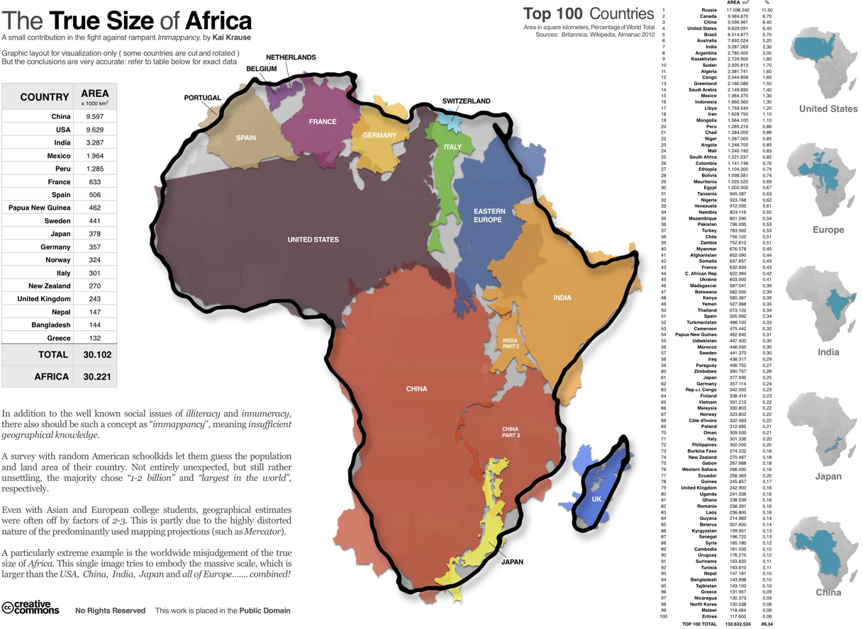
Online maps that we use for directions use the Mercator projection, and this tends to dictate how we perceive the size of countries and continents. If you look at the world map on Google, for example, Africa doesn’t look that much bigger compared to China or the United States. In reality though, it’s a lot bigger. Kai Krause scales countries by their area in square kilometers and then fits them into a Africa’s borders for some perspective.
This one’s for you, cartographers. What do you think?
[True Size of Africa via Good | Thanks, Cay]
48 Comments
Become a member. Support an independent site. Get extra visualization goodness.
See What You Get


Pingback: Great Data Visualisation: True Size of Africa « Musings on Interesting Things
Wow, Sarah Pailin was right: Africa is one big country!
God… Afrika is not a country…
I think Book Hill meant that as a joke…
If China has less land mass (given in the image) than the United States why does the author place it as number 3?
Yeah, I see what you mean. My first guess is that the list is sorted by “%” and not “AREA”. Although a quick scan shows the other ties are properly sorted. (The 0.30% is a good example.) I’m guessing the list was manually sorted by a person and not a computer, and they screwed up.
I didn’t notice it at first, but the other list (on the left) is also out of order for USA and China. Very curious that the same two countries are swapped in both lists in the graphic, but that’s probably because the lists originated from the same source list, so errors would propagate identically.
Yeah, what is going on there? China is cut into two parts making it look bigger within the Africa map to my eyes. And in the tables China is just smaller than the US (and Wolfram Alpha agrees with these area), but given third place instead of forth. That is weird…
Alaska. The map doesn’t include Alaska, which is a significant part of the United States’ land area. So if you remove Alaska, the United States does indeed look smaller, even if the overall number is larger. I suspect that that’s the source of the error.
Alaska isn’t part of the contiguous United States, which is the area represented in this graphic.
Because in China, there are still some disputable area with India, specifically the Aksai Chin, Trans-Karakoram Tract, and Arunachal Pradesh. China’s area is between 9,596,961–9,640,011 — a different large enough to switch place with United States. I’m guessing that the data on the left side excluded those disputed areas, while data on the right side included those areas.
Nice graphic! My main cartography complaint is that for something that ostensibly fights “immappancy” caused by map projections, there is no information given on the map projection used here. Is it an equal area projection? Presumably yes, but it would be good to note.
Can anyone tell what the internal boundaries in the different non-African countries are supposed to represent? In the images of the US and China, it almost seems to be the African country boundaries, but the E. European image seems to have European boundaries…
The Eastern Europe countries look to be manually moved together for the graphic: there are gaps in between them, not lines, which tells me they were pieced back together again. African country borders are underneath all other countries, which really isn’t helping anything. I think those borders shouldn’t have been included since the graphic is supposed to be showing how many non-African countries can fit inside the continent of Africa when jammed together. The thick black border is equivalent to a jar that holds jellybeans.
Nice map but not entirely accurate. For example, I don’t see Alaska or Hawaii represented as part of the US.
This attempt to illuminate inaccurate perceptions of country size perpetuates the problem but using what appear to be different scales for the countries filling in the African outline. Spain, for example, is roughly 1/20th the area of the US per the info provided, but the map of Spain appears to be aoubt 1/8 the size of the US map.
I would venture to say that it’s because Alaska is included with the total area value but not with the map overlay.
Yes, that’s right. It is there in number. I know that because Brazil is bigger than USA if not counting Alaska.
Spain is actually scaled incorrectly. I pulled up Google Earth to compare the distances of certain features on each country and found that while the U.S. is sized about right where as Spain is ≈1.26 as long as it should be or ≈1.56 times its proper area. If you add in Alaska as Leif suggested, that should make up for the discrepancy.
While showing the true size of things is a noble goal, these sort of errors really take away from this work.
Off the top of my head, I seem to recall that the land area of the country of Spain approximates that of the state of Oregon in the USA. Visually, this graphic does not portray this.
Someone please correct me if I am wrong.
Wikipedia says Spain is about twice the area of Oregon, 504,030 km² to 255,026 km².
Pingback: A Petty Blog » Africa: Bigger than You Think
Pingback: One Billion People and One Stereotype | Thought Clusters
Pingback: The True Size of Africa « Signal/Noise
All of Europe he says but only includes the southern countries and the middle ones, excluding northern Europe (Scandinavia, Iceland, Faroe Islands), Republic of Ireland, the Baltic states and the Russian European bit, the Ukraine, Belarus etc etc.
Nice gesture to show how big Europe is but ouch, that is glaring oversight.
Of course I meant to say “how big Africa is”
Australia? Another largely invisible continent. Of course, compared with Africa, there’s not much to know about Australia *s*.
Four years ago, I set out to learn about Tanzania for a blog I ran about the School of St Jude in Arusha. When I memorised the 52 countries in Africa, the whole continent became more ‘visible’ to me.
Pingback: XXXL… « (Roughly) Daily
Another “immappable” country: Indonesia.
http://www.sunda.org/assets/indoamermap.gif : this map shows the enormous size of Indonesia. It stretches for over 3,000 miles between the Indian and Pacific Oceans and separates Asia from Australia. The Indonesian land mass superimposed over a map of the continental United States stretches well beyond the US West and East coasts. Most of Indonesian territory is water but its 13,000 islands constitute a considerable amount of land and its 200 million population makes it the 4th largest in the world. Half of the population live on the island of Java which is the fairly large island shown in the middle of the map (across Texas and New Mexico).
Pingback: True Size of Africa - JOTA/JOTI Follow up | Jabbering All Day Long
I showed this map to a colleague, who became annoyed. “Of course, you know Africa is a continent, right, so why would it be news that many ‘major’ countries in the world are smaller in area? What’s the point?”
Anyone, anyone?
On that map Europe is still too big compared to the US. And Madagascar is more than twice the size of the UK, but they seem to have the same size on the map.
Great way of visualizing the size of Africa. Even though i also have to mention that Scandinavia is a quite large part of Europe that has been cut out.. Still like the effort and idea.
Pingback: Link Lovin’ Vol. 3 | Side Culture
The whole “Africa’s a continent” thing seems to be missing the point of the illustration (and it is just an illustration) that Africa is bigger than it appears on maps.
The image also needs some explanation which has been separated through the way it’s been disseminated on the web. The author has produced an updated version with the explanation: http://twitpic.com/2xu4ou/full
Well worth reading, because a lot of commenters here are missing the point.
Pingback: Combating Immapancy, One Map at a Time « Hands Wide Open
Ok, so we all now know where to move into if a big asteroid hits :)
Pingback: El Verdadero Tamaño de Africa « La Valija
Pingback: » El Verdadero Tamaño de Africa Té Forastero
The image is just there for illustration purposes so the scale is off and countries are missing. The main point is surely the table on the left which that shows that Africa is bigger then you think when looking at it on a map of the world.
Funny thing is: a lot of people are stating the map is not perfect (to say the least). But nobody volunteers to do an better one. ^_° GIS, anyone?
Strange that the author uses as evidence of a lack of knowledge of geography the comparison between one Continent, and several countries. Does not that define “immappancy”?
Funny how few people actually read what something is about before they comment. Thank you for an interesting comparison
Every nation claims Africa as their own. You ever wonder why civil wars never end in Africa?
The issue here is that of political vs geographical mapping. The BRICKS need to step up their act and push for a more balanced world in voice and it starts with correcting wrong perceptions such as those perpetuated by political maps. By the way most political maps do qualify this fact and in most cases include a scale of the levels of northern exaggeration (normally located in next to the legend or scale).
Where’s Alaska?! It’s the largest state of the United States. http://www.kswmyy.com/alaskamap.htm
Pingback: True size of Africa – Infoviz project « CS450
Pingback: The Best of the Web » The Vibe