It seems like all the mobile groups are suing each other these days. Who’s suing whom? What company is suing the most? Who’s getting sued the most? There was a mini-wave of graphics last week to help answer these questions.
Nick Bilton actually kicked things off back in March:

The Guardian revisited the topic (top) with the recent news that Microsoft is suing Motorola over their line of Android-based phones:
Microsoft, the world’s largest software company, claims that Motorola infringes nine of its patents in mobile phones running Google’s Android operating system; specifically, email, contacts and calendar synchronisation, scheduling meetings and notifying applications of changes in signal and battery strength.
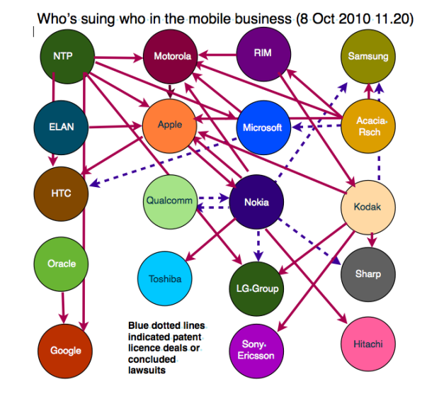
The Guardian version was a bit too powerpointy though and not especially easy to read, so David McCandless reworked it to minimize crossing lines. Companies are sized by revenue and colored by increasing or decreasing revenue:

Finally, Design Language tried their own version to make plaintiffs and defendants more clear with a circular network diagram:

Which one does it for you? I like Design Language’s the best for its simplicity and ease of read. However, David’s does a good job of telling what each lawsuit concerns. Both are definitely improvements on the original.
[Thanks, Bruce]
 Visualize This: The FlowingData Guide to Design, Visualization, and Statistics (2nd Edition)
That’s a pretty good idea to put together these suing graphs together ! It convinced me that i definitely prefer non-circular graph for the ease of exploration it gives. I found the round one sexier but not insightful (at least at first glance, why for example putting oracle and google diametrically opposed where they aren’t connected to anything else?) whereas informationisbeautiful one gives a lot of interpretations path and information ^_^
While the version McCandless has done is rich in detail — for me it doesn’t succeed as an information diagram in that it doesn’t tell a story at-a-glance.
By comparison, Design Language’s diagram has not only paid more attention to the design in terms of craftsmanship, but they have also communicated the overall meaning behind the graph. Just by quickly looking at it, you can easily discern that Kodak & Nokia have filed the most claims and Apple has the most claims against it.
The Design Language graph does not communicate as much information, such as revenue (is that even relevant to this particular story?) — but they could easily add a few extra touches, such as a dotted line, to show which lawsuits have been resolved and which are in progress.
If you asked me, McCandless has forgotten his own credo — that’s not a beautiful diagram.
I agree with the two previous commentators: David McCandless’ is the most informative while the DL-version is the prettiest. Pity they don’t match
Here’s my take on the matter http://bit.ly/9qu1CQ using network analytics (Gephi for the visualization).
Really like this version.
me too ! gephi rocks ^^
Thank you.
The challenge for me visualizing networks is incorporating statistics and other information to the picture: too much information and the result is a flowchart. Flowcharts are excellent in providing cause-effect information but – in my opinion – it’s easy to lose the bigger picture if explanations for the visualizations are complex.
Shows the importance of different views: several visualisations. I like yours too @Olli.
I actually find McCandless’ the prettiest. I agree, it doesn’t convey the number of suits against a company very well, but the two-way suits are interesting, and annotating what the suits are makes it so much more informative.
What did it for me was the untangled layout and the use of logos in place of names.
But I think the red herring in McCandless’ and Olli’s is that company revenue. LG, Samsung and Microsoft are really big, but telecommunications isn’t their core business, so it doesn’t really reflect their dominance, desperation, or amount of resources they will throw at lawsuits.