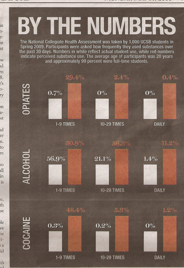
No clue where this is from, but something seems sort of off, no? I guess we should take the title literally. By the numbers… only.
I’m going to give the benefit of the doubt though, and assume this was just an honest mistake. Here’s my guess about what happened. A deadline was coming up quick, and a graphics editor put this together to get a feel for what the final design would look like. He then saved it as a different file, and then went to work. Except when it came time to send the file to the printers, the editor sent the wrong file. Actually, now that I think about it, I’m surprised this doesn’t happen more often.
[via @EagerEyes]


The different scales for each grouping within a category makes my eyes burn…but that could just be the marijuana I’m smoking, which, by the way, isn’t featured in this graphic. tsk tsk tsk
That’s my alma matter! See not much has changed haha! Go Gauchos!
Wow, this is kind of sad: I sat staring at the graphic for about a minute before I realized the problem! I don’t know whether to laugh or cry!
if you have a choice, always laugh :)
Okay. I admit it. i am not that bright. What is it that I am missing here?
PS:: thnx in advace for explaining :)
look closely, but not too closely. once you realized, you’ll have an ‘oh, duh’ moment.
yeah. I did. Right after I posted the comment. And aside from “duh” i went how the eff can I delete this comment.
haha. oh well. you only used a first initial anyways.
Nathan,
You’re right, it probably was an honest mistake. Looks like a common cut-and-paste error. I do this more than I like to admit, although with text more so than graphics.
How can that be a common, honest mistake?
One should NOT ever be making bar charts by cut-and-pasting….
Does any reasonable charting software have a default height for white and red bars?! Or ask for the proportions to be entered into text-boxes above the bar? Was this person going to manually adjust bar heights?!
As someone who teaches future science teachers and knows exactly how little some of our undergraduates understand science and data, I’m not surprised and I don’t think it was a mistake. This was an easy way to show the differences and all they were worried about was the overall message. It could have been cobbled together by anyone.
The even sadder thing is that the overall message is really important, but the message is weakened by such a presentation. Whether it comes to substance use, bullying in schools, relationships with parents, etc… kids and college students typically think that these things occur much more often than they actually do.
Jim
I meant to say “poor relationships with parents.” :)
Jim
Pingback: jardenberg kommenterar – 15 May, 2010 | jardenberg unedited
Argh. Almost as bad as the one big DUH is even having bars at all for the cases where the value is zero.
Why that Alcohal, 1-9 times white bar is lesser than red bar even though it is higher than red one. White 56.9% and red 30.9%
Pingback: Qu’est-ce qui cloche ? « Karma Blog
Pingback: Oops, but how to best present this data « Data Driven
Ended up writing a long blog post about this chart, not because of the error necessarily, but what the best way to show this information would be – bars, dealing with axes scales, pie charts (yes, really), bubble charts, and the initial study design..
Anyway:
http://www.datadrivenconsulting.com/2010/05/oops-but-how-to-best-present-this-data/
Enjoy, maybe.
This is why I double-check every attachment before sending it — to make sure that it is the right version, the graphical elements are correct, the numbers look right, etc.
Pingback: Wait. Something isn’t right here… | InfoGraphicsFyi
I hate people that only go to the same two bars all the time.
The chart (corrected) and accompanying article can be found at:
http://www.dailynexus.com/2010-05-10/influence-alcohol-drugs-feature/
You insight is probably correct as to the reason for the error. Too bad it made it out in print before someone caught it.