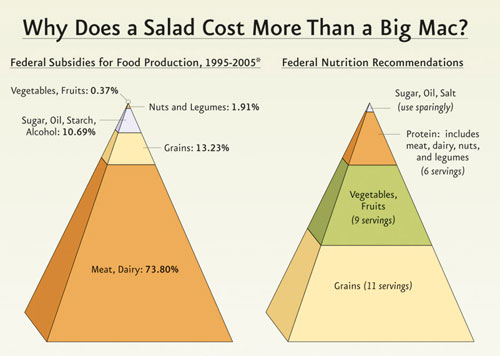
Here’s the idea. The government recommends a diet for healthy living (right pyramid), but at the same time there are billions of dollars of lopsided subsidies (left pyramid) whose distribution doesn’t look anything like the former. The Physicians Committee for Responsible Medicine (PCRM) used the above 3-d pyramids to present this information.
Interesting point. Funky presentation. Discuss (remakes highly recommended).
[via The Consumerist]
 Visualize This: The FlowingData Guide to Design, Visualization, and Statistics (2nd Edition)
A fruit salad must be awesomely expensive in the us…
it indeed is!!!
I went to go buy a pre-made fruit salad at the deli next door to my office and it was $14. It was not a very big salad at all. :/ But I sucked it up and bought it anyway. I love fruit. ^_^
I would arrange the subsidies in a horizontal bar chart on the left with the highest subsidies on the top. The inverse would create a nice visual line that parallels the side of the food pyramid and the differential in percentages would be more easily seen.
I would place the percentages at the ends of the bars on the right side, allowing for the possibility (not sure how it would look) of drawing lines from those percentages to the placement on the food pyramid.
Hi, I’ve made some observations and quick reworkings published here: http://www.visualisingdata.com/index.php/2010/03/why-does-a-salad-cost-more-than-a-big-mac/
Andy –
Nice. I like either of your first two charts.
The problem with the panel is the value axis scale has to shrink too much to make it fit (as you noted) and the offset baselines make comparisons harder than in the simpler bar and column charts.
Great post :)
I wonder if the nutrition recommendations are the same for the kids as well.
Your challenge: Why not make use of the Google API for sexy pyramids design? http://bit.ly/3IdPlT and http://bit.ly/6C3XJs
this is a joke right…?
Should never be too serious…
Fusion charts are one of your sponsors though…oh wait, they aren’t. sorry.
The pyramid and cone charts wildly distort the data.
One pyramid is almost like the other turned around, and both are interestingly labeled “federal”. A bit like Harvey Dent in Batman, wouldn’t you say.
I don’t have any visualization suggestion yet, I was toying with the idea of log plotting (charting) but haven’t gotten anywhere cool.
I don’t have the answer myself, but I’d love to see someone come up with a creative solution that keeps the pyramid (rather than switching to a bar chart). Yes, a bar chart is a clearer way to present the data. But the food pyramid is the standard way that the federal government has chosen to represent nutrition recommendations. (http://www.mypyramid.gov/) Given the context of how food recommendations are typically presented, I think that there could be some real value in working within that convention to show the disconnect between nutrition recommendations and federal subsidies.
So even if the “standard” is severely flawed, we should keep it?
Is the pyramid really severely flawed for this purpose? The current “my pyramid” — it’s really better described as a bizarre triangle — is a severely flawed atrocity, but the classic food pyramid used here works as a visualization. It expresses the idea of building layers of a foundation. So the perception of the proportions is reinforced by the order and location in which they appear.
In that sense, I agree with Sally that the familiarity of the classic food pyramid contrasted with the subsidy pyramid is actually effective.
Mark –
The original “food pyramid” was okay, because the idea is that you built on a solid foundation, the bottom of the pyramid. This was qualitative; the attempt to make the pyramid quantitative made it much less useful, because the values were encoded by height of the layer, not the apparent area or volume. Lower items in the pyramid are emphasized more because of this.
Exactly; and yes, I should have done more than skim your post before I said the same damn thing you already covered.
i actually don’t mind the pyramids. there’s a theme there, so i get that. i think metaphors are great. the main trouble i have with this is that they’re using height to represent proportions – but the shapes are 3-d. so like jon said, they should’ve used volume. If it were 2-d, then they should use area.
Why not flip the subsidy pyramid point down? It would enforce the contrast even more. Just be careful to make sure that the volumes match the percentages.
I tried to convert the nutritional pyramid into something that can be compared to the % of subsidy in the first pyramid. The aim is to compare apples to apples.
My attempt is here: http://verbeiren.blogspot.com/2010/03/recommended-subsidies-for-food.html.
I would love to see a 3-d radial chart for the subsidies shown next to the pyramid. Maintain the same order as the pyramid (grains, veggies, proteins, sugars), but have both the vertical and the radial datapoints be proportional to the realtive subsidy amount.
For example, some ascii art:
^
/ \
/ \ Sugar subsidies
\ /
\ /
/ \
/ \
| | Meat Subsidies
\ /
\ /
\ /
. (this period is veggie subsidies)
/ \
\/ Grains subsidies
This way we’ll be able to see the malformed shape of our subsidies vs the idealized pyramid…and it will also visually allude to the link between the subsidies and the obesity problem in the U.S.
I will gladly post this on our website when done. http://www.FarmlandLP.com
Thanks,
Craig
I think you’re right about keeping the same categories and order; it reinforces the point that we have fundamentally contradictory policies in different parts of not just the federal government but the USDA.
Unfortunately it removed the extra spaces that made up my ascii art. You’ll have to imagine each of the subsidy areas blown up like a balloon.
It was really pretty too. Davinci-worthy. Really.
BTW, thanks Nathan for your great website and newsletter. I read it all the time.
big problem with the pyramid chart is the values are defining the *height* of each pyramid slice, but the picture leads you to compare the *volumes* of the slices (that, given the same height, will diminish from bottom to top).
it’s more or less the same problem that we had with that bubble chart of the market cap of the biggest banks pre and post crisis (bubbles should have been related to data on area and not on their diameter).
Pingback: Visualising Data » Blog Archive » Why does a salad cost more than a Big Mac?
The food pyramid has no scientific basis.
I’ve made two attempts on my new blog. One is a 100% stacked column, and the other is dual-axis. Let me know what you think…
Dynamic Data Display
Love the first one. It’s exactly what I would have done.
My problem with the graphic is the implication that the subsidies go directly towards the production of meat and dairy. The original article makes clear that the bulk of those subsidies are paid to *grain* farmers who sell their crops to the meat and dairy industry for feedlot use. Grains help produce meat and dairy faster and at a lower cost, but with the baggage of disease, antibiotics, etc (ref Food, Inc.).
That’s why I like Craig’s point about keeping the same categories and order above. Doing that would make it a bit clearer that the left pyramid depicts subsidy of the type of nutrition in the finished good rather than the type of intermediate good, which makes the overall point a bit more effectively. A label to that effect would be useful.
How about a Scatter Chart?
http://peltiertech.com/images/2010-03/BigMacVsSalad.png
I like this the most.
This is the only one that makes this data comprehensible.
Wow. After reading ‘The China Study’ late last year, and learning about the dangerous effects of animal-based proteins on humans (versus plant based proteins)… This blows me away!
Plant-Based Nutrition is America’s way out of the unemployment and healthcare epidemics. Poor people today who are uneducated or unable to get jobs to feed their family are forced to rely on food stamps propogating an unhealthy diet. If only they could get access to farm and develop their own foods… true husbandry.
You all are doing great work on this post.
I like the pyramid the best so far. It serves it’s stated purpose. The purpose is to answer the question in the title: why does a salad cost so much more than meat? Answer: because meat is subsidized disproportionately. This is easily seen because the first pyramid has lots of orange, and the second one doesn’t. Done.
Now if you want to do more fine grained analysis beyond that first question, then sure, supplement it with those bar charts, or scatter plots, or whatever. But so far for me, the pyramid visualization gives me the most pointed and immediate impression.
Stanley –
The relative amount of orange in the first pyramid is exaggerated by its width at the bottom of the pyramid. It still is the largest piece, but only about 3 times the value of orange in the second pyramid, not the 12 or so times larger it appears by surface area.
This is why the pyramid is not an effective means to display the information.
That assumes that the purpose of the chart is to present quantitative information accurately. It’s not clear to me that that’s the real purpose. I think the purpose is to persuade, rather than to inform, if that distinction makes any sense.
I don’t know why I didn’t realize until just now that this post is a month old. Sorry.
Cost has nothing to do with it. Prices are based on what people are willing to pay. Since salad is sold as healthier (doesn’t really matter if salads are or not…they are marketed as healthier), restaurants have convinced people that the extra “health” is worth more of their money. Salads have a substantially higher margin (profit) than burgers to restaurants. Until people stop paying the existing prices for the salads and let restaurant managers know clearly that they are not buying the salad because of the price, the prices will remain as they are.
does this go for the food in grocery stores too?
At restaurants I’ve worked at, produce was expensive and went bad very quickly. You can’t freeze lettuce, you can freeze meat. Salads are expensive because produce costs restaurants money and can’t always be bought in money-saving bulk without a huge amount of waste. Also, salads can take a LOT of prep time, so you’re paying for both the ingredients as well as the labor (which is why all already trimmed/cut/portioned fruit and veg at a grocery store or whatever is more expensive than buying the same produce in its raw form. duh.)
Here’s our quickie remake:
http://farmlandlp.com/blog/2010/03/food-subsidy-pyramid/
Just a simple re-cut of the graphic to make the order comparable.
Craig
Got a 404 error on this link
Pingback: Food Subsidy Pyramid : : Farmland LP Blog
How about a burger ‘pacman’ taking a 74% bite out of the FNR pyramid?
Pingback: Flowing Data Pyramid Challenge Submission « The Sagamore Journal
My answer to the challenge: http://sagamorejournal.wordpress.com/2010/03/12/flowing-data-pyramid-challenge-submission/
I wanted to make the big pyramid a Big Mac devouring monster but these FD fans are so serious….
Here’s my thoughts on improving the situation, “Agriculutural subsidies working against the health of America???” http://www.freakalytics.com/2010/03/12/agriculutural-subsidies/
Remaking the chart away from the pyramid design misses the broader point: the disconnect between nutrition policy, the heart of which is the food pyramid (the absurdity of making a pretty picture as a policy is a separate subject, of course), and agricultural policy, which is a key factor in undermining nutritional policy by subsidizing everything that we’re not supposed to be eating. I think this is a case where better visualization of the data gets in the way of visualizing the meaning.
Pingback: In the news… | PDS APES 8th Period 2009-10
Pingback: In the news… | PDS APES 5th Period 2009-10
See post:
http://id.mattmelchiori.com/?p=103
This most effective way to show the difference, I think, is a stacked column or bar chart. It is very easy for humans to correlate changes in area to changes in magnitude, and very difficult for us to do the same for volume. While you may disagree with color choice, typography, etc. for my chart, I think it will be challenging to find a simpler way to present the data than a stacked bar/column.
Oh, and I combined the two protein categories they split out on the left. I would have preferred them split out in both cases, but it was confusing to have more categories in one than the other (it made comparisons difficult).
Matt –
The experts (e.g., Cleveland) have found that it’s not easy for humans to scale differences in area to magnitude. What we’re good at is scaling lengths to magnitude. The bar charts are effective because, with a constant width, the lengths of the bars encode value.
Hi Jon – thanks for your reply. I absolutely agree with you. Replace “area” with “length” everywhere I said it! Shame on me…this is info design 101 type stuff.
Pingback: Gravity’s Rainbow » Blog Archive » What I’ve Noticed
I disagree with the article’s way of thinking.
The article ‘suggested’ that:
Subsidy structure should mimic Dietary Intake Recommendation structure.
I think:
Subsidy structure does not necessarily must mimic D.I.R. structure.
It should be based on other reasons, such as:
1. Affordability of the commodity to consumers…
-> In case where grain is so cheap that it can be afforded for more than the DIR quantity per person, while meat is so expensive that people can’t purchase it as much as DIR. It may make sense to put more subsidy to meat than grain.
2. Industry competitiveness to foreign competition…
-> ‘infant industry’ theorem…
3. National strategic reasons…
-> eq: Japan may heavily subside its uncompetitive rice production to avoid food-import-dependence to potentially hostile neighbours. Despite land scarcity and dense population making it non-agriculturally competitive nation.
Mm hm. All good points, I think, along with cost of production.
I don’t find any of these point particularly compelling. Dietary consumption in the US is skewed far toward what we subsidize and away from nutritional needs (see, for example, high fructose corn syrup, a sweetener that is profitable only because of massive corn subsidies); that’s why we have a food pyramid policy to begin with. There are no agricultural products that would remotely qualify as infant industries in the US, at least not at the national level. And the history of most of our subsidies, especially in corn and wheat, is explicitly devoted to promoting exports from a country that is already far beyond self-sufficient.
Do the pyramids take into account the amount and profit margins of each type of food production? Maybe fruits an veg do really really well so need no subsidy at all, while meat is very expensive with low profit margins, so require a subsidy which props up the business and so maintains the recommended diet of americans.
There’s no detail here, it just aims to provoke a instinct reaction of americans are fat eat more salad.
My vote — use pictures of each, or rather the broken out by component. Normalize the size of the salad components to the layers comprising a big-mac. Further… each layer of the bigmac is sized proportionally to its subsidized rate and the total area of the bigmac subsidy is normalized to the salad.
Taking it a bit further, if you put some chicken and ranch dressing on the salad, it would be all you could see of it. Make it vegetarian (or a fruit salad) and put something like a raspberry vinaigrette on it and I’m thinking the salad may be invisible in relation. Now if I only had the graphic design chops to do it…
Pingback: Research « Data Visualization: Topics in Graphic Design
Just want to point out that it would be nice if while redoing these pyramids, you could actually make them honest. Tufte would lambast these suckers.
What is misleading about these is that the big chunk marked beef is really corn and soy subsidies used as feed. It’s true that feed can technically fall under meat, but the purpose of government subsidies is NOT to encourage meat production or consumption, but to encourage farming. Meat producers don’t actually see these subsidies, it just gives them cheaper inputs.
It just so happens that farmers can make more money producing feed than they can producing grains for human consumption. That is: the reasons for meat dominance are principally demand/consumer driven, as the subsidies are neutral on feed vs food, which suggests eliminating subsidies won’t move people to grains from meats, since grain prices would go up, too. It’s also important to realize that most of the farms that produce feed can’t turn around and produce vegetables on a competitive basis – the type of fields and climate determine what can be grown.
Subsidies exist because govt is encouraging the act of farming, and it has nothing to do w/ nutrition. The intent of subsidies was to prevent collapsing farming of human food staple commodities due to cycles and stochastic events in production (overproduction leading to low prices leading to underproduction leading to high prices leading to overproduction, plus drought, floods, etc). The system is ridiculous today, and might not be necessary, and I’m generally strongly in favor of moving towards a system that is more about 100% of Americans that are consumers than the 1% that are farmers. But but but the idea of simply shifting subsidies to line up with DIR is kind of nutty.
Plus, there is a new study out that showed that when healthy vegetable prices go down, people buy more of them, but they don’t reduce consumption of junk food. It’s not ALL about the money, and subsidizing healthy food production can’t create the DEMAND for healthier lifestyles.
I’m no fan of subsidies, but PMRC’s clear mission is to champion veganism. I was vegan for 7 years, so I sympathisize with their cause, but come on. The story behind this chart is really how you can win an argument w/ a sly use of graphics that cleverly avoid the controversial part of your story.
Bingo.
People like 3D graphics – especially those people that do not like statistics. The colours could be better generally primary colours are preferred. The subject matter though is a dichotomy or polarisation – meat eaters will prefer BigMac to salad..One question where are all those grains in a salad? my own salads may be missing an essential component! By the way I absolutely hate pasta in salad.
Pingback: Food pyramid vs. federal subsidies « Simpler Living, Radical Change
That’s because farming subsidies are meant to keep farmers from going out of business. They have nothing to do with the nutrition pyramid. Additionally, we cannot control the types of farming land, nutrients, etc that are available to farmers to make the pyramid more balanced. Finally, Big Macs are less expensive because McDonalds buys everything in bulk and even produces a lot of their own food, whereas a fruit salad is either assembled at home or in the case of pre-packaged ones, usually compiled from fruits purchased from third party wholesalers.
Critical thinking, people. America needs it back.
As a PhD Candidate in statistics too (just read your about page)l I am abhorred that you would condone the use of these 3D graph, which do not honestly represent the % subsidies. Note – I am not personally in favour of subsidizing meat, which is a health and environmental disaster. No my issue is with the dishonest and unscientific nature of those 3d graphs.
Next you tell me that you like pie charts and plan on using excel “solver” function to do optimization problems…
I just hope for the sake of your career that applied statistics are not part of your dissertation.
abhorred, eh?
look, i’m not gonna go use 3d stuff for analysis, but this is just a simple presentation of some really basic stats for a very general audience. absolute perceptual accuracy isn’t the issue here.
PHD… you reap what you sow.
Is the point of data visualization absolute statistical fidelity or communication of statistical data to those that aren’t handy with numbers?
I think most of us with a good stats background would prefer to see the data itself and not a chart. But most of my intro to American government students can’t handle anything more than the most basic numerical comparison; a table turns them into zombies.
If, as was pointed out above, most innumerate people can’t evaluate area or volume effectively but can evaluate length, that is at least prima facie a good argument that the communications gains from a 3-D pyramid scaled to height are greater than the statistical losses. Even my research methods students, given a 2-D graph scaled to height, see a doubling of the volume as a modest increase in the value.
Our job as data visualizers isn’t to communicate raw numbers. It is to communicate the meaning of the data. I think this chart, while needing some cleanup and clarification, does a decent job of that.
My bad: I forgot to delete “scaled to height” in the third paragraph when I revised what I was saying. Please disregard that part of the sentence.
The latter few comments came a bit too late in the day but I’ve done a reflection piece on this challenge
http://www.visualisingdata.com/index.php/2010/03/if-only-the-egyptians-had-built-bars/
I have a good stats background, and I would almost always prefer to be able to chart and visualize data I am working on a number of ways. To me, raw numbers just don’t convey the patterns that graphical representations of data do.
As for the pyramids, I think we all get the message and it’s using the (pretty much made up) food pyramid promoted by public health authorities.
This one similar to the one submitted by Matt.
http://yonoleo.posterous.com/nutrition-recommendations-vs-federal-subsidie
Win!! (just added some graphics here: http://riririri.tumblr.com/post/457004632/a-chart-about-subsidies-for-us-agriculture )
How about we get the government out of subsidies and let the market decide?
The information is out there and people are generally smart enough to decide for themselves. If they make bad decisions, the problem is self-remedying.
I feel like this is ignoring the underlying profitability of different agricultural products – what if vegetable/fruit growers have less competition and make a higher profit, and therefore don’t need any subsidies? Also interested in gross levels of production – if we produce twice as much dairy/meat domestically as fruit/vegetables, then a pro-rata distribution would mean twice as much in subsidies going to those industries. Lastly, since most of these subsidies are maintained through political lobbying, you’d have to account for each state that is dominated by the beef/dairy industry as opposed to the fruit/vegetable industry. Illinois and Wisconsin are focused on meat/dairy, but the big veggie states (Cali, the rest of the midwest/breadbasket) are also grazing states or oil states, so their lobbying power is less concentrated.
Pyramids are interesting to say the least. Razor blades go sharp if placed in a simple paper pyramid. Make one out of paper or cardboard and try it, Milk and food keeps fresh in one.
I always wondered about this whole pyramidology thing. How does the pyramid know to make the milk stay fresh, instead of the bacteria more efficient?
The food pyramid is an established concept and the ratios of the portions suggest a pyramid anyway.
Meanwhile, the numbers of the subsidy side of the chart (very heavy on one item, then the rest less in more-or-less proportional amounts) suggest the other staple of ancient Egyptian architecture: the obelisk.
Draw the other one as an obelisk, reduce to 2D for simplicity’s sake, do something about the colours and call the new chart “The Food Pyramid vs The Subsidy Obelisk”
I’d do it myself, but I’m lazy.
Why do you think high fructose CORN syrup is in everything instead of sugar? If we just stopped the subsidy game altogether our food choices might actually reflect what’s good for us instead of what’s affordable.
Pingback: Food Pyramids – Supply and Demand | Firefly Ecometrics
Some interesting reworks here. Nathan, any plans to create a secondary post that features each of them. For the same reason I buy fast food over preparing a meal myself, I’d rather not click on a dozen or so links. Cheers.
Pingback: A Petty Blog » Why does a salad cost more than a Big Mac?
Pingback: Waiting Room Reading…5/18 « Welcome to the Doctor's Office
Pingback: A World Economy and Population in Flux « Link Collection Made of Awesome
Pingback: A World Economy and Population in Flux « Link Collection Made of Awesome
Pingback: Link Collection Made of Awesome