You’ve seen the NameExplorer from the Baby Name Wizard by Martin Wattenberg. It’s an interactive area chart that lets you explore the popularity of names over time. Search by clicking on names or typing in a name in the prompt. It’s simple. It’s sexy. Everybody loves it.
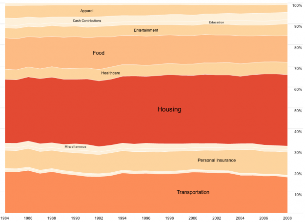
This is a step-by-step guide on how to make a similar visualization in Actionscript/Flash with your own data and how to customize the design for whatever you need. We’re after last week’s graphic on consumer spending (above).
Audience
This tutorial is for people with at least a little bit of programming experience. I’ll try to make it as straightforward as possible, but the concepts might be a little hard to grasp if you’ve never written a line of code. Just a heads up. Of course it never hurts to try.
If you don’t care about customization or integration into an application and don’t mind putting your data in the public domain, you could also just dump your data into Many Eyes, and use the Stack Graph.
Get Adobe Flex Builder
Like I said, this is all in Actionscript, so before we start anything, I strongly recommend you get Adobe Flex Builder if you don’t already have it. You can buy it, get a trial version from the Adobe site, or if you’re in education, you can get it for free.
There are ways to compile Actionscript without Flex Builder, but they are more complicated.
Working With Flare
Luckily you don’t have to start from scratch. In fact, most of the work has already been done for you using Jeffrey Heer’s Flare visualization toolkit. It’s an Actionscript library. We’re going to work off one of the sample applications: JobVoyager. Once you get your development environment setup, it’s just a matter of switching in your data, and then customizing the look and feel.
Okay, let’s get started (finally).
Step 0. Download and import Flare
Download the most recent version of Flare, and then unpack the contents into your working directory.
Open Flex Builder. You should see something like this:

Right click on the Flex Navigator (left-hand side) and click on “Import…” You’ll get a popup that looks like this:

Select “Existing Projects into Workspace” and click “Next.” Browse to where you put the Flare files. Select the “flare” directory, and then make sure “flare” is checked in the project window.

Do the same thing with the “flare.apps” folder. Your Flex Builder window should look like this once you’ve expanded the flare.apps/flare/apps/ and click on JobVoyager.as.

If you clicked the run button right now (the green button with the white play triangle top left), you should see the working JobVoyager. Get that working, and you’re done with the hardest part.
Step 1. Update the data source
Let’s dive into the code now so you can adapt the visualization to your own data and customize the aesthetics. Again, we’re going to adapt this code to consumer spending data to make last week’s graphic.

First we need to change the data source. This is specified on line 57.
private var _url:String = "http://flare.prefuse.org/data/jobs.txt";
Change the _url to point at the spending data, which like jobs.txt, is also a tab-delimited file. The first column is year, the second category, and the last column is expenditure:
private var _url:String = "http://datasets.flowingdata.com/expenditures.txt"
Now the file will read in our spending data instead of for jobs. Easy stuff so far.
Step 2. Change the years
The next two lines, line 58 and 59 are the column names, or in this case, the distinct years that job data was available. It’s by decade from 1850 to 2000. We could make things more robust by finding the years in the loaded data, but since the data isn’t changing we can same some time and explicitly specify the years.
Our expenditures data is annual from 1984 to 2008. We’ll change lines 58-59 accordingly.
private var _cols:Array = [1984,1985,1986,1987,1988,1989,1990,1991,
		1992,1993,1994,1995,1996,1997,1998,1999,
		2000,2001,2002,2003,2004,2005,2006,2007,2008];
Step 3. Data headers
Next we need to change references to the data headers. The original data file (jobs.txt) has four columns: year, occupation, people and sex. Our spending data only has three columns: year, category, and expenditure. We have to adapt the code to this new data structure.
Luckily, it’s pretty easy. The year column is the same, so we just need to change any people references to expenditure (vertical axis) and any occupation references to category (the layers). Finally, we’ll remove all uses of gender.
At line 74 the data is reshaped and prepared for the stacked area chart. It specifies by occupation and sex as the categories (i.e. layers), uses year on the x-axis, and people on the y-axis.
var dr:Array = reshape(ds.nodes.data, ["occupation","sex"],
     "year", "people", _cols);
Change it to this:
var dr:Array = reshape(ds.nodes.data, ["category"],
     "year", "expenditure", _cols);
We only have one category (sans sex), and that’s uh, category. The x-axis is still year, and the y-axis is expenditure.
Step 4. Sorting
Line 84 sorts the data by occupation (alphabetically) and then sex (numerically). We’ll just sort by category:
data.nodes.sortBy("data.category");
Are you starting to get the idea here?
Step 5. Proper categories
Line 92 colors layers by sex, but we don’t have that split in our data, so we don’t need to do that. Remove the entire row:
data.nodes.setProperty("fillHue", iff(eq("data.sex",1), 0.7, 0));
We’ll come back to customizing the colors of the stacks a little later.
Step 6. Labeling areas
Line 103 adds labels based occupation:
_vis.operators.add(new StackedAreaLabeler("data.occupation"));
We want to label based on spending category, so we’ll change the line accordingly:
_vis.operators.add(new StackedAreaLabeler("data.category"));
Step 7. Interactive filters
Lines 213-231 handle filtering in JobVoyager. First there’s the male/female filter and then there’s the filter by occupation. We don’t need the former, so we can get rid of lines 215-218 and then make line 219 a plain if statement.
Similarly, lines 264-293 at buttons to trigger the male/female filter. We can get rid of that too.
Step 8. Search categories
We’re getting really close to fully customizing the voyager to our spending data. Go back to the filter() function at line 213. Again, we need to update the function so that we can filter by spending category instead of occupation.
Here’s line 222 as-is:
var s:String = String(d.data["occupation"]).toLowerCase();
Change occupation to category:
var s:String = String(d.data["category"]).toLowerCase();
Step 9. Color scheme
If you ran the code right now, everything should compile correctly, and it’ll look something like this:

Color is specified in two places. First lines 86-89 specify stroke color and colors everything red:
shape: Shapes.POLYGON,
lineColor: 0,
fillValue: 1,
fillSaturation: 0.5
Then line 105 updates saturation (the level of red), by count. The code for the SaturationEncoder() is in lines 360-383. We’re not going to use saturation though. Instead, we’ll explicitly specify the color scheme.
First update lines 86-89 to this:
shape: Shapes.POLYGON,
lineColor: 0xFFFFFFFF
We’re going to make stroke color white with lineColor. If there were more spending categories, we probably wouldn’t do this because it’d be cluttered. We don’t have that many though, so it’ll make reading a little easier.
Next, make an array of the colors we want to use ordered by levels. Put it towards the top around line 50:
private var _reds:Array = [0xFFFEF0D9, 0xFFFDD49E, 0xFFFDBB84,
    0xFFFC8D59, 0xFFE34A33, 0xFFB30000];
I used the ColorBrewer for these colors.
Then we’ll add a new ColorEncoder around line 110:
var colorPalette:ColorPalette = new ColorPalette(_reds);
_vis.operators.add(new ColorEncoder("data.max", "nodes", "fillColor", null, colorPalette));
Tada, you now have something that looks like what we’re after:

Here’s the finished product.
Step 10. Download the code and see for yourself
To play with this yourself, just complete step 0 and then replace JobVoyager.as with this file. It has all the updates we’ve just covered.
Step 11. Where to Go From Here
There’s a lot of things you can do with this. You can apply this to your own data, use a different color scheme, and further customize to fit your needs. Maybe change the font or the tooltip format. Then you can get fancier and integrate it with other tools or add more Actionscript, so on and so forth. If anything, you should at least check out what else you can do with Jeffrey’s Flare visualization toolkit.
Have fun!
For more examples, guidance, and all-around data goodness like this, pre-order Visualize This, the upcoming FlowingData book.
 Visualize This: The FlowingData Guide to Design, Visualization, and Statistics (2nd Edition)
… or use HighCharts. No bad Flash karma: http://www.highcharts.com/demo/?example=area-stacked-percent&theme=default
Or Protovis, which although it doesn’t work in IE yet does support the interaction and filtering that Flare provides (and HighCharts doesn’t): http://vis.stanford.edu/protovis/ex/jobs.html
There are always trade-offs!
Nathan,
Great ‘How to’ post. I’ve been wondering where to get started trying to make these interactive graphs, and your easy to follow instructions make it, well, easy.
Thanks for sharing. Would love to see more like this in the future.
Absolutely great! I had always wondered how things like this were made, and now I was able to whip a completely customized one up in a couple hours. I’d also love to see more tutorials like this. Thanks!
@John and @Kyle – glad to hear it guys. i’ll see what i can cook up.
Pingback: What inspired me this week 2009-12-11 « Visualizing Economics
Pingback: Shared Items – December 13, 2009 | booyaa dot org
Pingback: How to Make an Interactive Area Graph | UserZen Meditations
Lovely! Thank you! Questions — My data is in 5 year increments: How do I change the x axis and the tool tips? How do I display values along the Y axis and in the tool tip in addition to %?
Can I just say how disappointed I am that the title of this post wasn’t an Office Space reference?
Seriously, though, I heartily second (third?) the idea of more how-to posts. I’m still at the stage of being creative with Excel, and would love to see more about the nuts-and-bolts of some of these designs.
Pingback: Interactive Area Charts in Excel « Visualization Network
Hey Nathan,
Great job! I just created a variation in Excel for those who might not have Flash or know how to code. Check it out on my blog at http://viznetwork.com/blog/2009/12/interactive-area-charts-in-excel/
Hi Tom
I am not able to view your videos using either Safari or Firefox. Any ideas? Thanks!
Mary – maybe you don’t have flash installed. Or if you’re at work, maybe Youtube is blocked?
That’s it! I forgot, I removed Flash. Thanks! Do you have any ideas about my earlier question?
Actually, tried it again, this time with Flash installed and still do not see videos. :-(
Pingback: Items that recently have caught my attention – Invisible Inkling
Pingback: Michelle Minkoff » Changes in how we travel across U.S. borders
If you click on the “use the interactive tool” link on this page, you can see what I’ve done with Flare so far: http://www.healthmetricsandevaluation.org/resources/news/2010/without_key_elements_0110.html
Thanks again for the tutorial!
@kyle – i’m glad you found it useful :)
Hi Nathan – Happy New Year!
My data is in 5 year increments: How do I change the x axis and the tool tips? How do I display values along the Y axis and in the tool tip in addition to %?
Pingback: Consumer Spending | Nathan Yau