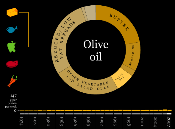
The Department for Environment, Food and Rural Affairs (DEFRA) keeps an archive of what British citizens have consumed over the years. The Times Online, in collaboration with designer Marcin Ignac, visualizes this data in their recent interactive. Consumption is by grams with a percentage breakdown up top with the donut chart, and a weekly average (for each year) on the bottom. The donut chart updates when you scroll over a bar in the time series chart. Very nice work I think. What do you think?
What Britain Has Eaten the Past Three Decades
FlowingData Delivered to Your Inbox
Chart Type Used

8 Comments
Second Edition
 Visualize This: The FlowingData Guide to Design, Visualization, and Statistics (2nd Edition)
 Visualize This: The FlowingData Guide to Design, Visualization, and Statistics (2nd Edition)
New tools, refined process.
Interesting visualization method for this dataset, however it wasn’t nearly interactive enough! I kept finding myself trying to click on slices to drill down into the category. Its great to know that a large chunk of people have eaten Pork, but what specific cuts of meat?
Maybe they don’t have that depth for the dataset, oh well.
Interesting, but required too much moving between sections… there was no ability to see the data rolled up, the inconsistency of the scale on the lower left and the different sections of food data does not allow for an understanding of the relative changes in diet, only the singe item changes.
Interesting butI think there’s little ability for comparison evident; surely the great advantage of an interactive chart. Sure, people are eating less butter, but it’s more interesting to see the consumption of butter in relation to the consumption of low fat spreads in the same view. I would have also liked to have seen the overall consumption of each food group when hovering over the centre – I found myself dragging my cursor round and round the ‘donut’ with gay abandon to measure it.
This seems like perfect data for that Many Eyes “stack graph for categories” thing.
One major problem with the data is that they’re comparing non-like items and you can’t get an accurate total of 100 percent. For example on the fat category they have butter, lard, olive oil (all various types of fat) but then they have reduced-fat spreads and salad oils that don’t specify which type of fat is used. They do this in the fish category too, where they break down white fish and blue fish and salmon, then have a general “takeaway fish” category. So it’s useful… to a point. But that’s a limitation of the data rather than the presentation, I think.
Hi,
Can anyone tell me what software is used to produce these kind of ‘organic’ interactive graphics? What I mean by this is the kind that immediatly adaptd itself according to mouse moving (often on slide bars) or by clicking a button (but you actually see the morph instead of just the image changing).
Thanks
it was done in flash/actionscript
Thanks for your answer Nathan.
I does look like flash, although I thought they would also use another software/tool. It looks so slick and “simple”.
Great stuff, I’ll just have to learn how to actionscript then!