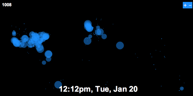
On Tuesday, January 20, 2009 at 12pm, Barack Obama officially became the 44th president of the United States of America. As we all watched Obama being sworn in front of the massive crowd, Twitter was abuzz with excitement. Just how excited was the Twittersphere? Watch for yourself. The map starts early Monday morning. As the day moves on more people wake and tweet at a steady rate with increasing volume as the time comes nearer. Europe gets in on some of the action when the US goes back to sleep. Tuesday morning comes in with a new beginning in the air. Then boom, it’s time, and Twitter bursts with excitement.
Visualizing Twitter as Barack Obama Became the 44th President


 Visualize This: The FlowingData Guide to Design, Visualization, and Statistics (2nd Edition)

Pingback: Visualizing Twitter reactions to Obama’s inauguration » VentureBeat
Pingback: Visualization of Twitter activity across the world during the… — Some Random Dude
Nice visualization Nathan. How did you go about the missing geo-data in twitter? Could you share some insight on how youlocalized the tweets?
Thanks for sharing,
Benjamin
This visualization is extremely good. Can you please share how you developed this? It will help lot of people who want to develop this kind of visualization.
Regards,
Ankur
@Ankur: Check out the code basis for the visualization from Nathan. It will teach you a great amount about how to create a visualization like this.
https://flowingdata.com/2008/10/21/code-for-walmart-growth-visualization-now-available/
Pingback: CovertlyObvious — Morning reading
Being from South Dakota I’m almost ashamed at the lack of people interested in Obama from that area…we are either technologically not engaged on twitter, such a red state that all of us who cared were in Washington, have such a small population it doesn’t register on your map…or all of the above. I’m going with the last one…sad but true.
btw, nice map!
@Benjamin – I originally tried to use the Twitter API’s “show” method to get location for a user and then used geoPy, a python wrapper for the major geocoding services, to get latitude & longitude. That worked fine – until I quickly passed the Twitter API request limit.
So I switched over to the Twittervision API, which supplies location for most users already. No geocoding required:
http://twittervision.com/api.html
I used it for my previous TwitterWorld project:
https://flowingdata.com/2008/07/28/welcome-to-twitter-world-twittervision-redux/
There doesn’t seem to be request limit on the Twittervision API yet, so it did OK for the 2,000 or so tweets I had. There were about 500 users that didn’t have location, because those users hadn’t entered that info on Twitter.
Pingback: links for 2009-01-22 - Kevin Bondelli’s Youth Vote Blog
@Nathan Thanks a lot for the comprehensive explanation. I thought you have used a third-party API to get the geo data (though I didn’t know about the “show” method from Twitter API).
Great sharing of kowledge!
Interesting. I’ve shown this to a couple friends and the biggest question is “this is only for positive reactions??” Would you post a correlating project for negative reactions? It would be interesting to see side-by-side comparisons. Would most of the negatives come from traditionally red states? just from the Texas and Kennebunkport? :)
Pingback: ++ t-empire.com ++ » Blog Archive » twitterã§ã®ã‚ªãƒãƒžå¤§çµ±é ˜å°±ä»»å¼ç¥ç¦ã‚’å¯è¦–化
Wondering.. Did you just include tweets with the word inauguration in, or did you use the #inaug09 hashtag that was so popular?
Pingback: Visualizing Twitter as Barack Obama Became the 44th President | FlowingData « Freshy Panda
That is just beautiful Nathan. Dugg.
If you can figure out how to still pilot your scrape, a single friends or followers request gives up to 100 users at a time.
You don’t get all the fields but you do get their location, url, followers count, description, photo and last tweet.
We’re going to push our API scraping toolkit out sometime soon, BTW…
@Zoe – the former, although i just got the data for #inaug09, so i’ll push that out some time soon.
@mrflip – thanks for the tip. i didn’t know that. Let me know when the API comes out. I’d like to post about that one.
Don’t know if what I said made sense… To be clear, this is our
__ toolkit for scraping from APIs __
comprising a motley but effective ruby frameworks for data munging, and not an
__ API providing a toolkit for scraping __
which would be http://dabbledb.com/ or http://dapper.net/
so hopefully it was the former you found interesting… but yes you will be one of the first to know. It’s @dhruvbansal’s baby; he says we just need to tidy up the place for company and integrate my hadoop|streaming components.
Nathan,
Great work. Will you be posting the code for this visualization? I am interested in how you added the “Play” and “Visit FlowingData” buttons.
To help Nathan reduce the requests for developement help, we’ve published our base application for any AS3 application using the ModestMaps library. The code should be easy to understand for everybody and get you up and running with MM with ease. Visit http://www.datavisualization.ch/technology/benjamin/mm_construct for documentation & download.
– Benjamin
Thanks, Benjamin. I’m looking forward to testing it out myself.
Pingback: Girvin Strategic Branding Design Blog | flowdataflow
Pingback: Visualizing Twitter as Barack Obama Became the 44th President - FlowingData « Tom Zazueta
Pingback: SCVTalk.com » Blog Archive » Friday the 13th - Daily Brief