How to Make a Graph in Adobe Illustrator
You can use the vector-based software normally reserved for designers and artists to make and edit charts.

Most of us create graphs with actual graphing software. Maybe it’s Microsoft Excel. Maybe it’s R. Whatever it is though it’s usually specialized for analysis. What if you want to make a graphic for a publication or a presentation that’s polished and fully customized? Adobe Illustrator gives you the control you need to do this. It’s not graphing software. It’s illustration software, but once you get the hang of things, Adobe Illustrator can be a valuable tool in your visualization arsenal.
In the rest of this post, I’ll go over the steps to make the above graph in Illustrator. I used the U.S. immigration data from our recent contest.
Familiarize Yourself with Toolbox
Adobe Illustrator has a large toolbox, but for your basic graph, you only need to familiarize yourself with a few of the available tools — selection, direct selection, pen, type, and graph.
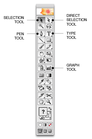
The selection tool lets you place focus on a group of objects; direct selection lets you choose individual objects like a line segment; pen tool lets you draw straight lines; type tool is used to put words in your graphic; and finally the graph tool lets you make different types of graphs.
Don’t worry, these tools will make more sense as we go through the examples.
Read the Data Into Illustrator
Start a new Illustrator document, and select the graph tool. Left click and drag. A rectangle appears that sizes according to how far you drag. This is initially how big your graph will be. You can always change it later so no need to fret about it. You’ll immediately see a grid once you let go of the mouse button (shown below). That’s where you put your data. You can manually enter data points like you would in Excel, but it’s easier to cut and paste data from Excel into the grid in Illustrator.
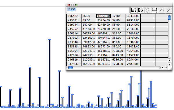
In this example (remember, we’re dealing with the immigration data), the first column is Europe, second column is Asia, so on and so forth. Click on the check in the top right corner of the grid box. The default grayscale bar chart will show up.
Change the Default Graph
We don’t want a bar chart though. We want a stacked area graph. Close the grid box, and then right click on the graph (currently a bar chart). Select Type. This will give you the following menu.
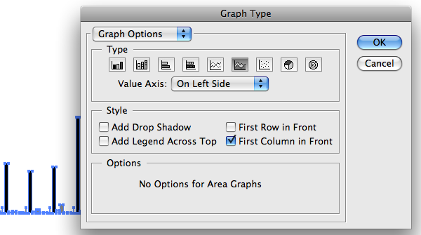
Select the icon for area graph, and your graph will change accordingly:
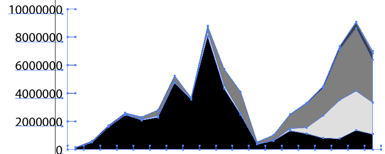
Okay, now we have our base. It’s time for the fun part now — customization. You could leave it like this, but the whole point of using Illustrator in the first place is to make a publication-level graph. Otherwise, we’d be better off using Excel. Onward ho.
Customize the Graph
Right click on your graph (now an area chart), and click on ungroup and click on OK:
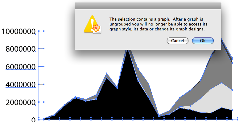
The reason for this is because the graph is initially created as a group, or single entity, but what we really want to get at is the individual elements like the axes and labels. You can modify individual elements without ungrouping, but it’s easier if you do this way. So ungroup. After that, some elements will still be grouped together (e.g. the polygon shapes), but like before, you can right click and select Ungroup. You’ll know right away if some elements are groups or not when you select an element with the selection tool. Try using the direct selection tool to select individual elements without ungrouping.
Once you’ve got that down, you can pretty much do whatever you want to the graph. I chose to add some color, change the font and font size, and extend the axes all the way across.
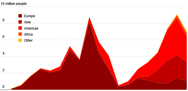
Annotate the Graph
I usually leave annotation to the very end, because I like to place labels in a way that doesn’t bring clutter. Use the Type Tool to add text. Select the tool, click where you want to add text, and, like you’d expect, Illustrator will prompt you for some wordage.
Here’s the finished product. I added a title, some lead-in text, removed the top grid line, and added years to the x-axis.
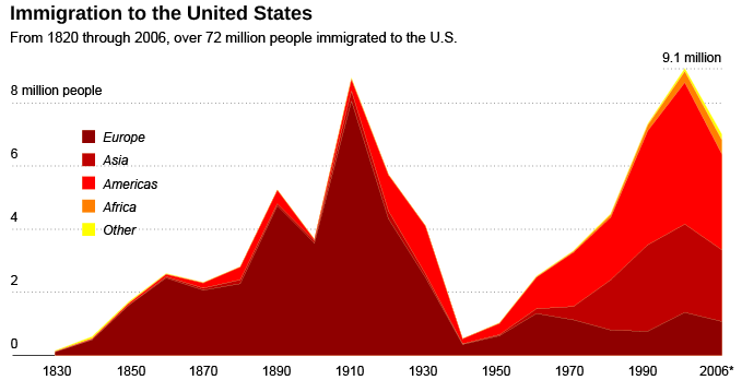
Of course, I could have added more history to the graph, optimized the colors, size, dimensions, etc., but that’s out of the scope of this tutorial. What I hope that you take away from this tutorial is that Illustrator offers you a lot of flexibility that other pure graphing solutions don’t. So if you’ve got a report or paper to publish, then you might want to consider cleaning up with Illustrator.
There’s a reason almost all of The New York Times’ graphics pass through Illustrator at some point in its life cycle. It’s a little tricky at first, but once you get the hang of it, you’ll see it’s well worth the effort.
Here is the Adobe Illustrator file for the above graph, if anyone is interested.
For more examples, guidance, and all-around data goodness like this, pre-order Visualize This, the upcoming FlowingData book.
Made possible by FlowingData members.
Become a member to support an independent site and learn to make great charts.
About the Author
Nathan Yau is a statistician who works primarily with visualization. He earned his PhD in statistics from UCLA, is the author of two best-selling books — Data Points and Visualize This — and runs FlowingData. Introvert. Likes food. Likes beer.


Pingback: Designtraining blog » Ðрхив блога » How to Make a Graph in Adobe Illustrator
Pingback: Graphs in Illustrator - dube.mine.nu
I make graphs in Illustrator as a major part of my job. I’m a production artist; I lay out books about international development and poverty relief, so there are a lot of statistics.
But I almost never ungroup a graph.
Ungrouping the graph means the underlying data in the “grid” are gone. If the client wanted to change a number—and my clients always do, as data from developing countries are notoriously unreliable—I’d have to start over.
All the adjustments you made here could easily be made without ungrouping the graph. Stretching the axes would cause the graph to “explode” if it were replotted (a common complaint), but that could be done with the Transform effect *instead* of actually moving the points. This makes replotting the graph not freak out and attempt to compensate for points you’ve moved. This is something I figured out after about eleven years doing my job. Granted, the Effects menu wasn’t there for the first several versions of Illustrator, but it’s a lifesaver now!
If I do have to ungroup a graph (for instance, Illustrator area graphs don’t go edge-to-edge [though the Transform Effect can fix this too]), I make a copy of the still-grouped graph, shrink it way down, and give it no stroke and no fill. That way, should any of the data change in future revisions of the document, I still have a manipulable copy of the graph with the data intact.
@Elaine – I learned Illustrator ad hoc when I was at The New York Times, and that’s how they taught me, so I always ungroup. I probably didn’t have to do it for this graph, but for complex graphics, I find it’s easier and more efficient.
Of course, I always duplicate the graph first, but left that part out of this post for sake of simplicity.
It’s interesting to know that that’s how they do it there! Sometimes when I’m making my 50th bar chart of the day about how bad things are for sick and starving people in Africa, I wonder what it’d be like to be able to make “happy” graphs at a higher profile!
intuition tells me… much more fun :)
Pingback: andy.edmonds.be › links for 2008-12-16
Pingback: How to Make a Graph in Adobe Illustrator
Pingback: Daily Research » Shared Items - December 17, 2008
Pingback: Favorieten en bookmarks voor 12 December tot 17 December | Cafe del Marketing
Nice writeup! I didn’t know Illustrator has these basic data handling tools.
Then again, doing the whole graph in a vector drawing program sounds like too much work… I prefer letting dedicated software like R, Octave, or even Python do the basic graph for me. Next, I use a vector editor as the essential second step for post-processing the graphs. Nothing as dull as a report full of plain Excel graphs :-)
I’m a bit biased towards open source solutions in this, using R/Python/Octave/… for the basic graph and Inkscape for the post-processing (via SVG).
Pingback: Excel Links of the week - the Christmas edition | Pointy Haired Dilbert - Chandoo.org
Pingback: links for December 16th through December 23rd | Silfies Scope
Pingback: aardige links « tableaux’ blog
Pingback: tableaux’ blog » aardige links
I have been using those small flash based softwares to build graphs. This was something i had never thought of. Thanks google to direct me here, and really thanks for the guidance.
What if you are lacking data for one country for the first 5 years. Is there a trick? Illustrator will not make the area graph if one of the columns is lacking data. I tried entering zeros.
thats great and all but you don’t say where the graph tool is