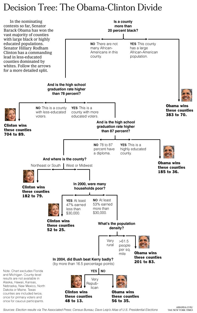
Amanda Cox, of The New York Times, made another excellent graphic (and I wouldn’t expect anything less). We see an entire story between Obama and Clinton – positions taken, counties won, and counties lost. Go ahead and take a look. Words bad. Picture good. Ooga. Booga.
[via Infographics News]
 Visualize This: The FlowingData Guide to Design, Visualization, and Statistics (2nd Edition)
Makes perfect sense to me. My only question is – how do we get the older or poorly educated whites to get a clue from the younger or better educated people who know Obama is the best choice?
Hey, Morgaine–We go talk to them. Find out what they’re concerned about, learn about their lives, and show them we care. That’s it. We talk to them. Find something in common, and educate.
Let’s see. Non educated, poor whites vs. educated middle class whites. So basically, dumbasses are holding the country back. There is no point in talking to these people. They DON’T understand issues, they just see ‘black guy, no vote’.
I have an idea. Pass legislation to stop dumbasses from voting.
How’s that for elitism? I’m serious though, I wish there was someway to parse a educated researched vote from a uneducated retarded one.
It just doesn’t seem fair that old people who won’t be around for the damage and stupid people who don’t know better get to decide my future.
Pingback: If A Picture Paints 1000 Words… - Bang the Drum
Well, Laila and all, by now the politicians have convinced everyone older than you are that they don’t care about the people, and they don’t even care that they don’t care!
You are too young to be sick and tired of the political games, but the rest of us have been through it too many times to see your idealism as anything besides youthful exuberance not based in facts or history. We’ve already been through that year after year after year after year.
margaret – why on earth would Hillary be the answer to your political prayers? based upon what you have said.
If Barack Obama is a false dawn then why would hil be otherwise?
What if a portion of that exuberance (even a minute portion) carries Barack to the presidency – will he not then have a mandate for change? a mandate to combat the politics that have told “everyone older than you are they don’t care about the people”?
come on, wake up. Hillary is not the answer, she has descended into a myopic cult of personality, in which the only tactics available to her are ‘rove-ian’, (or straus-ian, to be more accurate) i.e. re-image reality to suit your goals, with the tacit understanding that the populace is just too stupid to sift through and find out the actual reality.
seriously, you can’t make this stuff up, read some strauss. The sad part about the hil thing is that she has so clearly donned the clothing of her oppressors. An act that is all too prevalent in history.
wake up woman!
Interesting. It just miss the age factor, which seems to be a real deal in this election.
I voted for Sen Obama here in Ohio, but after hearing his racist comments in San Fran while pandering to the uber left for cash…nope. Not gonna get my vote in the General
http://www.floppingaces.net/2008/04/24/top-5-reasons-barack-wont-be-president/
Margaret, how do you know how old Laila is? She could be 45 years old. (She could even be a man, but I’m making a reasonable assumption that “Laila” is a female name.)
Vic, while I understand your feelings, I suggest you think back to your history classes– literacy testing as a requirement for voting was a tool used to keep blacks from voting in the past. Until people’s ignorance can be reliably assumed to be a matter of choice rather than unavailability of solid education, it is hard to advocate such tests as an ethical solution to “The Moron Problem”.
Margaret, how do you know how old Laila is? She could be 45 years old. (She could even be a man, but I’m making a reasonable assumption that “Laila” is a female name.)
LOL, nice condescention in there.
Couldn’t just leave it YES or NO?
Gotta throw in the comments” YES – …highly educated…”
When education = intelligence give me a call.
Pingback: light leaks - Flowchart
Pingback: Obama vs Clinton Decision Tree « The Mendicant Bug
Pingback: Ένα διαφοÏετικό δÎνδÏο απόφασης « Data Mining, a Course by Blog
“There is no point in talking to these people. They DON’T understand issues, they just see ‘black guy, no vote’. Pass legislation to stop dumbasses from voting.”
Wow! That may be one of the most bigoted comments I’ve seen in a while. Got news for you Vic. They say the say thing about you.
Good thing that legislation would never be passed because you no longer be allowed to vote.
Here’s a clue, Morgaine et al. You stop talking down to the people who don’t have the advantage of an ivory tower education. It doesn’t take a college education to recognize that Obama has a lot of supporters who are so busy congratulating themselves on their hgiher education that they forget to do simple math like how many people are like them and how many peole are there who aren’t.
Pingback: links for 2008-04-24 « andrew golis
Seriously, is anyone surprised?
The Clintons consistently made decisions that backed the oligarchs, whether they came in the guise of the military-industrial complex, the WTO, the IMF, the IADB, the World Bank; the Clinton period saw no abatement of the ongoing centralization of power, or in the continuing brutalization of the periphery; we know this about them, we know where they stand.
But where do you think Obama will fall on these issues? Is it really likely that someone coddled and imprinted by an elite institution such as Harvard will differ much from the Clintons on these issues?
What happened when the ugly truth of American neo-colonialism raised its head in this campaign, in the form of Obama’s minister’s statement about “blowback”? Did Obama stand up and say: “Yes, in fact the brutality of my nation’s actions over the past 50 years is having a predictably radicalizing effect around the world”? Of course he didn’t.
So we know now where Obama stands, and it is not much different from the Clintons, or even Bush. Yes, there will be substantial differences in execution, but the over the fundamental issues there is little disagreement amongst our elites.
The miracle of electoral politics lies in how one or the other side ends up looking “populist.”
Pingback: links for 2008-04-25 | Select2008 Blog - Comparing and tracking the 2008 presidential candidates
Pingback: Decision tree: is it an Obama or Clinton county?
Pingback: Tensegrities » Blog Archive » Clinton-Obama graphic
Pingback: Friday links « …the importance of being, Andy.
Has anyone ever heard the term, “Educated Idiots”?
Life experience is far more valuable than someone who has a college degree. The people that have put this country in this mess all had college educations. Young people may think they are so much smarter than older Americans but what do they really know?
JS. I just happen to have both a college education AND life experience–and I’m one of those “young people.” You are in no position to assume that just because I happen to be in grad school with a 4.0 (not “congratulating myself,” just categorizing) I am not also schooled in the streets as well. You are in no position to assume that as an “educated idiot” I have never worked, nor had experiences that taught me what it’s like to have people you love die in your arms, to work 50 hours a week just to make the bills, to travel all over this country and the world and understand that this universe is much bigger than the space between your face and this computer right now. And I most certainly realize there are more people unlike me than like me (JonO), I communicate with them every day, and they challenge my resolve and push me to work harder. No, JS, I have worked my ass off both in school and out, and to imply that somehow I don’t know as much as you just because I am not as old is not only rude and presumptuous, but also reflects the very difference between the intelligence of the educated (or educated/experienced) and the intelligence of the experienced–we know that knowledge and wisdom come in many forms. You think yours is the best. That is what I call–elitism.
Pirate–
Good post, swashbuckler.
just proves Hillary is a better republican
Pingback: Happy One-Year Birthday, FlowingData! | FlowingData
Bonnie:
Yarr. Thank ye, lass. Oh, and lest anybody think I’m just a young idealist, I would like to point out that the one and only reason that I intend to own a lawn in my life is just so that I can yell at kids to get off it.
I started saying “kids these days” when I was still in high school.
There is a lot of generalizing going on here. Education has never equaled logical reasoning. There are always grey areas. And perhaps those grey areas are much larger than a lot of you seem to perceive.
Pingback: Charles Apple » Blog Archive » NYT spends half a million on infographics? Every month?
Horribly manipulated. By stripping out the black vote first, all of the subsequent measures are skewed. If the black vote had been at the end of the sequence the true picture of what really happened wouyld have shown. The only reason Obama won was that he got 95% of the black vote. Racism in reverse. Cutoff points also look a bit contrived. Where do they stand in relation to the overall population. Any r-squared done on this?