 The box-and-whisker plot is an exploratory graphic, created by John W. Tukey, used to show the distribution of a dataset (at a glance). Think of the type of data you might use a histogram with, and the box-and-whisker (or box plot, for short) could probably be useful.
The box plot, although very useful, seems to get lost in areas outside of Statistics, but I’m not sure why. It could be that people don’t know about it or maybe are clueless on how to interpret it. In any case, here’s how you read a box plot.
Reading a Box-and-Whisker Plot
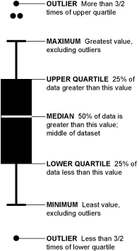 Let’s say we ask 2,852 people (and they miraculously all respond) how many hamburgers they’ve consumed in the past week. We’ll sort those responses from least to greatest and then graph them with our box-and-whisker.
Take the top 50% of the group (1,426) who ate more hamburgers; they are represented by everything above the median (the white line). Those in the top 25% of hamburger eating (713) are shown by the top “whisker” and dots. Dots represent those who ate a lot more than normal or a lot less than normal (outliers). If more than one outlier ate the same number of hamburgers, dots are placed side by side.
Find Skews in the Data
The box-and-whisker of course shows you more than just four split groups. You can also see which way the data sways. For example, if there are more people who eat a lot of burgers than eat a few, the median is going to be higher or the top whisker could be longer than the bottom one. Basically, it gives you a good overview of the data’s distribution.
That’s all there is to it, so the next time you’re thinking of making a bar graph or a histogram, think about using Tukey’s beloved box-and-whisker plot too.
Want to learn more about making data graphics? Become a member.


It’s probably better to call the “maximum” and “minimum” upper and lower fences!
Nice! ;o) Another fan of the box plot.
Two weeks ago I wrote a similar article on
http://informationandvisualization.de/blog/box-plot
Let’s put the box plot back on the map!
oh, alright, fine. maximum = upper fence. minimum = lower fence :)
There are techniques for drawing box and whisker plots in Excel. Most provide pretty good charts, and I think my technique is among the best:
http://peltiertech.com/Excel/Charts/BoxWhisker.html
I’ve been working on a utility that a user will be able to point at their data, and it will generate a box and whisker plot. The boxes and whiskers are pretty easy, but efficient treatment of the outliers is rather complixated. I have an earlier attempt available for testing:
http://peltiertech.com/Excel/Zips/PTS_Box_Charter_Setup.zip
I thought I’d solved the outlier problem with this version, but after a rather small number of observations it breaks down (and slows down, especially in Excel 2007). I’ve been working on this and hope to have a robust new version available soon.
Jon Peltier
Nice summary article. I honestly don’t know why more people don’t use box-and-whisker plots. Many of my colleagues insist on using the sinister dynamite plot to show mean/variation around the mean. In most cases they should be replaced with either a dot plot or boxplot.
I think that there is a simple explanation: Excel.
The simple solution: R.
@Dylan: Haha, those are some, uh, excellent examples. I’m sure the dynamite plot could be good for something… maybe. But the hatch patterns – that’s just uncalled for.
@Nathan: Re: dynamite plots. I suppose they are good for blowing up your hard work by bungling the presentation.
Nice website by the way– fun reading! You have to watch out for that Hadley character though! hehe, just kidding!
Comment on How to Read (and Use) a Box-and-Whisker Plot
Here is a link for the francophone community
http://matisse.univ-paris1.fr/leguen/leguen2001b.pdf
Le Guen M. (2001), La boîte à moustaches de Tukey, un outil pour initier à la Statistique, Statistiquement Vôtre, n° 4, 14 pages.
Hi Nathan. It’s very useful and well-made post. May I translate it into Russian for my blog? Of course with link to you.
@grossu: sure, go for it. and thanks for asking :)
Nathan & Hadley,
Actually, the maximum/minimum whiskers are not equivalent to the upper/lower fences. The whiskers go out to the maximum values WITHIN the fences. This is a subtle point, but an important one if you’re constructing your own box-plots.
Box-plots are my favorite graphics, so I loved coming across this blog post!
@doug: point taken :)