Borne out of everyday curiosities, learning experiments, and mild insomnia.
An ongoing series about looking at the everyday through the eyes of data and charts.
Reviving the currently defunct Census-produced publication with current data.
Not everything has to be visualized. I do it anyway.
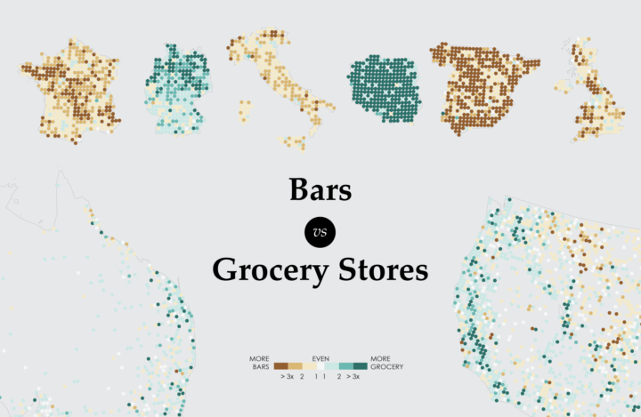
A closer look at the age old question of where there are more bars than grocery stores, and vice versa.
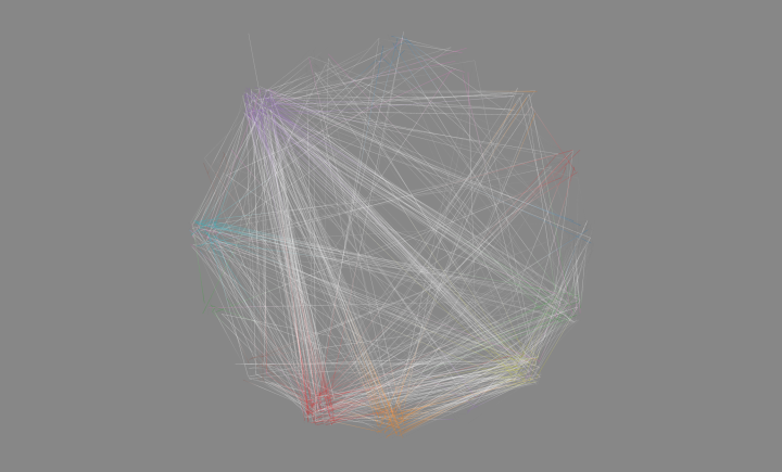
I wanted to see how daily patterns emerge at the individual level and how a person’s entire day plays out. So I simulated 1,000 of them.
People get married at various ages, but there are definite trends that vary across demographic groups. What do these trends look like?
I compared time use for those with children under 18 against those without. Here’s where the minutes go.
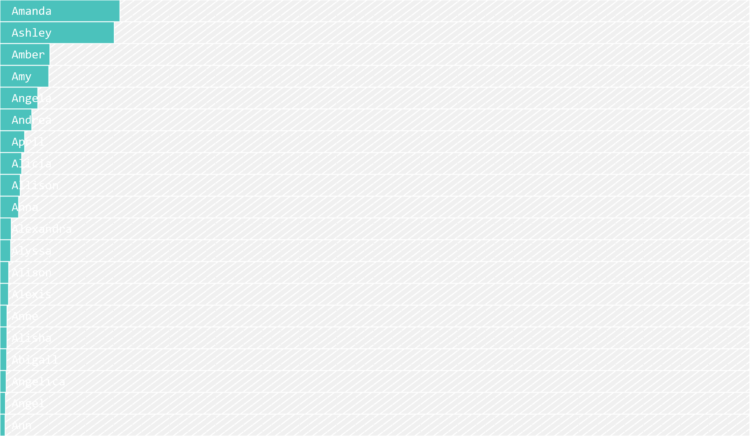
I’m terrible at names, but maybe data can help. Put in your sex, the decade when you were born, and start putting in your name. I’ll try to guess before you’re done.
We use some names mostly for boys and some mostly for girls, but then there is a small percentage that, over time, switched from one gender to another. Which names made the biggest switch?
Some jobs tend towards higher divorce rates and some lower.
Some occupations have more turnover than others. See how it varies for your occupation and others.
It seems like people don’t stick with the same job for as long as they used to, but maybe that’s not the case.
Why Americans are unemployed varies across groups.
A practical resource for beginners who want to visualize data for humans.