Visualization
Showing the stories in data through statistics, design, aesthetics, and code.
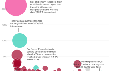
How fake data goes viral
BuzzFeed describes how an article on Daily Mail — that falsely reported claims…
Nine rounds a second sonified
The New York Times used sonification along with a dot plot to demonstrate…
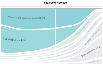
Given your income, most beneficial tax breaks
With the release of the Republican proposed tax plan, Reuben Fischer-Baum and Kevin…
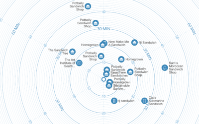
Time map shows locations based on how long it takes to get there
With the premise that we often search for locations based on how long…
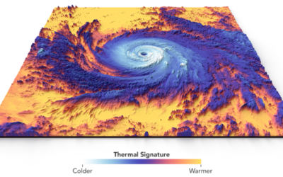
Thermal structure of Hurricane Maria
Hurricane Maria touched down in Puerto Rico. This visualization by Joshua Stevens at…
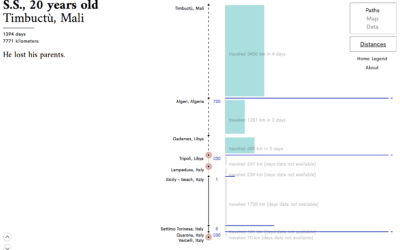
Visual narrative of six asylum seekers
We often visualize migration and people movement as lines that go from point…
Computer uses wind to mine cryptocurrency and then fund climate research
HARVEST is an art piece by Julian Oliver that consists of a 4G-connected…
Aviation tracker with depth
I’ve grown bored of maps that show commuter traffic, but for whatever reason,…
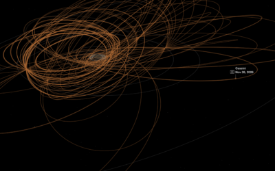
Tour of Saturn through Cassini, the satellite that crashes on Friday
About two decades ago, the Cassini satellite headed towards Saturn and has been…
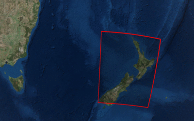
Landsat satellite imagery browser
Downloading and viewing satellite imagery is a bit of a process. There are…
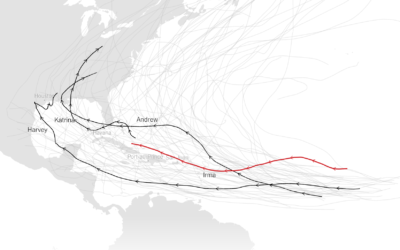
Comparing the strength of Hurricane Irma against previous hurricanes
For perspective, The New York Times compares the strength of Hurricane Irma to…
Mortgages in terms of years of working life
Buying a house is often confusing and complex, compounded by a dollar sign…
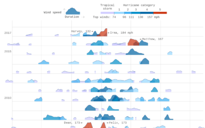
Thirty years of hurricanes
After their graphic for thirty years of floods, Axios follows up with thirty…
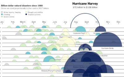
Cost of Hurricane Harvey
Kevin Quealy for The Upshot charted the estimated cost of Hurricane Harvey, along…

