Visualization
Showing the stories in data through statistics, design, aesthetics, and code.
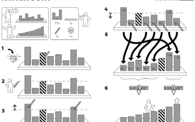
Algorithms drawn as IKEA furniture instructions
Learning algorithm steps can be a challenge when viewed only through code or…
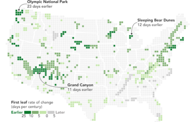
Maps show spring arriving earlier
From Joshua Stevens at the NASA Earth Observatory:
But over the longer term,…
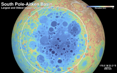
The Moon in 4k resolution
Based on data gathered by the Lunar Reconnaissance Orbiter, NASA pieced together this…
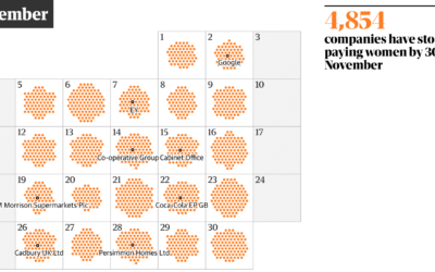
Day of the year companies stop paying women
One way to think about gender pay gap is to imagine women receive…
A musical journey in 1939, retold with visualization
In 1939, John and Ruby Lomax traveled through ten southern states in three…

SimCity-like views using satellite imagery
Maps typically show a view from straight above, which is good for navigation…
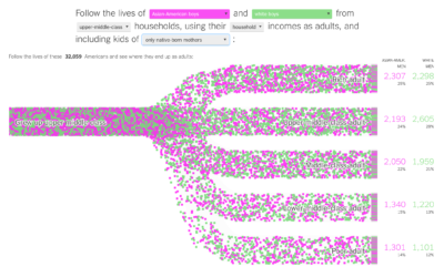
Income mobility for different groups
Building on their previous visualization work on black boys dropping income levels in…
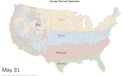
Average first leaf appearance, as animated map
The USA National Phenology Network uses a computer model to estimate heat build-up…
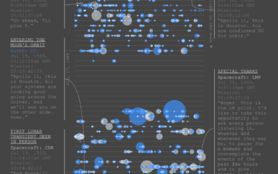
Apollo 11 conversations on the way to the moon
As you can imagine, there was plenty of conversation between Earth and Apollo…
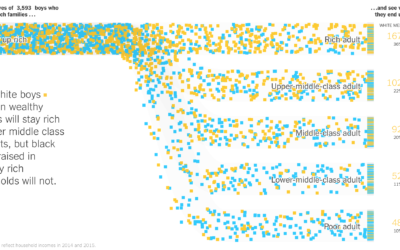
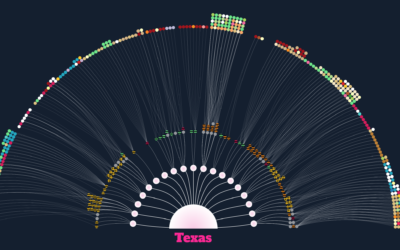
Black boys dropping income levels as adults
Research by Raj Chetty, Nathaniel Hendren, Maggie Jones, and Sonya Porter from the…
One-way tickets out for homeless people
Many cities provide free bus tickets for homeless people who want to relocate.…
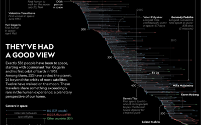
All the astronauts and their spaceflights
556 people have gone to space. In an article on their changed perspectives,…
Let it flow, let it flow, let it flow →
The particles R package from Thomas Lin Pedersen ports d3-force from d3.js to…

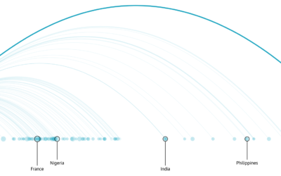
Traveling birds on a thousand-mile journey
Birds migrate to areas more hospitable, but where do they go? It depends…
Beginner’s guide to visualization literacy
Mikhail Popov, a data scientist at the Wikimedia Foundation, led a workshop on…
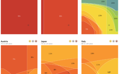
Who’s winning the medal race, depending on how you weight the medals
Every year, we look at the medal counts of each country. Who’s winning?…
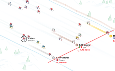
Mikaela Shiffrin pulling away for gold
Mikaela Shiffrin won her first gold medal in PyeongChang with a fraction of…