Visualization
Showing the stories in data through statistics, design, aesthetics, and code.
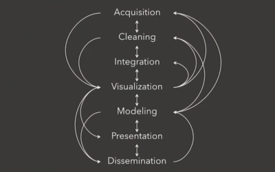
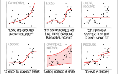
Constructing charts and graphs
Jeffrey Heer, a computer science professor at the University of Washington, provides an…
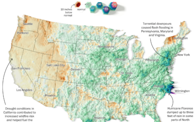
Summer rain levels compared to the norms
Tim Meko and Aaron Steckelberg for The Washington Post compared this summer’s rains…
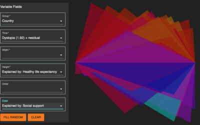
Morph, an open-source tool for data-driven art without code
Morph, by Datavized in collaboration with the Google News Initiative, is a tool…
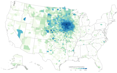
Judging connectedness of American communities, based on Facebook friendships
We talk about geographic bubbles a lot these days. Some areas are isolated,…
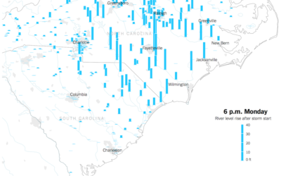
Watch rising river levels after Hurricane Florence
Hurricane Florence brought a lot of rain, which in turn made river levels…

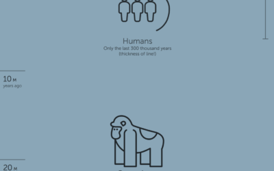
Endangered species that could fit in a train car
There are endangered species where the remaining few in the world could fit…
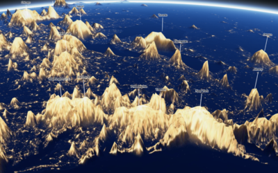
3-D view inside Typhoon Mangkhut
Typhoon Mangkhut went through the northern end of the Phillipines a few days…
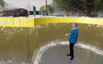
Realistic storm surge depicted in Weather Channel forecast
The Weather Channel is using a realistic 3-D depiction surrounding a reporter to…

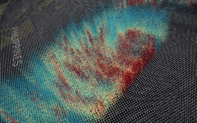
Turning water pollution into audiolized awareness
Brian House collected polluted water with acid mine drainage in the Tshimologong Precinct,…
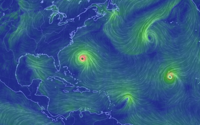
Hurricane Florence trackers
Hurricane Florence is forecast to touch down Thursday night or Friday, and what’s…
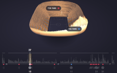
Experience a soccer game through crowd noise
Sports visualization and analysis tends to focus on gameplay — where the players…
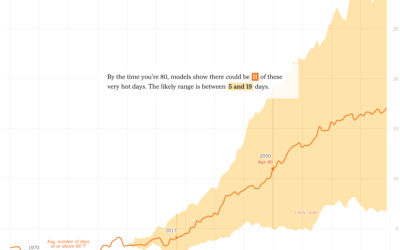
Hotter days where you were born
It’s getting hotter around the world. The New York Times zooms in on…

Algorithmic art shows what the machine sees
Tom White is an artist who uses neural networks to draw abstract pictures…

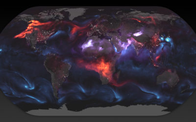
World map shows aerosol billowing in the wind
Using a mathematical model based on satellite data, NASA shows an estimate of…