Visualization
Showing the stories in data through statistics, design, aesthetics, and code.
Evolution of the alphabet
Matt Baker provides this nifty diagram on how the alphabet changed over the…
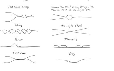
Closeness in relationships over time, illustrated with a couple of lines
Cartoonist Olivia de Recat illustrated the closeness over time for various relationships. Charming.…
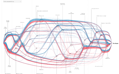
See every member’s path to the House of Representatives
For The New York Times, Sahil Chinoy and Jessia Ma visualized the path…
Rail delay scarf goes for $8,500 on eBay
Sarah Weber posted a picture of a scarf that her mom knit to…
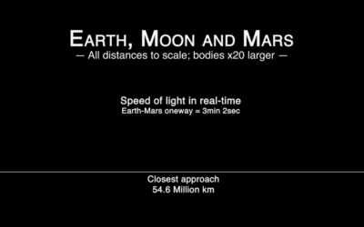
Real-time speed of light from Earth to Mars
Hurry up, light. We’re gonna be late:
By James O’Donoghue, the animation shows…
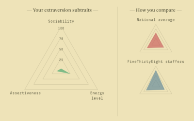
Personality quiz with traits on a spectrum
Ah, the online personality quiz, oh how I missed you. Oh wait, this…
Inside out map of the Grand Canyon
John Nelson turned the Grand Canyon inside out to understand the magnitude better:…
Build a parasite to block your digital assistant
Digital assistants offer convenience, but they also offer continuous surveillance, and it’s not…
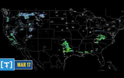
One-year time-lapse of the weather
Along the same lines as last week’s one-year wind time-lapse, Weather Decoded provides…
Voronoi diagram from smooshing paint between glass
It feels like magic. I think there’s a magic trick percolating in there…
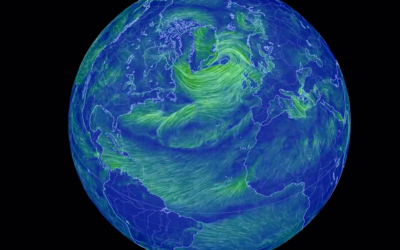
Time-lapse of all the wind in 2018
Using the same National Weather Service data that powers his live-ish wind map…
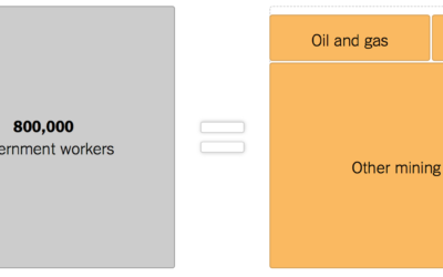
Government shutdown, other industries provided for scale
As the shutdown continues, 800,000 government workers wait for something to happen. The…
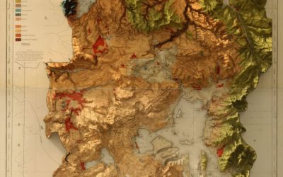
Vintage map with modern 3-D elevation
This vintage recreation by graphic designer Scott Reinhard fills all the right checkboxes…
List of visualization best-of-year lists, 2018
The end of a year is always a good time to look back…

