Visualization
Showing the stories in data through statistics, design, aesthetics, and code.
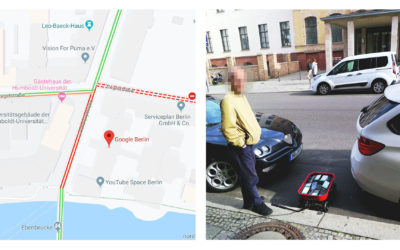
Faking traffic on Google Maps with a wagon of 99 smartphones
Google Maps incorporates data from smartphones to estimate traffic in any given location.…
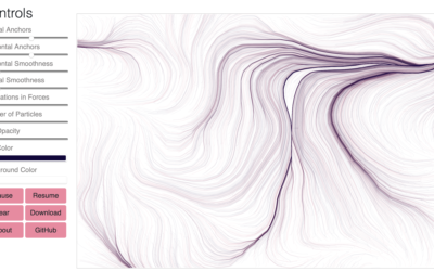
Flow Fields, a generative art tool
Flow Fields, a generative art tool by Michael Freeman, lets you adjust various…
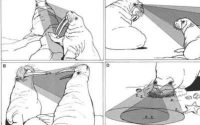
Questionable science diagrams
Sometimes illustrating scientific findings is a challenge. Sometimes the illustrations are published anyways,…
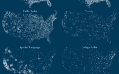
Geography of FM radio
So get this. There are these things called radio stations that broadcast music…
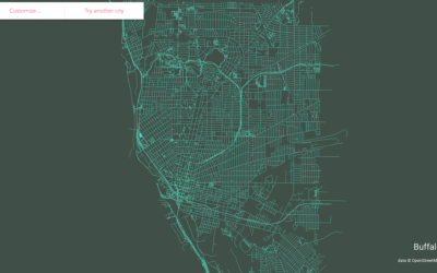
Make a streets map of anywhere in the world
Following up on his mini-app to draw ridgeline maps for elevation, Andrei Kashcha…
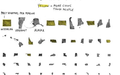
Cow representation in the Senate
For the Absurd America section of The Washington Post, Sergio Peçanha asks the…

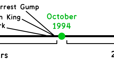
Quiz to see which Democratic candidate agrees with you most
The Washington Post asked Democratic candidates a series of policy questions. To see…
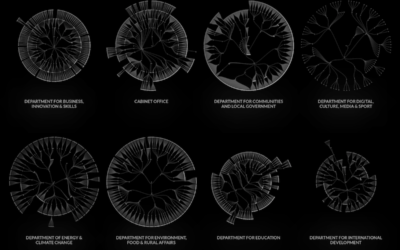
UK government org charts
When I think government structure, I tend to think in general overviews where…
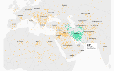
Can’t find Iran on a map
Based on a Morning Consult/Politico survey, most people don’t know where Iran is:…
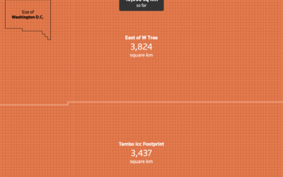
Scale of Australia bushfires shown with unit charts
Outside of Australia, it can be a challenge to get a grasp of…
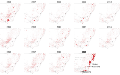
Where the Australia fires are burning
The New York Times zoomed in on southeastern Australia where the fires have…
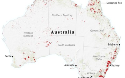
Visual guide for the fires in Australia
For The Guardian, Niko Kommenda and Josh Holder provide a visual guide to…
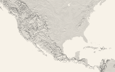
Draw a ridgeline map showing elevation, for anywhere on Earth
Ridgeline charts or frequency trails use parallel lines that overlap on the fluctuations,…
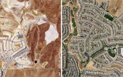
Urban growth via satellite imagery
For The Upshot, Emily Badger and Quoctrung Bui looked for major urban developments…
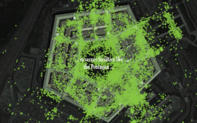
One leaked file, the location of 12 million smartphones
A file leaked to The New York Times contained location traces of 12…
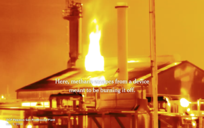
Making invisible gas leaks visible
For The New York Times, Jonah M. Kessel and Hiroko Tabuchi went to…