Visualization
Showing the stories in data through statistics, design, aesthetics, and code.
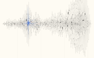
Visualizing 16th century letter correspondence of the Tudor government
Kim Albrecht, Ruth Ahnert, and Sebastian Ahnert visualized the network of communications over…
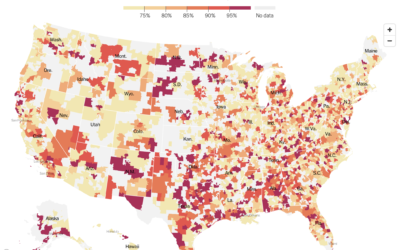
Where ICUs are near capacity
The New York Times mapped the seven-day average of ICU bed occupancy rates:…
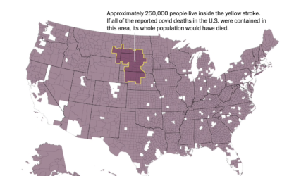
Bill Nye on masks, with a map and some props
Talking about the effectiveness of masks on TikTok, Bill Nye uses a map…
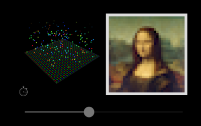
Interactive explainer for how cameras and lenses work
We use our cameras all of the time, and it almost seems like…
Defining “essential worker” to distribute vaccine
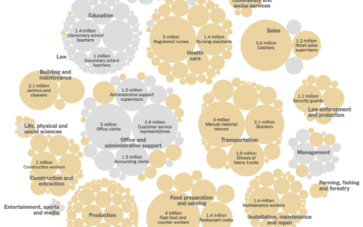
Matthew Conlen, in an article by Abby Goodnough and Jan Hoffman for NYT,…
Data Sketches, the book
Data Sketches was a one-year visualization collaboration between Nadieh Bremer and Shirley Wu…
Vaccine contracts
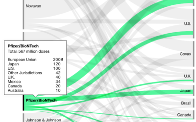
Bloomberg is tracking nine coronavirus vaccines around the world. In addition to the…
Your place in the vaccine line
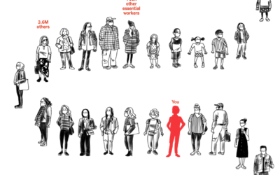
Using estimates from the Surgo Foundation and Ariadne Labs, Stuart A. Thompson for…
Searching for Blue Moon ice cream
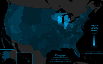
Daniel Huffman grew up with an ice cream flavor called Blue Moon. Where…
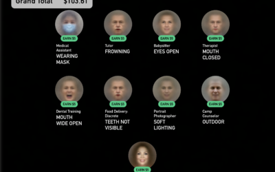
A game where you get to be a faceworker and mess with an AI system
Kyle McDonald, in collaboration with Greg Borenstein, Evelyn Masso, and Fei Lui, made…
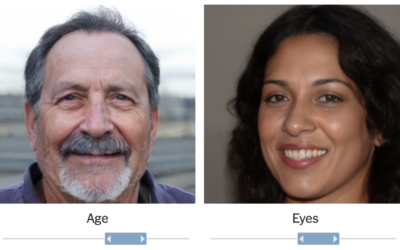
Fake faces created by AI and where this might be headed
It’s grown easier and easier to generate fake faces with AI. For The…
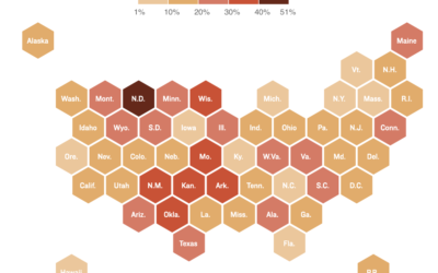
Where there are hospital staff shortages
Reporting for NPR, Sean McMinn and Selena Simmons-Duffins on staffing shortages:
On data…
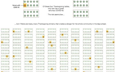
Why small gatherings can be dangerous too
A small gathering of 10 people or fewer can seem like a low-risk…
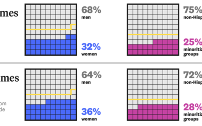
Analysis of representation in crossword puzzles
For The Pudding, Michelle McGhee analyzed representation in crossword puzzles. Some crossword publications…
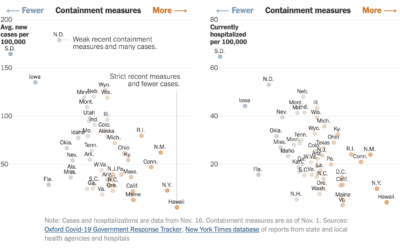
State restrictions and hospitalizations
The University of Oxford’s Blavatnik School of Government defined an index to track…
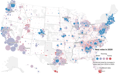
Voting gains for 2020, compared to 2016 election
For The New York Times, Ford Fessenden, Lazaro Gamio and Rich Harris go…
Recap of all the election maps and charts
Alan McConchie from Stamen recaps the wide array of maps and charts that…

