Visualization
Showing the stories in data through statistics, design, aesthetics, and code.
India vaccine procurement compared to other countries
Prasanta Kumar Dutta and Manas Mishra reporting for Reuters on the slow rollout…
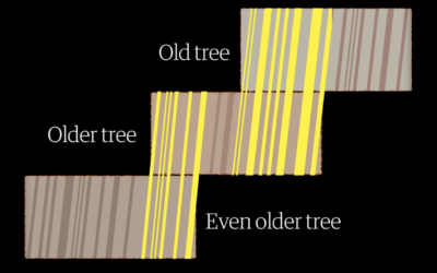
Measuring centuries-old droughts through tree rings
To measure drought in the present day, we use data from sensors that…
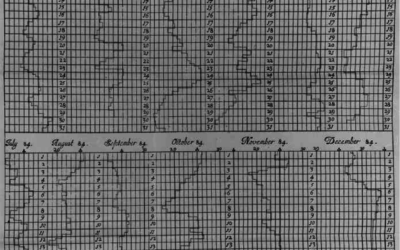
Graphs before anyone knew what they were
Michael Friendly and Howard Wainer have a new book out: A History of…
Collapse of Mexico City Metro explained
The New York Times investigated the collapse of the Metro, which killed 26…
xkcd: Base Rate
xkcd points out the importance of considering the baseline when making comparisons:…
Scale of a mouse plague
There’s a mouse plague in Australia right now. The words alone don’t express…
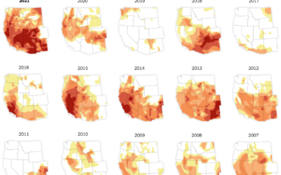
Drought in the Western United States
In what’s become a recurring theme almost every year, the western United States…
Tapestry for reflective data visualization
As a way to reflect on 2020, Catherine Madden wove tapestry to visualize…
All the passes in soccer visualized at once
This is a fun soccer graphic by Karim Douïeb. It shows 882,536 passes…
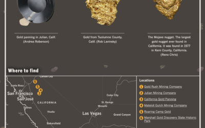
Rockhounding in California
Any outdoor activity sounds amazing at this point. Andrea Roberson and Casey Miller…
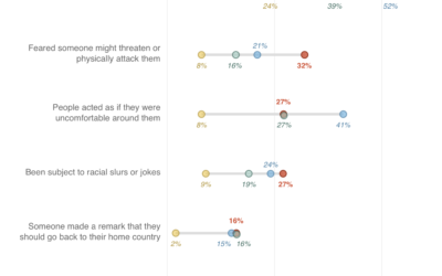
Myth of the Asian American model minority, explained with charts
Asian Americans are often viewed as a “model minority”, but when you look,…
Where chess pieces are most often captured
Reddit user desfirsit made heatmaps to show where on the chess board pieces…
Seeing how devices talk to each other
Your computer connects to your router, which connects to your modem. Your printer…
Recreation of the neighborhood in the Tulsa race massacre
In 1921, hundreds were killed. The New York Times recreated the neighborhood, adding…
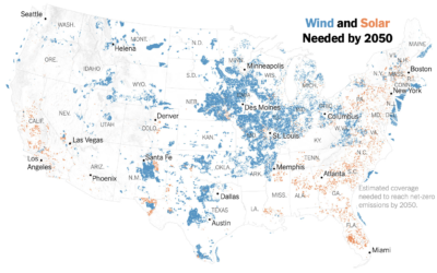
Where wind and solar needs to grow by 2050
Based on estimates from Princeton University’s Net-Zero America Project, Veronica Penney for The…


