Visualization
Showing the stories in data through statistics, design, aesthetics, and code.
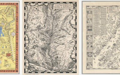
David Rumsey Map Center, cataloging historical works
The David Rumsey Map Center at Stanford houses hundreds of thousands of maps…
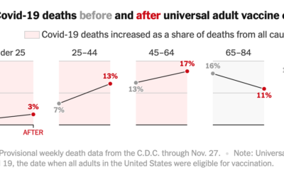
Covid-19 mortality before and after vaccine eligibility
Denise Lu and Albert Sun for The New York Times show the shifts…
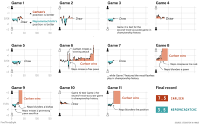
World Chess Championship in charts
Magnus Carlsen continued to assert his dominance at the World Chess Championship. FiveThirtyEight…

Virtual proctoring simulation
Many colleges use virtual proctoring software in an effort to reduce cheating on…
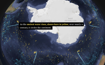
Shifting currents and melting ice in the Antarctic
Based on data from autonomous sensors floating in the oceans, researchers are able…
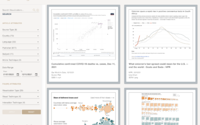
A catalog of all the Covid visualizations
The COVID-19 Online Visualization Collection is a project to catalog Covid-related graphics across…
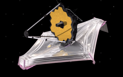
Launching a telescope to explore the Big Bang
NASA is launching the James Webb Space Telescope on December 22, 2021 with…
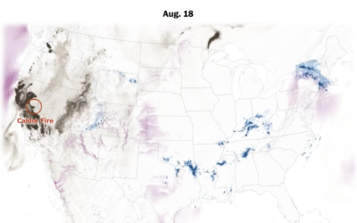
Mapping the weather disasters of 2021
Zach Levitt and Bonnie Berkowitz for The Washington Post mapped and animated the…
What works in visualization, scientifically speaking
Steven L. Franconeri, Lace M. Padilla, Priti Shah, Jeffrey M. Zacks, and Jessica…
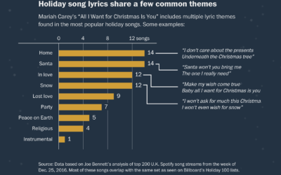
Why we listen to the same Christmas songs
You know it’s the holiday season when Mariah Carey starts singing about wanting…

NASA solar probe touched the sun
NASA launched the Parker Solar Probe in 2018 in an effort to explore closer to the sun.
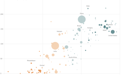
Vaccination rates compared against country wealth
Vaccine supply is only part of the equation. For The New York Times,…
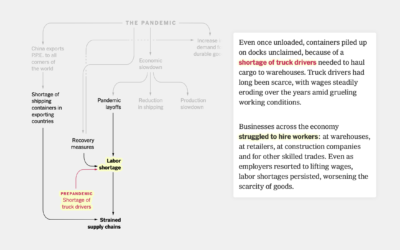
Flowchart for pandemic supply chain issues
Lazaro Gamio and Peter S. Goodman for The New York Times used a…
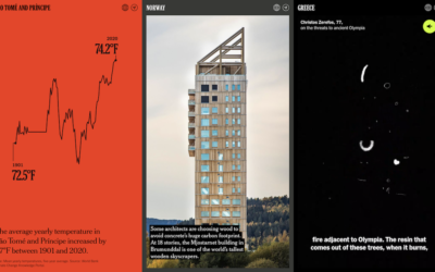
Climate change postcards from every country
The effects of climate change can be seen around the world, in the…

Leland Wilkinson, creator of The Grammar of Graphics, passed away
Leland Wilkinson passed away on Friday, according to his daughter Amie. In visualization…
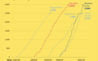
Stephen Curry career threes compared to other players
Stephen Curry is about to break the record for number of three-pointers made…
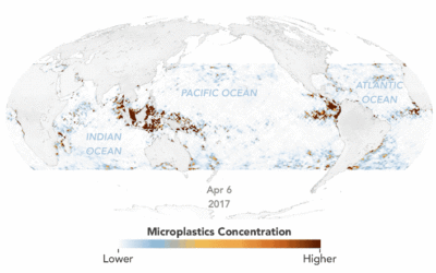
Animated map of microplastics in the ocean
Using estimates based on satellite data, Joshua Stevens for NASA Earth Observatory mapped…