Visualization
Showing the stories in data through statistics, design, aesthetics, and code.
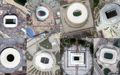
$300b World Cup seen through satellite imagery
Qatar spent $300 billion with a ‘b’ over the past twelve years to…

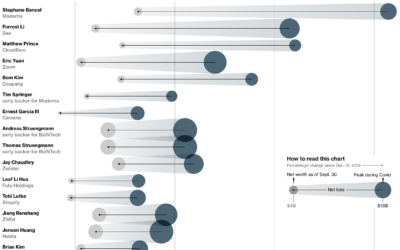
All the parts of daily life in India controlled by Mukesh Ambani
Mukesh Ambani has an estimated net worth of $90.7 billion, because his company…
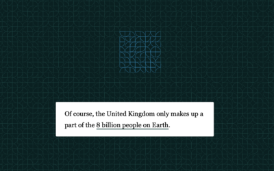
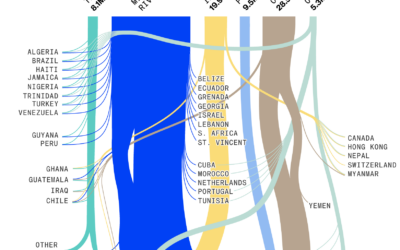
8 billion population visualized
Here’s a fun interactive from The Washington Post to earmark the world reaching…
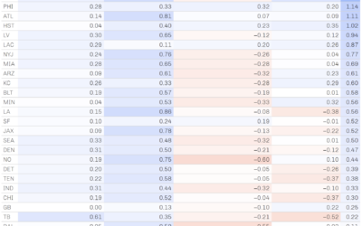
Role of luck in football wins
NFL Football Operations calculated how much luck has contributed to team wins and…
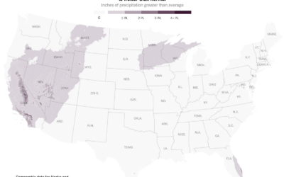
Exports through the Mississippi River
Drought has caused water levels to drop in the Mississippi River, which is…

History of wars and power in Europe, animated from 1500 to present
Agar.io is a multiplayer game where people control cells in a Petri dish-type…
Chance of rain and election turnout
There’s rain in the forecast tomorrow in some areas of the United States,…

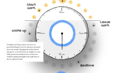
Daylight saving time and circadian rhythms
Daylight saving time ends in the United States this weekend and ended already…
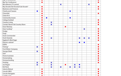
How you might vote based on what you like
By Angie Waller, this table shows how Facebook thinks you’ll vote based on…
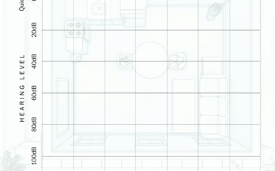
What hearing loss sounds (and looks) like
Using an audiogram as a backdrop, Amanda Morris and Aaron Steckelberg, for The…
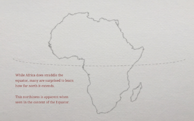
Geographic misconceptions about the location of continents
When you’re used to looking at the world through a certain lens, such…
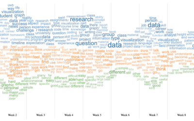
Word cloud + Streamgraph = WordStream
I hear it all the time from chart purists. “I love the streamgraph!”…
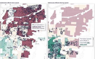
Slow internet for the same price as fast internet
When you pay for internet, it seems like a reasonable expectation that if…
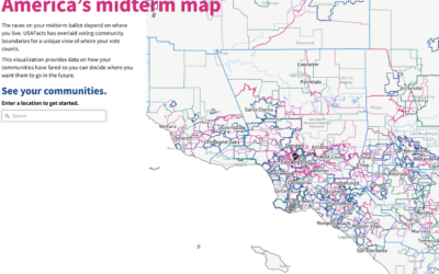
All the elections where you live
We tend to talk about elections as this uniform thing. People vote for…