Visualization
Showing the stories in data through statistics, design, aesthetics, and code.
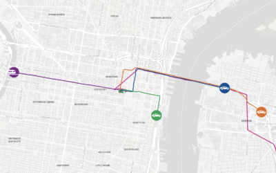
A race to find the best route to the Jersey Shore
To find the fastest route from Philadelphia to the Jersey Shore, The Philadelphia…
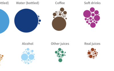
What Americans drink and their changing habits
When I was a kid, I drank a lot of milk, and bottled…
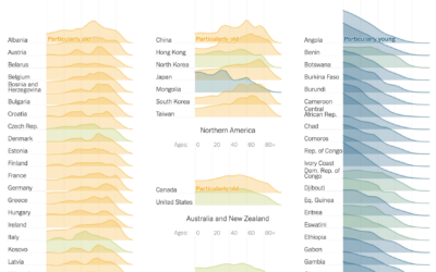
Age shifts around the world
The world is getting older overall. For The New York Times, Lauren Leatherby…
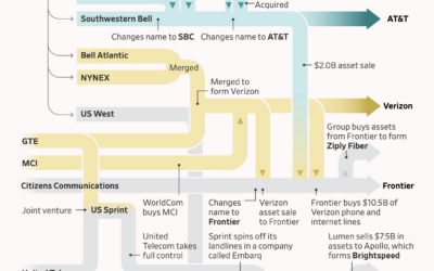
Flowchart showing the splits, mergers, and acquisitions of the former Bell Telephone Company
Bell System’s monopoly broke up in 1984 leading to independent phone companies, which…

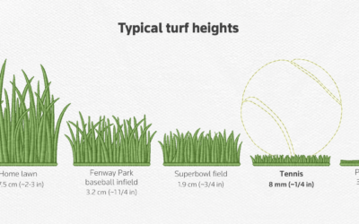
Wimbledon grass patterns
This might surprise you, but the grass at the Wimbledon tennis tournament is…
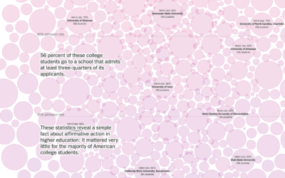
Focusing on the majority of students not affected by affirmative action
For NYT Opinion, Richard Arum and Mitchell L. Stevens, with graphics by Quoctrung…
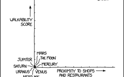
xkcd: Real estate analysis
xkcd provides the analysis we all need. I can’t believe Jupiter scored so…

Competitive hot dog eating requirements
Nathan’s Famous hot dog eating contest, so gross to watch but impossible to…


Password game requires more ridiculous rules as you play
Password rules seem to get more strict and weird over time. Neal Agarwal…
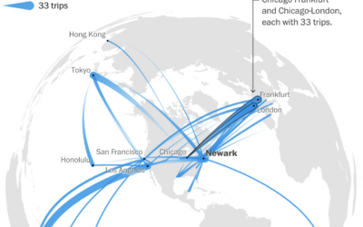
A year of flight paths, for someone with an unlimited pass
United Airlines sold a lifetime unlimited pass in 1990 for $290,000. Tom Stuker…
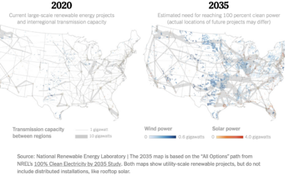
Map of electric grid required for cleaner energy
To power the United States with more clean energy, you might think it’s…

Friend simulation system, with ChatGPT
Philippe Vandenbroeck and Santiago Ortiz were curious about a system that incorporated knowledge…

To make electric vehicle batteries, China must be involved
For The New York Times, Agnes Chang and Keith Bradsher ask if it’s…
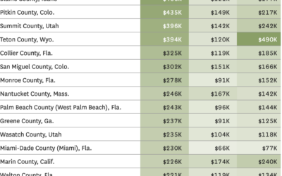
Where people are moving in the U.S.
Based on migration data recently released by the IRS, Nami Sumida for the…
Objectiveness distributions
Putting this joke chart up for posterity, because it deserves it. The earliest…