Visualization
Showing the stories in data through statistics, design, aesthetics, and code.
A New Way to Search Images With Google Image Swirl
There’s this branch in computer science and statistics for vision research. Normally, if…
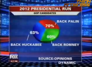
Can You Guess What These Maps Show?
I’m no doubt still under massive food coma at this time, but in…
What’s Cooking on Thanksgiving, Mapped and Ranked
Food-wise, Thanksgiving is different across the country. In some places you’re going to…
Battle of the Coverage Maps: Verizon vs. AT&T
Verizon has been running these ads lately that compare their 3G coverage to…
The Cost of Getting Sick
GE and Ben Fry (now the director of SEED visualization), show the cost…
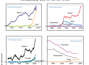
Buzzwords in Academic Papers (Comic)
This comic was really amusing, although it might be because I’m a big…
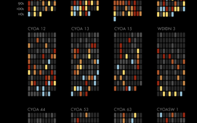
Choose Your Own Adventure – Watch the Stories Unfold
Interaction designer Christian Swinehart takes a careful look at the popular Choose Your…
The Future: Embedding Data in the Everyday
Imagine a world where data becomes the everyday, simply embedded in what you…
Review: The Visual Miscellaneum by David McCandless
David McCandless’ The Visual Miscellaneum: A Colorful Guide to the World’s Most Consequential…
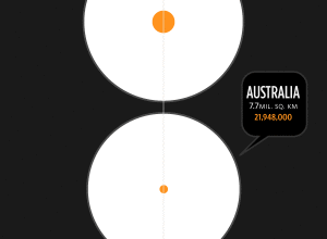
Land Mass and Population by Country
From Herald Daily is this giganto view of land mass and population size…
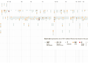
The Pitching Dominance of Mariano Rivera
The New York Yankees just won the World Series. I don’t know much…
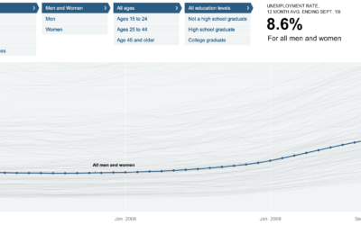
Unemployment Rate For People Like You – NYT Interactive
Shan Carter, Amanda Cox, and Kevin Quealy of The New York Times explore…
7 Visualization Groups On Flickr to Find Inspiration
I’ve always thought of Flickr as a place where I can share my…
Make Thematic Maps With Cartographer.js
Like it or not, Google Maps mashups continue to be a Web favorite.…
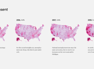
Unemployment, 2004 to Present – The Country is Bleeding
The Bureau of Labor Statistics released the most recent unemployment numbers last week.…
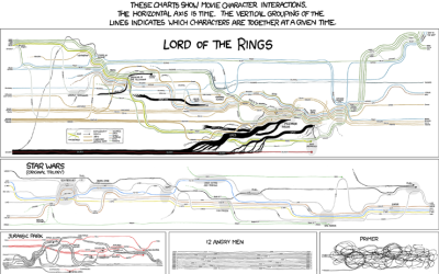
Fictional Character Interactions Over Time
Popular nerd comic xckd takes a look at character interactions over time in…
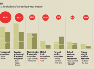
A Land Where Men and Women are Paid Equally
We all know (or at least should know) about the pay gap between…