Visualization
Showing the stories in data through statistics, design, aesthetics, and code.
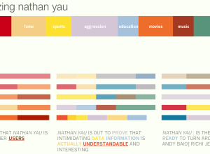
How Does the Internet See You? – Personas From MIT Media
I Google myself every now and then. Everyone does. I don’t know why…
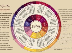
What is Your Wine Personality Profile?
The Texas in a Bottle guide to Texas Wine [pdf] reads:
Ever listen…
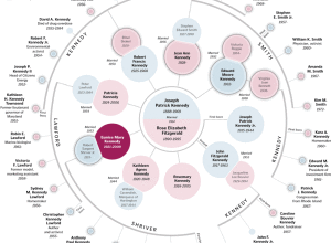
Detailed View of the Kennedy Family Tree
As far back as I can remember there’s always been a mystique around…
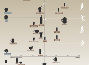
Caffeine vs Calories – Buzz vs Bulge
David McCandless from Information is Beautiful plots the calories in popular beverages versus…
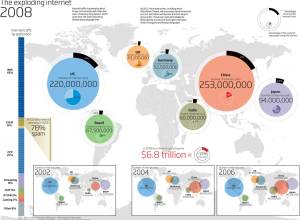
Mapping the Growth of the Internet – What Do You Think?
I, uh, well. Hmm. Yeah. New Scientist recently compiled a list of visualizations…
Map/Territory Shows Augmented Reality of the Future
Map/Territory, by designer Timo Arnall, is a concept video of what it might…
What DC Metro Routes are Most Common?
Greater Greater Washington maps rider flow for the DC Metro. As you might…
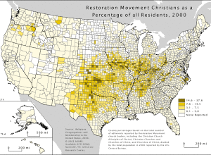
Religious Geography of the United States
The U.S. Census Bureau doesn’t ask questions about religion because of political issues…
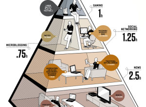
Balance Life With the Media Diet Pyramid
In the August issue of Wired are the New Rules for Highly Evolved…
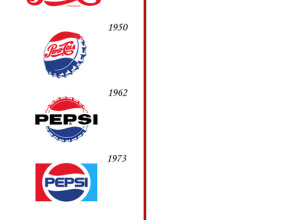
Pepsi and Coca-Cola Logo Design Over the Past Hundred Years
There have actually been some subtle changes in the Coca-Cola logo but not…
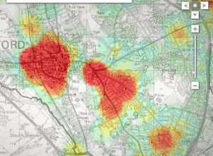
Mapping Crime in Oxford Over Time
Mentorn Media and Cimex Media, on behalf of BBC, explore crime patterns in…
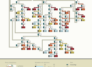
Choose Your Own Adventure – Most Likely You’ll Die
Remember those choose your own adventure books that you used to read as…
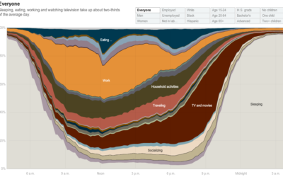
How People in America Spend Their Day
From Shan Carter, Amanda Cox, Kevin Quealy, and Amy Schoenfeld of The New…
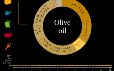
What Britain Has Eaten the Past Three Decades
The Department for Environment, Food and Rural Affairs (DEFRA) keeps an archive of…
Track Presidential Approval Ratings and Compare to Past
From William Couch, Kristen Novak, Michelle Price and Joshua Hatch of USA Today,…
Step-by-Step Guide On How to Get Shot by the Sartorialist
The Sartorialist is a unique fashion blog that highlights people’s hot styles on…
Watch the Ebb and Flow of Melbourne Trains
Similar to other visualizations showing location (e.g. Cabspotting, Britain From Above), this one…
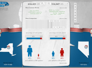
Compare What Your Senators and Reps are Talking About With Congress Speaks
There’s a lot of talking in congressional meetings, but what are your state…

