Visualization
Showing the stories in data through statistics, design, aesthetics, and code.
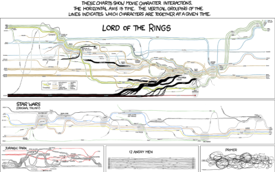
Fictional Character Interactions Over Time
Popular nerd comic xckd takes a look at character interactions over time in…
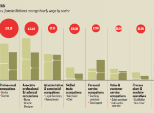
A Land Where Men and Women are Paid Equally
We all know (or at least should know) about the pay gap between…
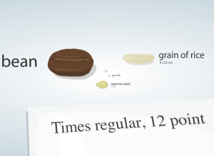
Putting Cell Size in Perspective
It’s hard for us, cognitively speaking, to imagine things that are really really…
Using Flickr as a Paintbrush
Andy Woodruff from Cartogrammar uses average color in Flickr photos to map the…
This Would Be Perfect for a Roomba Commercial
You know the Roomba from iRobot? It’s the robot vacuum cleaner that is…
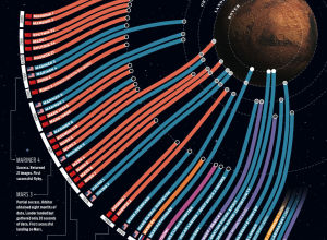
Failed Space Missions to Mars
The above graphic shows missions to mars starting in 1960 to present (top…
Open Thread: What the **** is Visualization Anyways?
I think ever since visualization got started, people have been asking this question.…
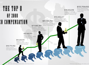
How Much Do CEOs Make in the United States?
GOOD magazine’s most recent transparency contest asked designers to focus their powers on…
When Twitter Says Good Morning Around the World
Jer Thorp, an artist and educator from Vancouver, Canada, visualizes when people “wake…
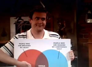
An Addiction to Charts and Graphs
Haha, Jason Segel is hilarious. In this episode of How I Met Your…
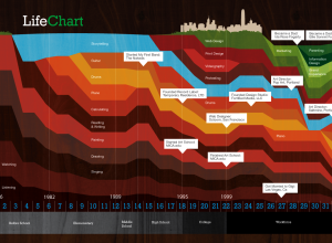
One Life, One Stacked Area Chart
Ben Fogarty uses a stacked area chart to represent his life. To us…
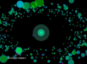
The S&P 500 as a Planetary System
The Stock Ticker Orbital Comparison, or STOC for short, from media student James…
You Are Not Allowed to Read this Book
What would a freshman English class be without Of MIce and Men? No…
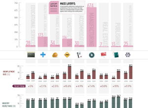
The Geography of Job Loss
While on the topic of job loss and unemployment, here’s an animated map…
Trendsmap Shows Twitter Trends Geographically
Twitter shows trending topics, but it’s for the entire user base. You can…
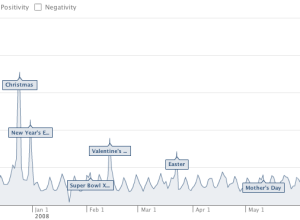
Facebook Measures Happiness in Status Updates
As we all know, Facebook lets people update their friends with status updates,…

