Visualization
Showing the stories in data through statistics, design, aesthetics, and code.
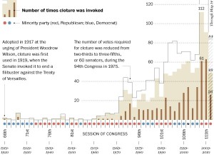
Is the filibuster unconstitutional?
Washington Post’s Ezra Klein busts on the filibuster. Gone are the days of…
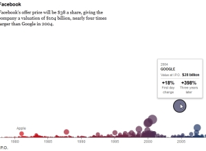
The Facebook Offering: How It Compares
The New York Times does it again with this succinct look at tech…

The Descriptive Camera
The unassuming little Descriptive Camera made me rethink data. This project by Matt…
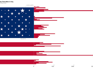
ITP Spring Show: Iraq war and diabetes visualizations
Yesterday I visited the ever popular NYU ITP bi-annual show which is a…
Stop motion music video
Music visualization with stop motion board games. You can’t go wrong.
[via @jcukier]…
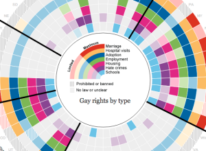
Gay rights in the United States, by state
Gay rights vary across states and by region. The Guardian US interactive team…
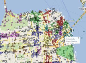
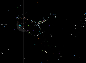
Neighborhood boundaries based on social media activity
Researchers at the School of Computer Science at Carnegie Mellon University investigate the…
An era of human-affected Earth
Welcome to Anthropocene:
Scientific concepts like the Anthropocene, planetary boundaries and planetary stewardship…
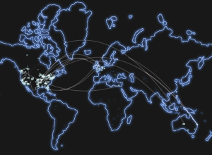
Minecraft server connections
I’ve never played Minecraft, but maybe this map showing live server connections means…
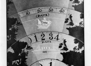
Titanic infographics from 1912
With the Titanic anniversary this year, Chiqui Esteban dug up graphics back from…
Avengers characters first appearances
With The Avengers coming out today in the US, artist Jer Thorp had…
Parallel Sets for categorical data, D3 port
A while back, Robert Kosara and Caroline Ziemkiewicz shared their work on Parallel…

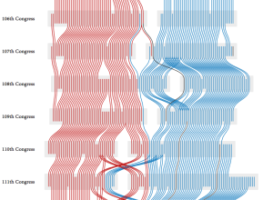
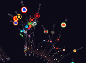
Agreement groups in the US Senate
PhD student Adrien Friggeri demonstrates a new clustering algorithm with a visualization of…
Easter spending patterns in Spain, animated
The MIT SENSEable City Lab, in partnership with BBVA, visualizes spending in Spain…