Visualization
Showing the stories in data through statistics, design, aesthetics, and code.
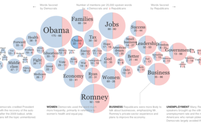
Words used at the National Conventions
The elections season is in full swing, and the New York Times graphics…
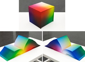
RGB Colorspace Atlas shows every shade in a cubic book
The 8-inch cube RGB Colorspace Atlas by artist Tauba Auerbach shows every color…
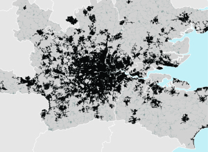
Mapping urban footprint
After identifying 129 metropolitan regions that represent 35 percent of the world’s urban…
How NASA visualizes large datasets
Horace Mitchell, director of the NASA Scientific Visualization Studio discusses the process behind…
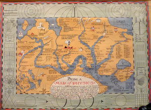
Physics as a geographic map
The fictional map of physics by Bernard H. Porter in 1939 reads:
Containing…
Making of Perpetual Ocean →
Making of Perpetual Ocean. NASA interview on how they made this; surprisingly, they…

Long-exposure fireworks photos
Photographer David Johnson took long-exposure shots of fireworks. Fireworks already leave trails when…
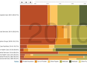
Who pays for healthcare, 1960 to 2010
Josh Cothran looked at who’s paid for healthcare over the past five decades,…
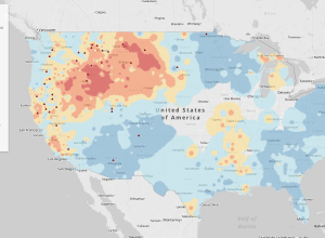
Fire forecasts across the United States →
As megafires in the Southwest are becoming the new normal, NPR reports in…
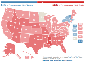
Amazon election map, based on book sales
Amazon used their book sales data to color a map red and blue.…
Water Light Graffiti
Water Light Graffiti is an installation by Antonin Fourneau that lets you use…
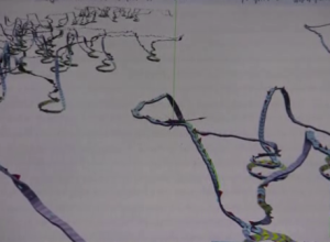
Tracing the paths of humpback whales
For the past ten years, researchers have been tagging hump back whales in…
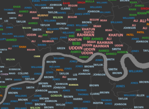
Most common London surnames mapped →
James Cheshire, a geography lecturer at the University College London, mapped common surnames…
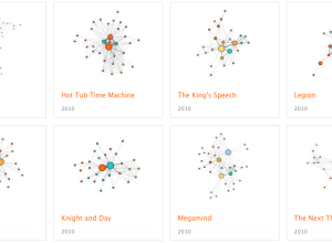
Character social networks in movies
We’ve seen a lot of network charts for Twitter, Facebook, and real people.…
Disney Research makes plants interactive
Botanicus Interacticus from Disney Research turns plants into multi-touch surfaces, simply by placing…
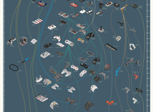
Evolution of video game controllers →
From the department of old-but-new-to-me, Pop Chart Lab charted the evolution of video…
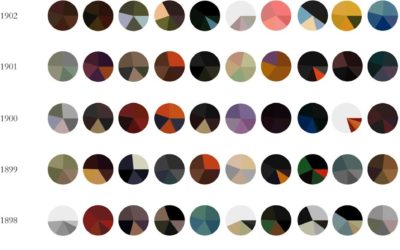
Paintings as pie charts →
Expanding on his Vincent van Gogh pie charts, Arthur Buxton minimalized famous paintings…
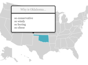
State stereotypes suggested by Google
Renee DiResta got to wondering about state stereotypes, so she looked them up…