Visualization
Showing the stories in data through statistics, design, aesthetics, and code.
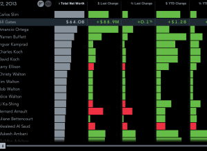
Billionaires of the world ranked and charted
How wealthy are the richest people in the world? How do they compare…
Vintage American Infographics →
Small collection of graphics from mid-19th century…

silenc: Removing the silent letters from a body of text
During a two-week visualization course, Momo Miyazaki, Manas Karambelkar, and Kenneth Aleksander Robertsen…
Treasure island of infographic textbooks →
A look back on an old collection…
Global temperature rises over past century
New Scientist mapped global temperature change based on a NASA GISTEMP analysis.
The…
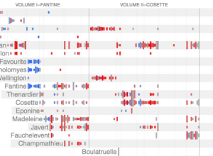
Character mentions in Les Miserables
Jeff Clark took a detailed look at Victor Hugo’s Les Miserables via character…
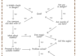
Flowchart: Gandalf problem solving →
The Lotr Project breaks down the thought process in the magical mind.…
How a Civil War Vet Invented the American Infographic →
Creator of the first Statistical Atlas of the United States…

Five years of traffic fatalities
I made a graphic a while back that showed traffic fatalities over a…
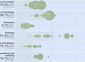
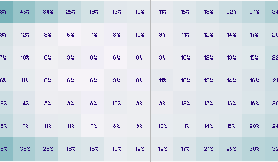
Women as academic authors over the years →
The Chronicle of Higher Education has a look at the percentage of academic…
D3 map projections →
A collection by Jason Davies of the map projections possible with D3…
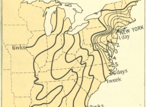
Time of travel in the 1800s
From the 1932 Atlas of the Historical Geography of the United States, these…
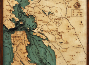
Wood charts reveal layers of underwater world →
Below the Boat produces beautiful laser-cut wood maps:
Starting with a bathymetric chart…
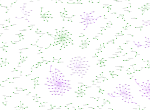
Wine industry network in the US
A group of researchers at Michigan State University, led by Phil Howard, explored…
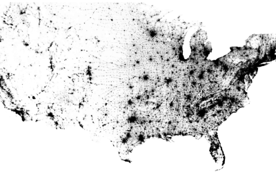
Map of every person counted in 2010 US Census
In the 2010 United States Census, 308,745,538 were counted, and Brandon Martin-Anderson from…
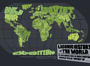
Map: Laconic history of the world
Cartographer Martin Elmer made a truncated history map of the world:
This map…