Visualization
Showing the stories in data through statistics, design, aesthetics, and code.
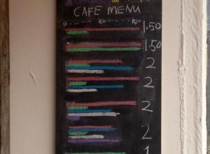
Chartspotting: Coffee graph menu
FlowingData reader Amir sent this along. In lieu of a list of coffee…
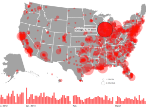
Gun deaths since Sandy Hook
The shooting at Sandy Hook Elementary School was horrible, but there have been…
Metrico, an infographic puzzle game
Metrico is a puzzle action game for PlayStation Vita that centers around charts…
Spatial Memory: Mapping Blank Spots in the Cheeseboard Maze
Mapping Blank Spots in the Cheeseboard Maze. “IST Austria Professor Jozsef Csicsvari together…
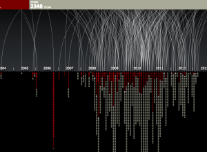
Every known drone attack in Pakistan
It’s hard to know the impact of drone attacks as outsiders looking in,…
Deleted Slides
Science graphics editor Jonathan Corum of The New York Times is great at…
A visualization of pi for high school math students
On Kickstarter: A project that uses a visualization of pi to connect Brooklyn…

Internet Census
Upon discovering hundreds of thousands open embedded devices on the Internet, an anonymous…
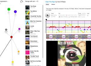
Interactive: Common chord progressions in 1,300 songs
If you listen to the radio long enough, you’ve probably noticed that many…
A new brand of cartographer
Emily Underwood on new cartographers and the growing field:
Geographers have traditionally studied…
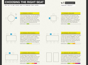
How to be Interesting by Jessica Hagy
Jessica Hagy, the one who made Venn diagrams on index cards popular, has…
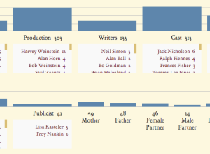
An exploration of how Oscar winners express gratitude
Each year, Oscar speeches seem to follow a similar format, with familiar names…
Geo Point Plotter
Geo Point Plotter by Derek Watkins is a quick and dirty mapper. Copy…

App shows what the Internet looks like
In a collaboration between PEER 1 Hosting, Steamclock Software, and Jeff Johnston, the…
A Globe Hack and Good Old Mercator
A Globe Hack and Good Old Mercator. An illustration of the Mercator map…
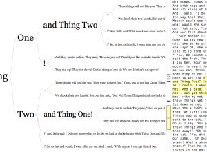
Word tree for any URL or Twitter username
In 2007, Martin Wattenberg and Fernanda Viégas created the word tree, a search…