Visualization
Showing the stories in data through statistics, design, aesthetics, and code.
On Maps with Michal Migurski
Michal Migurski talks online mapping on the Data Stories podcast. Some history and…
Orbiting planets found by NASA Kepler mission
The Kepler mission by NASA has discovered more than 100 planets that orbit…
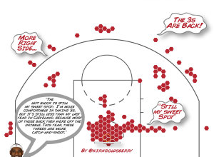
Shot charts show evolution of Lebron James
With the start of the NBA playoffs tomorrow, it’s worth coming back to…
Time-lapse: Package shipped with a hidden camera
Designer Ruben van der Vleuten was curious about the shipping process, so he…
Wealth distribution in America
This video clearly describes the distribution of wealth in America using a set…
Crosslet
Crosslet is “a free small (22k without dependencies) JavaScript widget for interactive visualisation…
Visualizing the Paris metro system
Data visualization group Dataveyes looks closer at the Paris metro system from a…
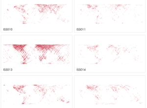
Locations of every photo from International Space Station
Over the last 12 years, astronauts have taken a lot of pictures from…
Doing good with data
Periscopic founders Kim Rees and Dino Citraro spoke with Co.Design on what makes…
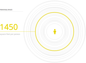
Personal space per person in various countries
How much space is there per person in different countries? Andrew Bergmann for…
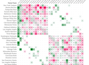
Analysis of baseball ticket pricing
If you’ve ever looked at ticket prices for sporting events, you probably noticed…
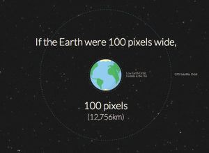
Distance to Mars
Long distances (and big numbers) can be difficult grasp. Designers Jesse Williams and…
Wall shelf represents water in snowpack
Melting snowpacks feed into streams and rivers and serve as a source of…
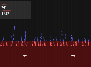
How a cab driver makes money
According to the Bureau of Labor Statistics, cab drivers and chauffeurs make a…
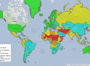
The fallacy of new cartography
Cartographer Kenneth Field argues that mapping on the Web isn’t really new. The…
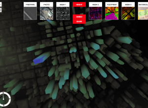
An experimental map service using 3-D data
For the past few months, Stamen Design has been working with 3-D data…

