Visualization
Showing the stories in data through statistics, design, aesthetics, and code.
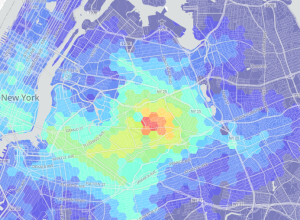
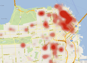
Lessons learned from mapping millions of dots
Erica Fischer, known around these parts for her dot maps, describes the lessons…
Physics of love
Louise Ma, along with Chris Parker and Lola Kalman, started a six-part short…
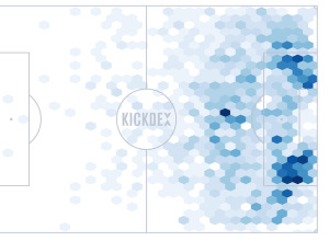
Soccer assists mapped
Using Opta data for assists in the Premier League, Kickdex made this straightforward…
Physical installation shows actual wind patterns
Artist Charles Sowers specializes in public art works and display of physical phenomena.…
GPS shoes show you the way home
Inspired by The Wizard of Oz, where Dorothy clicks her heels to get…
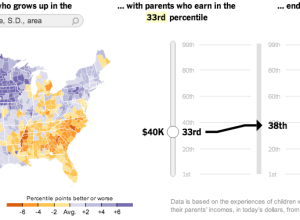
Climbing the income ladder →
In a study conducted by researchers at Harvard and UC Berkeley, data shows…
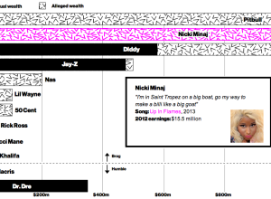
Rappers’ claimed wealth versus actual wealth
Allison McCann for Businessweek graphed rappers’ claimed wealth in their songs versus their…
Movie sounds
Moviesound is a goofy yet charming look at sounds in movies. Imagine sound…
Make your own US rivers and roads maps
Inspired by Nelson Minar’s map of US rivers, Mike Bostock demonstrates how to…
Visualizing uncertainty still unsolved problem
Vivien Marx in Nature Methods:
Data from an experiment may appear rock solid.…
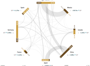
Global migration and debt
Global Economic Dynamics, by the Bertelsmann Foundation in collaboration with 9elements, Raureif, and…
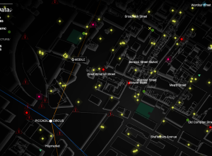
An eerie view of the linked city
Watch_Dogs is a video game that imagines Chicago as a city where everyone…
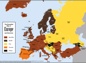
Map shows how to say “beer” in Europe
Feòrag NicBhrìde provides a handy map on how to say beer in European…
A people-centric view of your Gmail inbox
Immersion by the MIT Media Lab is a view into your inbox that…
Instagram cities
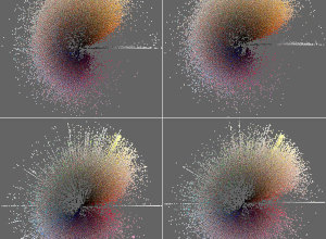
The collaborative project Phototrails is a visual exploration of millions of Instagram photos,…
Yelp maps words used in reviews
We typically think of Yelp reviews as aggregates on a restaurant or business-specific…


