Visualization
Showing the stories in data through statistics, design, aesthetics, and code.
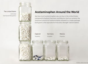
Acetaminophen availability around the world
Probublica has a detailed piece on the potential overuse of acetaminophen, commonly known…
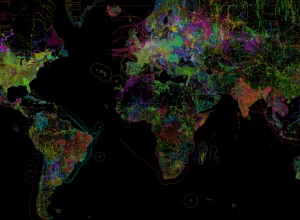
OpenStreetMap, the work of individuals visualized
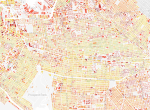
In the continued series of meta-data-driven maps, OpenStreetMap shows the work of individuals…
D.C. building heights study
Emily Chow and Gene Thorp for The Washington Post explored the change in…
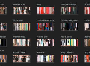
Treemap art
Ben Shneiderman invented the treemap in the 1990s to visualize the hierarchical contents…
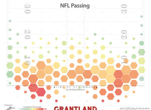
Where NFL quarterbacks throw
Kirk Goldsberry, known for his basketball analysis and shot charts, has applied his…
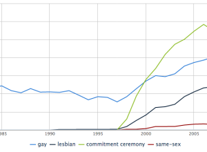
Crunching the wedding numbers
Weddings are special events where friends and family come together to celebrate, and…
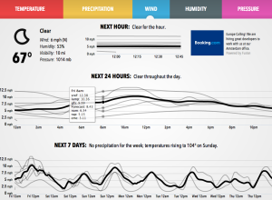
Weather models, a visual comparison
Forecast, one of the best if not the best quick-look weather sites, uses…
London to Brighton train ride, 1953-2013
In 1953, the BBC filmed a train ride from London to Brighton and…
Etymology and word usage when you ‘define’ with Google
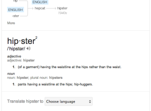
Pro tip: When you Google “define <INSERT WORD HERE>” and open the information…
Playgrounds for everyone →
NPR digs into accessible playgrounds, because everyone should get to play.
Remember running…
British relationships throughout history
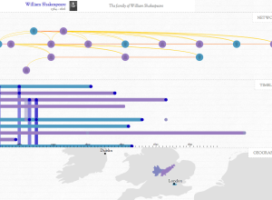
In Kindred Britain, Nicholas Jenkins, Elijah Meeks and Scott Murray provide a visual…
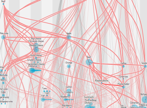
Network of shared flavors
Jan Willem Tulp, for this month’s Scientific American food issue, recreated the flavor…
Learn to make animated information graphics
Graham Roberts, a graphics and multimedia editor at The New York Times, is…

