Visualization
Showing the stories in data through statistics, design, aesthetics, and code.
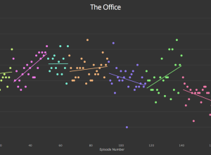
Graph TV shows ratings by episode
Kevin Wu made a straightforward interactive that lets you see IMDB television ratings…
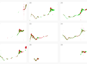
Failed Bitcoin market activity
Stamen visualized Bitcoin activity, noting a variety of traders who knew what they…
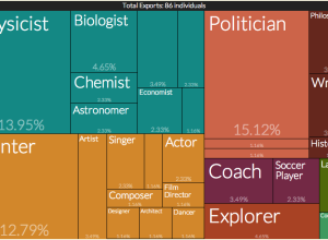
An exploration of cultural production
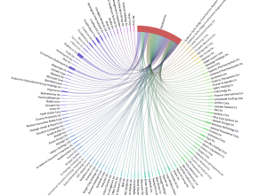
Pantheon, a project from the Macro Connections group at The MIT Media Lab,…
Beer me, Minnesota
The Star Tribune has a fun interactive that recommends Minnesota brews, based on…
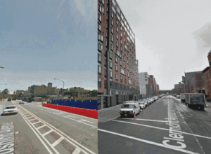
Before and after lot vacancy
Justin Blinder used New York’s city planning dataset and Google Streetview for a…
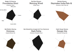
Find new beers to drink
Based on reviews from BeerAdvocate, Beer Viz, a visualization class project, asks you…
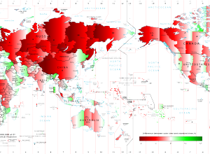
Solar time versus standard time around the world
After noting the later dinner time in Spain, Stefano Maggiolo noted relatively late…
An exploration of selfies
Selfiecity, from Lev Manovich, Moritz Stefaner, and a small group of analysts and…
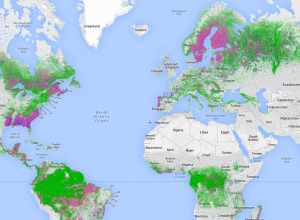
Near-real-time global forest watch
Global Forest Watch uses satellite imagery and other technologies to estimate forest usage,…
A human-readable explorer for SEC filings
Maris Jensen just made SEC filings readable by humans. The motivation:
But in…
Using slime mold to find the best motorway routes
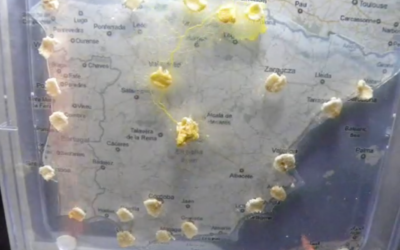
This is all sorts of neat. Researchers Andrew Adamatzky and Ramon Alonso-Sanz are…
Why we think of north pointing up
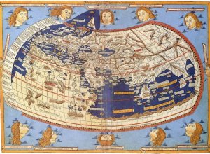
Nick Danforth for Al Jazeera delves into the history books for why north…


