Visualization
Showing the stories in data through statistics, design, aesthetics, and code.
A decade of college degrees
North by Northwestern looked closer at degrees awarded by their university over the…
Evolution and history of London
Using data from the National Heritage List for England, the London Evolution Animation…
Gotham City map
In 1998, artist Eliot R. Brown created a map of Gotham City for…
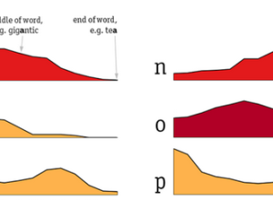
Distribution of letters in the English language
Some letters in the English language appear more often in the beginning of…
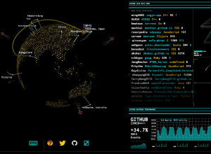
Tron-style dashboard shows Wikipedia and GitHub streams
As a fun learning exercise, Rob Scanlon made a dashboard that shows GitHub…
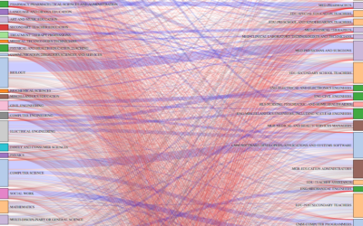
Careers after the college degree
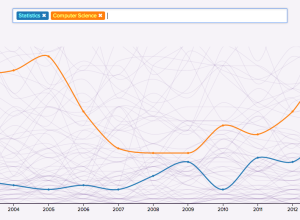
Ben Schmidt, an assistant professor of history at Northeastern University, was curious about…
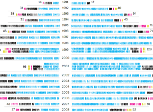
Death penalty, the executed and the victims →
The Washington Post provides a look at the death penalty in the United…
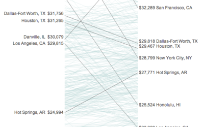
Your income versus what it feels like →
Incomes and the cost of living vary across the country. Some areas might…
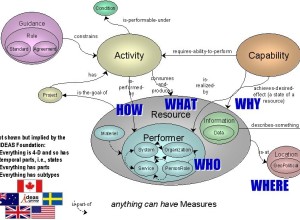
Military infographic fascination
Paul Ford describes his fascination with military infographics. Here’s what he has to…
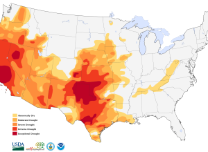
Drought map shows extreme shortages
From the U.S. National Drought Monitor.
The entire state of California is in…
Alcohol consumption per drinker
We’ve seen rankings for alcohol consumption per capita around the world. These tend…
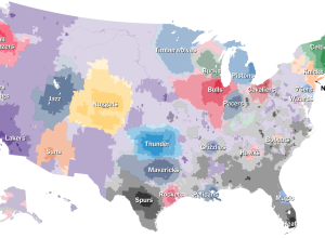
NBA basketball fans by ZIP code
After the popularity of The Upshot’s baseball fandom map, it’s no surprise the…
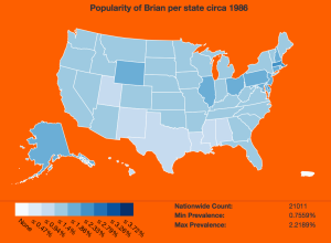
Name popularity by state, animated by year
Using baby name data from the Social Security Administration, Brian Rowe made this…

Crystal clusters of world data
Artist Scott Kildall generates what he calls World Data Crystals by mapping data…
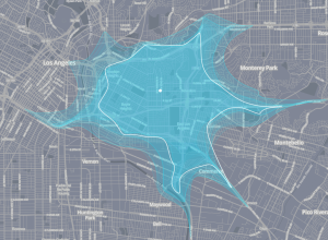
Your mobility at various times during the day
Isoscope, a class project by Flavio Gortana, Sebastian Kaim and Martin von Lupin,…
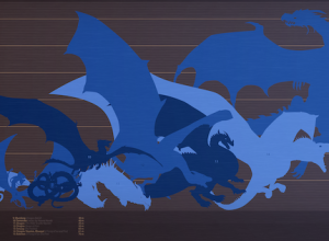
The size of Game of Thrones dragons compared
Because Game of Thrones. Max Fleishman and Fernando Alfonso III for The Daily…
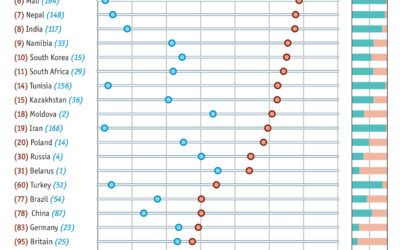
Views of white Americans
In light of the Donald Sterling brouhaha, Amanda Cox for The Upshot put…
Interactive visualization used as music video
George & Jonathan used an interactive audio visualization for their recent album George…