Visualization
Showing the stories in data through statistics, design, aesthetics, and code.
Map of book subjects on Internet Archive
The Internet Archive makes millions of digitized books available in the form of…
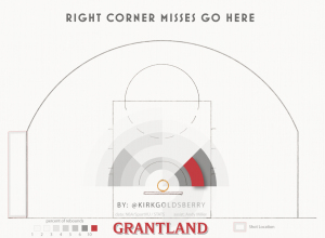
How basketball rebounds work
Kirk Goldsberry, with help from Andy Woodruff, looked at how rebounds work in…
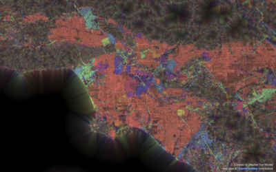
Road grid orientation in major cities
This is what you get when you group streets by their geographic orientation…
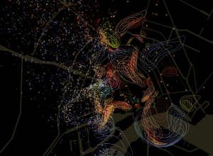
Geographic smell maps
Kate McLean, a PhD candidate in Information Experience Design at the Royal College…
10,000 League of Legends matches, all at once
League of Legends is an online, free-to-play game that pits two teams of…
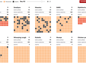
Ebola spreading, a simulation
As a way to understand the deadliness and spread of Ebola, the Washington…
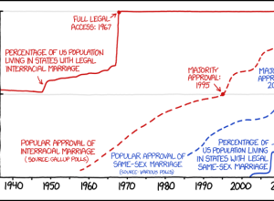
Interracial and same-sex marriage parallels
xkcd doing what xkcd does. Randall Munroe charts a brief timeline of interracial…
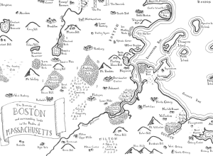
Real cities drawn as fantasy maps
Remember that time you were sitting by the fire reading The Lord of…
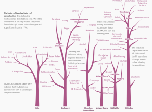
Beer family tree
With Anheuser-Busch InBev rumored to have an interest in acquiring SABMiller and SABMiller…
Drones programmed for light painting in the sky
What do you get when you put LEDs on a system of drones…
No Ceilings highlights progress towards gender equality
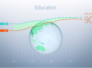
No Ceilings: The Full Participation Project, an initiative from the Clinton Foundation, aims…
Hand-drawn, detailed city maps
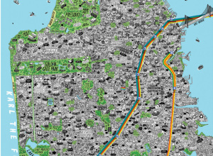
Maps can be about a lot of things, from strictly geography and location…

