Visualization
Showing the stories in data through statistics, design, aesthetics, and code.
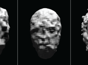
Detecting your face
Sterling Crispin reverse engineered facial recognition algorithms and produced masks that only kind…
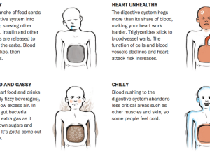
Why you feel bloated after holiday meals →
Because that’s what happens when you eat ten full plates of turkey and…
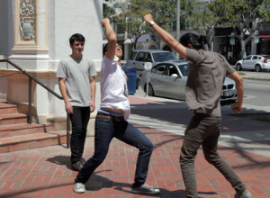
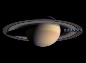
Friends in Space
Part celebration of Samantha Cristoforetti, the first Italian woman to fly into space,…
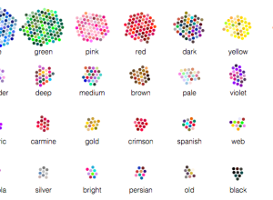
English versus Chinese color descriptors
Color exists on a continuous spectrum, but we bin them with names and…
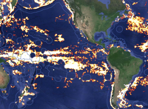
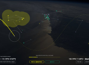
Tracking global fishing through satellite data
Global Fishing Watch is an initiative to place some accountability on global fishing,…
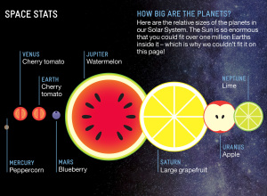
Planets as fruit to show scale
I still don’t understand the relative size of planets. The universe is too…
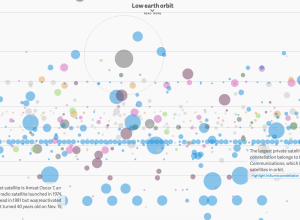
Earth-orbiting satellites, all of them
David Yanofsky and Tim Fernholz for Quartz visualized the satellites orbiting Earth. There’s…
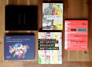
Casual visualization books for the coffee table
Since my son was born, it’s been a challenge to focus on a…
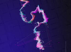
Wireless networks translated to sound
Wi-fi is embedded in our everyday lives so much that we don’t pay…

Berlin wall of lighted balloons
Celebrating the 25th anniversary of the fall of the Berlin Wall, Lightgrenze, translated…
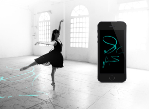
Ballet dance traces
Electronic Traces, by Lesia Trubat, tracks ballet movements and allows dancers to see…
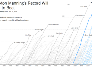
Touchdown passing record
Peyton Manning, quarterback for the Denver Broncos, passed up Brett Favre’s career record…
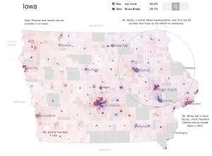
Senate results maps →
The New York Times pushed out super-detailed, precinct-level maps for the Senate election.…
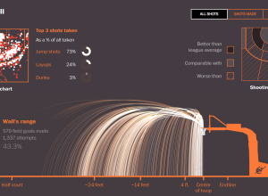
Basketball shot
Todd Lindeman and Lazaro Gamio for the Washington Post explored shooting patterns for…
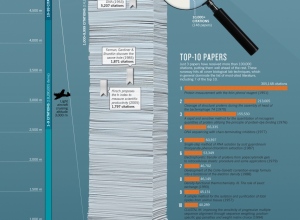
Most cited research papers →
In the department of comparing large numbers to objects and situations that are…
Relative size of astronomy stuff
Look! More size of very big things with large numbers, compared against things…