Visualization
Showing the stories in data through statistics, design, aesthetics, and code.
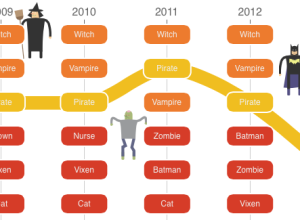
Halloween costume rankings
Accompanying their segment on Halloween stores stocking costumes, NPR ranks bestsellers for the…
Neurons conversing
Adam Cohen and his group are using genetically-modified neurons that light up when…
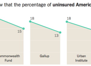
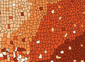
Affordable Care Act progress report
The New York Times takes a data-centric look at the progress of the…
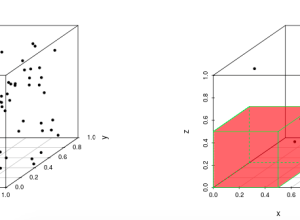
Curse of dimensionality, interactive demo
Jeff Leek was trying to explain the curse of dimensionality and realized that…

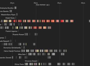
New York Times mapmakers
When news breaks, maps often accompany stories (or the maps are the story),…
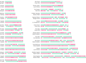
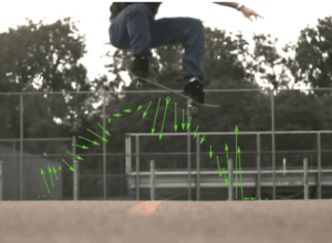
Visual summary of skateboarding tournament
George Murphy visualized the results of this year’s skateboarding tournament Battle at the…
Cynthia Brewer profile
Wired wrote a short profile for Cynthia Brewer, best known for Color Brewer,…
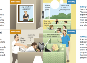
A healthy versus unhealthy office environment
In an interesting use of the before-and-after slider, this Washington Post graphic by…

Map of book subjects on Internet Archive
The Internet Archive makes millions of digitized books available in the form of…
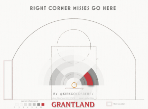
How basketball rebounds work
Kirk Goldsberry, with help from Andy Woodruff, looked at how rebounds work in…
Road grid orientation in major cities
This is what you get when you group streets by their geographic orientation…
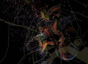
Geographic smell maps
Kate McLean, a PhD candidate in Information Experience Design at the Royal College…

10,000 League of Legends matches, all at once
League of Legends is an online, free-to-play game that pits two teams of…
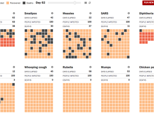
Ebola spreading, a simulation
As a way to understand the deadliness and spread of Ebola, the Washington…